Vintage Travel Poster Tutorial
Learn how to make your very own Vintage Travel Poster in Illustrator.
- Post author By Jeremy Chabot
- Post date March 9, 2021

Introduction
Welcome to my Vintage Travel Poster Illustrator Tutorial. I wanted to make this to teach and inspire others how I make my Vintage Travel Posters, which you can check out here. Art should be shared and celebrated, not hoarded and kept a secret. If you asked me, I wouldn’t say that I’m an expert at Illustrator and this tutorial should work for someone with a decent understanding of the program. I developed my skills and abilities over many years and slowly created this process. If you want to learn more about my “why,” click here . Basically, what I do is trace real images in Illustrator in order to create my posters.
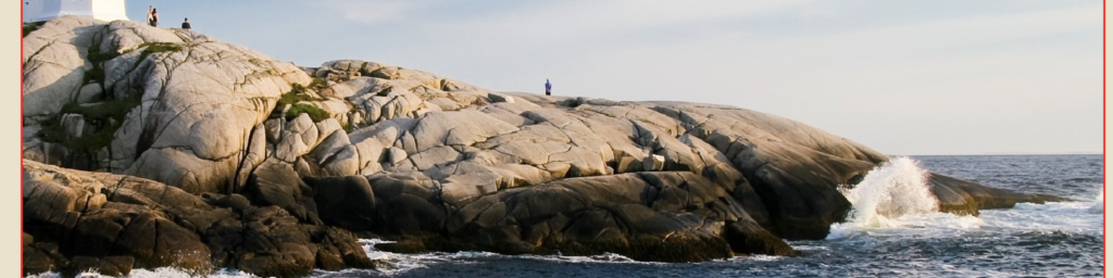
Alright, that’s enough about my story. Let’s dive right in. In order to help you follow along and get started, I’ve included the original image and an SVG File Template that you can download. I like to have the original image open at all times so I can reference it. If you don’t feel comfortable, then you can create your own illustrator template and try to match it to my specifications.
If you don’t feel comfortable, then you can create your own illustrator template and try to match it to my specifications. Keep in mind that you’ll have to try and match the photo up with mine for the rest of the tutorial to work.
- Artboard Width: 1296px
- Artboard Height: 1728px
- Border Width: 1152px
- Border Height: 1476px
If you open the Poster Background Layer, you’ll see that I’ve already included the image I used as my model. You can find the original image here . I like to use images I’ve taken myself, whenever I can; however, there are so many places in the world and traveling can be difficult and expensive, so I rely on images I find on the internet. Pixabay is a great website for finding free images and vectors.

Warning, this is a pretty long tutorial and it actually takes a few hours to actually accomplish the entire thing. So, if you’ve had to take a break and you need to jump to a different section, you can do so here: Section 1 , Section 2 , Section 3 , Lighthouse Method 1 , Lighthouse Method 2 , Sky and Water , Finishing Touches and Text .

The way I start my posters is by breaking it down into smaller sections. It is much easier to tackle a smaller section. Typically, I also start at the front and work my way back. So, in this image, the best place to start is with the rocks directly in front of us.

I’ve broken this up into 3 smaller sections as well. The area on the right, the large section in the middle and the small rocks on the left. Start with making an outline of the area using the Pen tool. Then connect anchor points all around to make the shapes. From there, just add some detail.
Subsection 1

So as we can see on the left rock, there is a crack and some dark spots near the bottom.
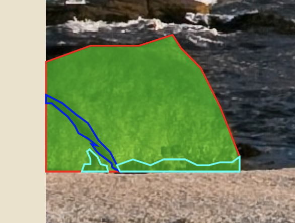
So, using the pen tool again, begin drawing the detail. For the purpose of this tutorial, I used different outlines to designate the different elements. The teal outline is the dark spots and the blue outline is the crack in the rock. Keep everything in outlines until you’re absolutely finished drawing or editing. Next, let’s move onto the main section in the middle.
Subsection 2

Again, just connect the anchor points and follow along with the general shape of it. There’s no right or wrong way to do this. Just connect points until you’re happy with the shape. Then start adding some details. Notice that this area has a puddle and some small cracks in the rock.

Starting with the cracks, start making a bunch of anchor points and kind of following with the actual crack. It is okay to freestyle a bit, because that’s what makes it unique. These posters don’t have to be perfect replicas of the scene. They just need to capture the essence.

As you can see, my cracks are larger than the real ones. The bottom crack was pretty small though, so I just drew a simple path and adjusted my stroke size to match the real one.

The problem with this is that you can’t get the pointy ends that many of these cracks have, so you’ll want to go to Object, Expand, expand the “Stroke,” then add some anchor points on each end and drag them outwards to make it pointy.

Next, is the puddle. This is made up of 2 parts, the dark ring and the water itself. Starting with the water, use the border of the poster as your edge and connect anchor points around the water to create a similar shape.

Next, to add the dark ring, trace the edge of the puddle and take your cursor slightly outwards and go back around and follow along. This ensures you don’t have any space showing underneath.

The final thing is to trace the shadow of where the indention in the rock begins. Again, retrace the lines you already made for the dark part of the puddle, move your cursor outwards and then follow the image.
Subsection 3

The last subsection is very similar. Draw by drawing the outline of the rocky area.

Then draw the detail, which in this case is really only the cracks. It simplifies the detail, but it still looks great when you’re done. If you wanted to go into more detail, you could try to draw each rock individually and line them up and create the cracks that way. I chose to take the simpler route, because I wanted to keep it looking more uniform for the rest of the poster.

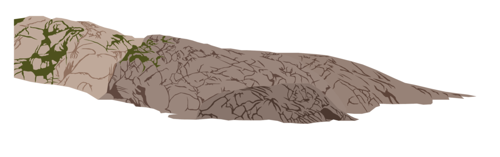
So, when you decide you’re ready, you can begin adding color from the rocks. An easy way to do this is to select the object or path you want and use the eyedropper tool to match the color from the image. Here’s how mine turned out.
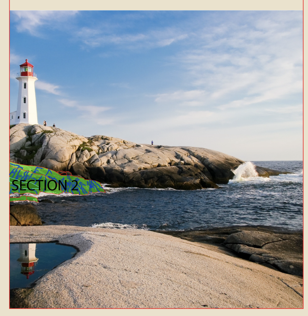
I’m going to quickly go over these next two sections, since the process is basically the same as the first one. So the second section is what I marked in the image above. I broke it down into four smaller ones.

Divide the rocks into smaller groups, outline them and then add the color to the rocks and the cracks. The closer rocks are slightly darker and the further rocks are slightly lighter in color. Here’s how mine turned out.

Again, this section is pretty much identical to the previous two.

Divide this large rock structure into smaller groups and then trace the shapes and add detail. This one does have a twist though. Instead of only having cracks, there is some moss and grass on part of the rock. There’s no wrong way to go about this. Just do your best and use the same technique you used to make the cracks.
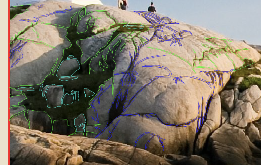
If we zoom in on the image, you can see that there were some rather large areas of detail in the picture. Blue lines mean it is a crack, green means grass and the teal means it is a rock I had to draw back in. I ended up doing this for all sub-sections, but I just wanted to highlight it here.
Either way, here is how mine turned out after I finished outlining and adding color to the rocks.
Optional Step: I initially chose a darker color for all the cracks, but wanted to soften it up a bit, so I messed with the blending mode. You can find all sorts of options in the Transparency menu. For mine, I chose “Soft Light” and I applied it to all the cracks I drew in the picture.
Lighthouse Method 1

Now, the part we’ve all been waiting for, the lighthouse. I will outline two methods you can use. I ended up going with the second method, but I wanted to demonstrate both so that you could choose how you want to handle situations like this in the future. The reason I have two methods is because the details can be pretty fuzzy when examining the original image in Illustrator, especially when you zoom in really close to trace the lighthouse. While this first method is more true to the picture, it is also more difficult to get to look right in my opinion. If you want to simplify things, then I would recommend that you click here to skip ahead to Method two , otherwise just keep going.
Side Entrance

This first way is to simply trace the lighthouse as is and try to get the perspectives right. Start with the side entrance, draw the roof, the roof perspective (dark area), then the body of the structure, then the door and the doorknob and door perspectives to give it some semblance of depth. Now, I tend to maybe overdo it on the details of my buildings. The truth is that you could probably do without the perspectives and your structure would look perfectly fine.

Let’s move onto the center of the lighthouse. Trace the body and the curves.

Then make the first of the three windows. Outline the glass and where the perspective around the window are. Because it is slightly at an angle, you’ll have to skew the larger rectangle.

Then, add the cross sections across the window.

Next, fill in the gap between the window and the larger rectangle by connecting anchor points to make three shapes. A top and bottom part (which I like to make the same color when finalizing the shape’s color) and a side part (which will be slightly different colored than the top and bottoms).

Lastly, make the triangle roof detail that sits above the window. Because it is at an angle, there needs to be a side perspective and a bottom one as well. Start with the main part, then add the side perspective and finally the bottom one. If you really wanted to get technical, you could follow this process two more times and tweak the perspectives slightly to match the angles of the windows perfectly, but I promise it doesn’t really matter that much.

Next, select all the window shapes together and group with CTRL/CMD + G, then hit CTRL/CMD + C, then CTRL/CMD + F to paste a copy of the first window in place and use the mouse to drag it upwards. Do it one more time for the last window.

Next, use the pen tool to trace the left side of the lighthouse, then the right side. If you look closely, you’ll see that there are actually two areas to the right of the section with windows (in green and purple). Each section basically has five parts (numbered 1-5 in red), designated by where you placed anchor points. From bottom to top, there’s a bottom lip, an angled part, the large body, another angled part and a final lip. So the way I handled this was to start with my outline like above, then use the pen tool to make each of the five parts by tracing over them and closing them off (like the red shape on number two). I did that for all five parts on all four sides of the lighthouse. Don’t forget the little window on the left section.
Top Section

Moving upwards, mark the six spots where there are posts and add the chains. Make sure the chains stop at the bounds of the red structure, otherwise it will look like your chains don’t go around.

Similar to the body of the tall area below, you’re going to want to outline the entire red structure. Make sure you mark the roof perspective and outline the roof and the window frame. Then, just like before, section off each of the parts using each anchor point as a boundary, since they each represent a different angle of the red structure. Remember to keep some space in between the windows since they have individual frames. Those places are designated by a teal line.

Next, we have to draw the actual light fixture. Don’t worry about lining it up exactly with the frame of the structure. This will sit behind the window outline and the actual red structure pieces. Again, this image’s quality is pretty heavily reduced when you zoom in, so I looked for another picture of this lighthouse on Google and modeled it after that. There’s a main body, the light itself, a top area and a base structure on which it sits.

Don’t forget the top section on the roof. this one is basically a small version of the main red section, I went ahead and made it “flat,” meaning I didn’t include the perspectives and alternative angles. It was hard to match the picture because the quality is so reduced. So I would start by making bottom section, the middle, the “roof” and the perspective (in yellow) where it attaches to the middle part and the top pointy thing in that order.

The final thing to remember is the perspective on the ceiling and the back of the structure that is visible through the glass. This is outlined in purple.

Then, just start adding your color to the shapes you made. I like to use the eye dropper tool and pull from the actual image. So, once you put it all together it might look something like mine.
Lighthouse Method 2

Out of the two methods I’m covering, this is the one that I used. I felt like it was easier and that the accuracy of the exact positioning of the lighthouse didn’t matter that much. At first this might seem just as complex, but what you’ll find with Method one is that getting the perspective to look right can be difficult and frustrating.
For this method, I found a different, closer up picture of the lighthouse; which can be found here . Basically, I got a higher resolution photo of the lighthouse so that I could see more detail and trace it more easily. Another difference is that this picture is taken from such an angle that you only see 3 sides and it is more symmetrical than the original picture, which again simplifies the process greatly. However, keep in mind that we want to keep the side facing us from the other picture, so we are going to trace this angle, but keep the features from the other one.

What I mean by that is begin by tracing the middle body section of the lighthouse, but then add the three windows to this section, like the other photo of the lighthouse has. So although this version of the photo is from a different angle, you’re going to use it to match the generic structure while keeping the details from the original photo. Start off by dividing this middle section into five parts: the base, the angle, the main body, the upper angle and the top lip.

Next, move onto creating the window. Because this angle is straight on, it is easier to get the glass and window perspectives right. Build a rectangle for the glass and then duplicated it and make it larger to create the window’s frame. Repeat this process another time to line up where the window’s frame perspective lines up (blue outline), since the window is technically inset in the building.
Lastly, add the horizontal cross sections on the window. Do this by making a small rectangle across the inner-most rectangle, put it in the center of the object and duplicated it. Then move each one upwards and downwards the same distance. An easy way to move shapes and objects is to use Shift + Arrows. This moves it greater distances than just the arrows. It also makes it easier to keep track of how far you move objects by counting how any Arrow presses you do.

The next step is to use the pen tool and fill in the gaps between the second and third rectangles on the window. As seen in blue and magenta outlines, create a left and right perspective followed by a top and bottom one. These are to help give the window the illusion of being inset in the building.

The last step on the window is to create the triangular overhang part above the window (Red). Again, this will need a perspective shape (teal) behind it in order to give it the illusion of being three dimensional. Next, select the objects that are part of your window and group them with CTRL/CMD + G, hit CTRL/CMD + C, then CTRL/CMD + F to paste a copy in place and drag the window upwards. Do it one more time to place the bottom window. Group your middle section and the windows together using CTRL/CMD + G.

Since this method creates a symmetrical lighthouse, we only need to worry about making one of the side sections. I started with the side with the right. Use the middle section to help you align everything and try to match the body of the lighthouse. Don’t forget to curve the line to match the shape of the lighthouse. You can quickly access the Anchor Point Tool to manipulate the curvature of lines with Shift + C. Once you’re happy with how it looks, group it together and duplicated it.

You can either right click, transform, reflect and then drag the group to the opposite side, or you can press O on the keyboard to open up the reflect tool. Left click to place your reflection point in the middle of the middle body section and then just left click and drag your mouse to spin the side area around. Either way works.

Now that the base of the lighthouse is complete, it’s time to move up to the upper section. Mark the four spots where there are posts around the perimeter of the top section. Make sure the chains stop at the bounds of the red structure, otherwise it will look like your chains don’t go around. You’ll notice that this picture isn’t perfectly symmetrical, but for the purposes of this tutorial, we can pretend that it is. Again, you only need to make one side of this area first. Once you’ve done that, group and duplicate and use the same techniques I mentioned in the above section to create the entire rail area. Keep in mind that when you order the layers, you’ll want to place this in front of the next section we create, but after the body section below.

Alright, so the next section is going to be the Red area that houses the light and makes up the roof. Start with a square-like rectangle for the base. Then make another one for the area that houses the window. Duplicate that rectangle with CTRL/CMD + C then CTRL/CMD + F to paste it in place. Now shrink it to match the size of the glass. Select both of those rectangles, make sure the smaller one is on top in the layers panel, navigate to the Pathfinder panel and choose Minus Front. This creates a complex path that basically hollows out the square.

This way, you can create the frame of the window. Remember, you’re going to want to see through in order to see the light. You can fill in that area with another rectangle and adjust the transparency in order to create a glass effect.

Next, add the sliver that’s above the window and create the roof that goes up to the top detail. Don’t forget to leave some space so you can add some perspective to make it look like the roof hangs over the window. The topmost part of this section will attach to the top detail.

This section is basically a small version of the main red area. Make a bottom section, the middle, the “roof” and the perspective (in yellow) where it attaches to the middle part and the top pointy thing. The picture makes the outlines look disconnected from each other, but that’s just because of the sharp angles and the difference in line thickness.

Next, we move onto the side next to the middle of the red area. Duplicate the middle area, move it over to the right, align your anchor points and then adjust the perspective to match. If you wanted to, you could build this side from scratch, but I find it easier to duplicate the middle and then adjust it to match what I need from there.

Using the duplication and reflection techniques I previously mentioned, create the left side. There, you’ve just recreated the entire top area. All that’s left is to make the light.

Next, we have to draw the actual light fixture. There’s a main body, the light itself, a top area and a base structure on which it sits. Make sure to place it behind the Red Structural pieces in the layers panel.

Another thing to remember on this top section is the perspective on the ceiling and the back of the structure that is visible through the glass. This section is filled in with magenta.

The last part we need to draw is the entrance on the side of the lighthouse. For this, I went back to the original image, because I wanted to get the perspective right. Go ahead and switch back to the original image if you haven’t yet. Select and group all the objects that make up your lighthouse. Then move the group over top of the lighthouse from the original image, shrink it and try to line it up as best as you can.
To draw the side entrance, start by drawing the roof, roof perspective (dark area), then the body of the structure, then the door and the doorknob and door perspectives to give it some semblance of depth. Now, I tend to maybe overdo it on the details of my buildings. The truth is that you could probably do without the perspectives and your structure would be perfectly fine.

Sky and Water

I always do these sections last since they are at the back of the image. Just draw a rectangle that covers the area where they sky is. Then match up a second rectangle and draw it downwards to create the water area. The sky is pretty simple, because you can just use the eye dropper tool to match the blue from the image.

Another option is to open up the Swatches Menu by going to Window, then Swatches. In the bottom left corner, there is an icon that resembles several books. Click that, then gradients, then sky. This will bring up several pre-made sky gradients.
There are lots of options that range from daytime to overcast and beautiful sunsets. Once you find one you like, just click on it and make sure the angle is correct in the “gradient” window. For some reason, mine always defaults to a zero-degree angle, so I have to change it to ninety degrees. The nice part too is you can always edit the colors to make it your own.

But for this poster I just used a pre-set, daytime gradient that I felt matched the picture. The last step to complete the sky is to add in the clouds. I often find that clouds are difficult to draw. Which is why I almost always simplify them.

As you can see, in the original image, they are quite wispy and drawing these would be pretty difficult.

So, to make this easier, try to draw long, skinny clouds that look pretty wispy. Use the pen tool and the Anchor Point tools to draw the shapes and eliminate any jagged edges by rounding them.

Then, instead of leaving them as outlines, select them all and use the eye dropper tool to pull the color from the clouds on the image. As you can see in the image above, it still doesn’t look right. The color is too harsh and they don’t look like real clouds.

There’s a pretty cool tool that might get overlooked by a lot of people. In the Transparency menu, you can use the dropdown next to where it says “normal.” This is the blend mode drop down. What you’re going to want to do is select all of them, then find the blend mode menu and select soft light. As you can see in the picture, it adds some transparency to them. Since they are on top of the sky, which has a gradient, they pick up that color change and look more like real clouds. If you want to add your own flair, you can add some birds or a boat in the distance (not pictured here).

Next, we move onto the water. Water can also be very difficult to capture. However, I’ve discovered a technique that I’ll share with you. If you’d like to find the tutorial where I originally found it, you can click here . So what you’re going to do is select the rectangle you created for the water earlier, hit CTRL/CMD + C, then CTRL/CMD + F to paste it in place. Next, select the copy and expand it so that it is larger than the original one.

I like to call the original layer, “water base” because when we apply the effect to the top layer, this will serve as the detail for the waves. I also typically make the “water base” layer white. You’ll see why in a little bit.

Next, let’s focus on the layer you duplicated and scaled up. Let’s call this “water top.” Just like the sky, I like to try and give my water a gradient. You can use the same method as the sky, or simply use the eye drop tool on the sky layer and then adjust the colors manually. If you hit “G” on your keyboard, you’ll get the gradient tool. You can click and drag to create it along the layer and select individual nodes to find a different color. I like to use the eye dropper tool and try to match the original image as much as possible.

Here’s where the fun starts. Select “water top” and go to Effect, Stylize, and Scribble.

Then try to match similar values to what I did in the image. This creates gaps in the shape and it exposes the “water base” layer, which creates the illusion of waves. Feel free to mess with the values in the scribble menu as much as you want.

Now, we need to capture only the area that is going to appear on our final illustration. To do this, select the “water top” layer, go to Object, Expand Appearance. This turns the scribbles into an editable object.

Duplicate the “water base” layer, rename it “crop area” and move it over the expanded “water top” layer in the layer side bar. It should look like the image above.

Select both the “crop area” and “water base” layers and find the Crop option in the Pathfinder menu.

What you’re left with is a rectangle that resembles water.

Here is how both my sky and water ended up turning out. If you wanted to, you could manipulate the water areas so that it looked more like it was going around the shoreline and the rocks or draw your own shapes, but I’m pretty happy with how it turned out.
Finishing Touches and Text

It is time to put on the finishing touches. In the original image, there is a reflection of the lighthouse in the puddle on the nearest rocks.

So what you’re going to want to do is duplicate the lighthouse from earlier, reflect it so that it is upside down and move it over top of the puddle. Then duplicate the puddle layer, move it on top of the lighthouse in the layers panel so that it looks like the image above.
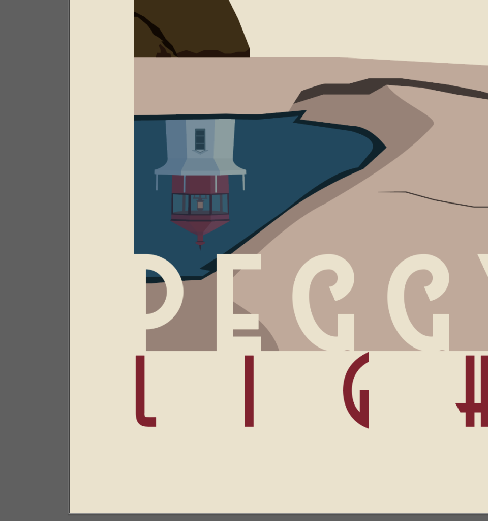
Next, select both layers and use the crop option in the pathfinder menu, like you did with the water earlier. Either mess with a blend layer or drop the transparency, or both and it’ll look like a reflection.

Now when it comes to the text layers, there are 2 main sections. The top and the bottom. I’m going to start with the top. You’re free to do whatever you think looks best, but I’m going to show you what I did so you have an example to reference. All these fonts are free and are available for commercial use.
In the top section, I always try to write something like, “Visit” then “City/Town, State/Country.” Let’s start by writing the word “VISIT.” I used the High Summit Font , but you could use any handwritten font you like. Next, write “PEGGY’S COVE” in the Better Book Font , or whatever you choose. Then, write “Nova Scotia” in Astrud Font below that.

In order to get the shadow look on Peggy’s Cove, duplicate it in place, go to Effect, Distort & Transform, Transform and use the values I entered in the image and place it below the original Peggy’s Cove layer.

Next, group Peggy’s Cove, the shadow and Nova Scotia together. Then go to Effect, Warp, Rise and use the values from the image.

Finally, make Visit and the Original Peggy’s Cove text layers the same color as the tan background. For the shadow and the Nova Scotia text layers, I used the red from the lighthouse roof. I always try to find an accent color that looks good and sticks out from the illustration. And that’s it for the top section.

For the bottom section I typically write the name of the specific thing that was created in the illustration, rather than just the place. In this case, the town is called “Peggy’s Cove,” but the scene we drew is called, “Peggy’s Point Lighthouse.”
To get started, write “PEGGY’S POINT” in the Westmeath Font , or whatever you want. Try to make it line up with the bottom of the red outline and just spill over on the left and right side. You want it to blend in seamlessly on each side with the poster background. Then, underneath, write “LIGHTHOUSE.” I reused the Astrud font from earlier. Try to make this one line up at the top with the bottom of the red outline and stretch across widthwise without spilling over the side. Make the top text the same as the background (tan) and make the bottom text the same as the red text above.

Make sure that you’ve got all your layers in the correct order. It’ll be pretty obvious if things aren’t in their proper positions. You might have named your layers differently, but it should resemble mine.

Now if you put it all together, you get a pretty nice-looking poster. But we aren’t done yet. It might look nice, but it is missing that gritty-ness and roughness that makes it look vintage. So open up Photoshop and create a new project that is 18 inches wide by 24 inches tall, since that’s the size of the illustrator artboard.

Go back to Illustrator, select all the layers (Poster background, Illustration and Text), then hit CTRL/CMD + C and move over to your Photoshop canvas and press CTRL/CMD + V to paste it as a smart object. What’s nice about this is if you notice something is off on illustration, you can double click the image part on the Vector Smart Object layer and it’ll re-open in Illustrator so you can make any changes. When you save the illustrator file, it’ll update in Photoshop.

Next, I would recommend downloading some grunge or dirt brushes and adding them to your photoshop. I don’t recall where I got mine, but you can find a bunch of free brushes here . Create a new layer above your illustration and using the grunge or dirt brush, start painting on that layer using either white or a very light color. In the image above, I added a black background behind my grunge layer so you could see how I did it.

Then, I like to duplicate it and reflect it so it adds even more texture. Make sure you use the Blend Mode drop down (similar to the Illustrator one I mentioned previously) and select “soft light.”

What you end up with is some texture that creates a more “vintage” look. There are plenty of other ways you can mess with Photoshop effects to create your own unique Vintage look, but I have just one more step that I like to take.

Go to Filter, Filter Gallery and under Texture, select to Grain. I try not to make it too intense, but I do like the way it looks. Choose soft grain type, make the intensity about 35 and the contrast anywhere from 45 to 60, depending on how dark your scene is. Since this one is daytime, I chose 60. When you’re done, click “OK” to apply it.
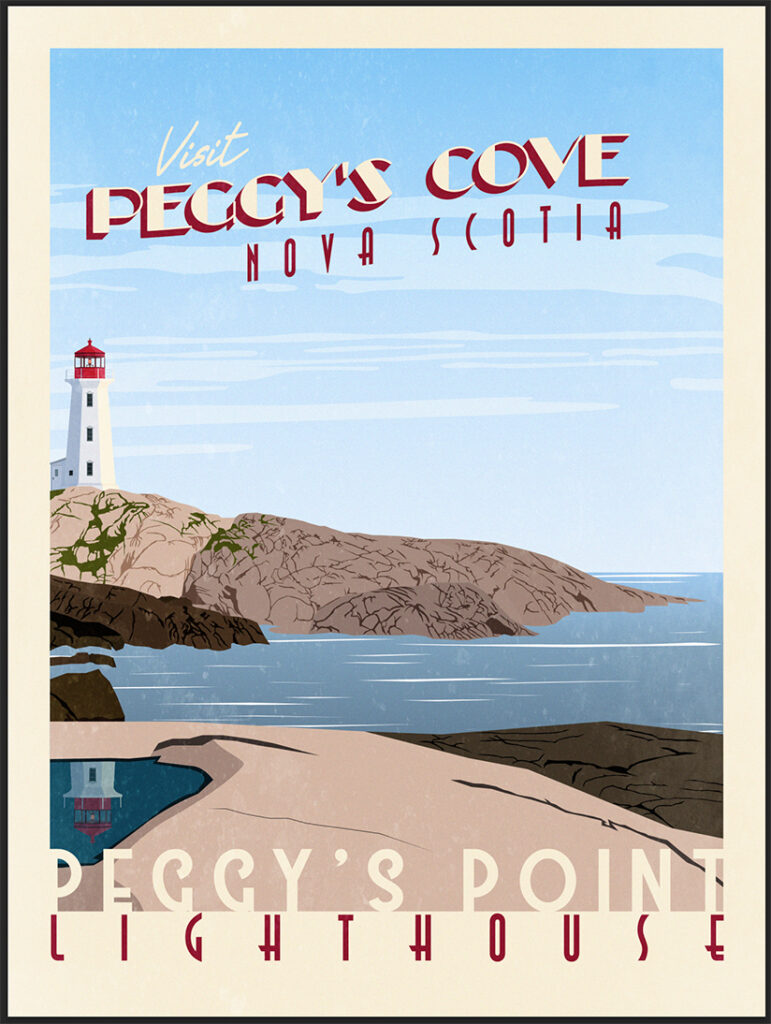
Here is how mine turned out. The grain didn’t change much, but it did make it brighter and older looking. Anyways, I know that was very long, but you just created your very own Vintage Travel Poster. Let me know what you think of my tutorial or my process. I’d love to hear some feedback. If you’ve got any tips and tricks for me, I’d love to hear them also. You can use my contact form and I’ll make sure to respond.
- Tags adobe , adobe illustrator , adobe tutorial , illustrator tutorial , tutorial , vintage travel poster , vintage travel poster tutorial
Don't forget to visit my store! Dismiss
15+ Best Tutorials for Creating Posters in Illustrator
Posters are an incredibly versatile medium for promotion – not only for events, but also for businesses and causes. With various design styles, illustrations, and typography at your disposal, you can convey your message in a visually appealing manner.
If you’re looking to take your poster design skills to the next level, we’ve got you covered. Our curated collection of the best Illustrator tutorials will equip you with the knowledge to create stunning posters for a range of projects and industries. Whether you’re new to Illustrator or a seasoned professional, these tutorials offer valuable insights and inspiration for your next poster design project.
From mastering typography to creating eye-catching illustrations, these tutorials will help you hone your skills and develop your own unique style. So, dive in and discover the endless possibilities of poster design with Adobe Illustrator!
You might also like our collection of Photoshop poster design tutorials .
The Top Poster Design Tutorials for Illustrator
How to create a retro vhs cassette poster (video tutorial).
Were you ever inspired by the art on those VHS covers from the 80s or 90s? Well, you can follow along with this video tutorial and learn how to create your very own artwork based on that long-gone design style.

Abstract Art Poster Collection for Illustrator
With bold and vibrant designs, unique shapes, and striking colors, this stunning collection of abstract art poster templates for Illustrator are perfect for adding a touch of modernity to any living or workspace.

How To Create a Geometric Collage Poster (Video Tutorial)
By combining the capabilities of Illustrator and Photoshop, you will be able to follow along with this video tutorial to create a collage poster reminiscent of an album or abstract poster.

15 Vintage Poster Templates for Illustrator
The posters have a classic, old-world charm with various designs ranging from travel destinations to advertisements. East to edit Illustrator and are perfect for adding a touch of nostalgia and sophistication to any office wall.

How to Create a 1950s Advertisment Poster
Travel back in time with this step-by-step tutorial to create a 1950s-style poster. You will be creating everything using basic shapes and tools and then transforming them to give an aged look.

Geometric Patterns, Shapes & Posters
This collection offers a variety of playful seamless vector patterns, vector poster templates, and geometric shapes in vibrant colors. This set is perfect for adding a modern and dynamic look to any design project.

How to Create a Colorful Retro Poster
Creating a colorful retro poster is as easy as finding a photograph that you love, and using Photoshop and Illustrator to change small portions to create a whole new image. Learn how with this step-by-step tutorial.

Abstract Background Patterns for Illustrator
This abstract background and poster template collection features editable objects and colors in AI, EPS, and PNG formats. The well-organized and grouped layers make it easy to customize and create a unique poster design.

How to Create a Colorful Spring Poster (Video Tutorial)
Spring into this video tutorial and learn how to use Illustrator to make a simply divine spring-themed poster. You will be transforming simple shapes into colorful leaves and wildlife in no time.

How To Create a Colorful Abstract Poster
Colors and geometric shapes are all it takes to create this wonderful poster. Learn how Chris used a series of tessellating shapes created with the help of Illustrator’s Pathfinder tool, then added color swatches and gradients to bring the design to life.

How to Create a Desert Landscape Flat Design Poster (Video Tutorial)
Ever wanted to create your own desert landscape? Now you can, with this video tutorial. You will learn how to make use of flat design , simple patterns, and basic shapes to create your own desert landscape.

How to Create a Retro Theatre Poster
When you follow this step-by-step tutorial, you will learn how to make a vintage-looking theatre poster. By combining clipping masks, vector brushes , basic shape tools, and great typography, you’ll be able to apply your new skills to any poster design project that comes your way.

How to Design a Vintage Travel Poster
With this tutorial, you will rediscover the golden age of travel posters. You will learn how to capitalize on Illustrator’s drawing tools and then leverage Photoshop’s brushes and blending modes to make these vintage-looking posters.

How to to Create a Geometric Poster Vector Design
Use shapes instead of letters for your next poster! With this step-by-step tutorial, you will learn how to use geometric shapes to make letters and then transform them into your next poster.

How to Create a Hand-Lettered Textured Poster
Need to unleash your inner creativity with some hand-lettered posters? Then get your coffee ready and dive in with this step-by-step tutorial that will show you how to bring your hand lettering to life!

How to Create a Geometrical Abstract Poster (Video Tutorial)
With this video tutorial, you will be able to take a simple pattern and transform it into an abstract geometric poster. You will see how to make use of swatches to create a 3d randomized pattern that you transform into a fully-fledged poster.

How to Create a Daft Punk Poster in Illustrator
Want to make your own Daft Punk-inspired artwork? Then you’ll enjoy this step-by-step tutorial showing you how to make a Daft Punk poster using Adobe Illustrator. You’ll then finish off the design in Photoshop.

How to Create a Retro Poster with Astronaut Child
Were you ever inspired by the art on the VHS covers? Intrigued to see what that artwork was? Well, join us with this video tutorial to learn how to create your own artwork based on that long-gone cassette type.

Frequently Asked Questions (FAQ)
- What will I learn from these Illustrator tutorials? These tutorials teach you how to use Adobe Illustrator to create various types of posters. You’ll learn about layout, color schemes, typography, and incorporating images and graphics properly.
- Are these tutorials suitable for beginners? Yes, most tutorials are designed for beginners. They’re a great way to build your skills in Illustrator.
- What types of posters can I create with these tutorials? You can learn to design a wide range of posters, including event advertisements, movie posters, informational graphics, and artistic or promotional posters.
- Do I need the latest version of Illustrator for these tutorials? Most tutorials can be followed using basic tools and features found in various versions of Illustrator. However, having the latest version might offer additional helpful features.
- How long does it take to complete a poster design tutorial? It varies. Some tutorials can be completed in a short time, focusing on specific aspects, while others might take longer, covering more complex designs.
- Can beginners in Illustrator start with these poster design tutorials? Definitely! Many tutorials are tailored to be easy to follow, even for those new to Illustrator, and are a great way to learn by doing.
- What skills will I develop from these tutorials? You’ll enhance your skills in vector graphic design, learn about effective visual communication, and explore creative ways to convey messages through poster design.
- Is learning poster design in Illustrator beneficial for my portfolio? Absolutely! Being able to create visually appealing and effective posters is a valuable skill in graphic design and can make your portfolio stand out to potential clients or employers.
Create Stunning Posters in Illustrator
Poster design can make or break your event, cause, or campaign, which is why it’s important to get the poster design just right. With the help of the tutorials in this collection, you’ll learn how to create stunning posters for all kinds of projects and campaigns.
More Illustrator Tutorials
Related topics.
- Illustration
- Illustrator Tutorials
- Poster Design

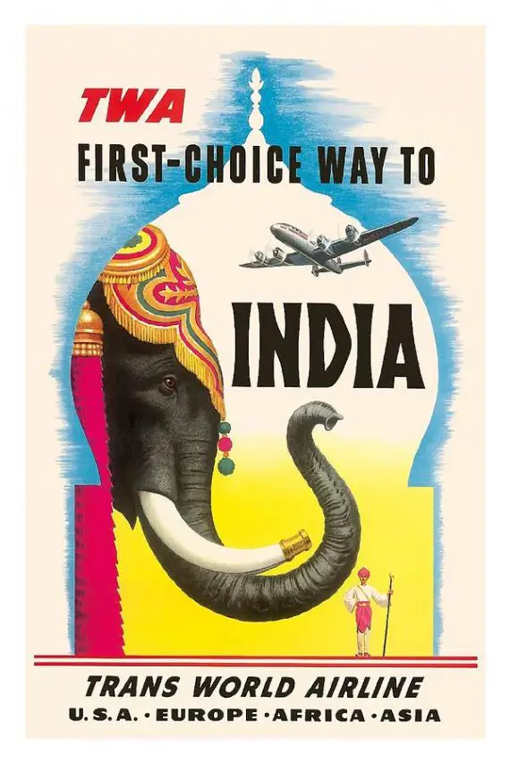
Meet The Artists Behind Your Favourite Vintage Travel Posters
In my late teens, I bought myself a calendar that was illustrated with vintage travel posters. I was particularly smitten with one for Cuba produced in 1949 by the Cuban Tourist Commission. From that moment I formed a slight obsession with the beautiful artwork created to sell travel in the early days of advertising.
Since becoming a graphic designer I’ve found myself asking “who are the artists behind these fabulous vintage travel poster designs? What was their process? Did they travel to all the places they illustrated?” So, I did a little research into these advertising industry pioneers and this is what I found.
Table of contents
A brief history of the travel poster, joseph binder, donald brun, fred ludekens, abram games, frank newbould, david klein, maurice laban, jan lewitt & george him, harry rogers, james northfield, bernard villemot, edmond maurus, albert solon, frank soltesz, vincent guerra, albert victor eugène brenet, joseph feher, vittorio grassi, otto nielsen, lucien boucher, robert falcucci, georges dorival, roger broders, harry stevens, daphne padden, percy padden, tom eckersley, reginald montague lander.
Modern posters were born in the mid-nineteenth century when a few planets aligned. The first was the development of printing technology, which allowed for mass production of colour images (“mass” being a relative term to today’s standards). The second was countries such as France lifting government censorship of public places. Lastly, mass-produced consumer goods were being advertised in populated urban environments.
By the late nineteenth century, posters had hit their stride in Europe with many fine artists such as Henri de Toulouse-Lautrec taking up poster commissions. As the new century dawned, posters grew in popularity and their design became an increasingly respected art form.

Early twentieth-century travel posters were often commissioned by rail lines, and later airlines, to advertise their mode of transport using images of exotic destinations. Poster artwork varied in style as fashions came and went: art nouveau, art deco and modernism were key styles of the travel poster era. Finally, poster art gave way to photography in the 1960s, as printing technology underwent another evolution.
The art of vintage posters has experienced a renaissance in the last two decades, as new generations rediscover the illustrations and paintings of the past. Original travel posters are now highly collectible items. In 2014, Christie’s sold Henri de Toulouse-Lautrec’s Moulin Rouge lithograph for £314,500, its highest-grossing travel poster in history. I grew up with this image printed on a set of coasters that my mum purchased while travelling in France. For those who aren’t millionaires yet, prints of vintage posters can also be purchased at much more reasonable prices.
The artists behind the posters
Allow me to introduce to you the mysterious talents behind the vintage travel posters you love. This is by no means a definitive list and there are many artists unaccounted for – these are artists behind some of the most recognisable and collectible travel artworks. Sadly, there is very little information available about some of them.
Joseph Binder (1898–1972) trained in lithography and studied at the Vienna School of Arts and Crafts before establishing his own graphic design studio, Vienna Graphics, specialising in advertising and poster design. After visiting the US as a guest lecturer at the Chicago Art Institute and Minneapolis School of Art, he immigrated to New York in 1936. He created modernist masterpieces for American Railroads, American Airlines, and United Airlines such as these.

Swiss illustrator Donald Brun (1909-1999) was a student of one of Switzerland’s first professional calligraphic artists. He apprenticed as a publicity illustrator and took art classes in Basel and Berlin before becoming a freelance artist. Brun created posters for Swissair among others. Though he never stuck to one particular style, my personal favourites are the “picture-in-picture” posters he designed, like those below.

Californian illustrator Stan Galli (1912-2009) may have created your favourite 1950’s poster for United Airlines. Galli studied at the California Art Institute (now the San Francisco Art Institute) before becoming an advertising artist. He worked in various areas from designing postage stamps to Navy instructional manuals over the course of his long career. His posters for United Airlines are among the most collected vintage travel posters today.

Fred Ludekens (1900-1982), was an American artist and illustrator. The Californian had no formal training and worked initially as a billboard painter. Ludekens produced work for magazines and other media. He worked alongside the aforementioned Stan Galli at one time, painting wildlife images for Weyerhauser Timber advertisements. Ludekens created a series of posters for American and United Airlines in the 1950s.

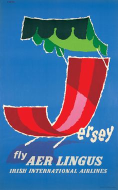
British born designer Abram Games was one of the last of the great poster designers, as the art was lost to offset printing and photography. His early work was often for London Transport and Shell. After a stint in the British War Office during World War II, Games returned to posters for British Airways, Aer Lingus and EL AL.
British artist Frank Newbould (1887-1951) attended the Bradford College of Art and Camberwell School of Art. He designed many posters for railways and shipping companies, before WWII at which time he became assistant to Abram Games (above) at the war office. Frank Newbould along with the artists, Tom Purvis (below), Austin Cooper, Fred Taylor, Frank Mason were the “Big 5” that for a time were exclusively contracted to design travel posters for LNER (London and Northeastern Railway).
British artist Tom Purvis (1888-1959), attended the Camberwell School of Art. He worked in advertising agency Mather and Crowther before branching out on his own as a freelancer. Between 1923 and 1945 he created over 100 posters for London and North Eastern Railway (LNER), depicting the rail lines destinations in bold, flat colour with little detail. Though Purvis moved away from this style later, reintroducing some detail into his imagery, that vibrant, minimalist style is one of my absolute favourites.

David Klein (1918-2005) created boldly coloured modernist posters. The Texas native studied at the Art Center School (also known as the Art Center College of Design) in Los Angeles. He created illustrations for the U.S. Armed Forces during WWII, then went to live and work in New York City. He created most of his travel-related work between the mid-1950s and ’60s. Klein’s commercial art includes these memorable commissions for TWA.

British freelance illustrator Maurice Laban (1912-1970) created posters during the 1940s through to their dying moments in the 1960s. His vibrant posters for BOAC/Qantas were printed by silkscreen technique and made use of fluorescent opaque inks.

The graphic design duo of Jan Lewitt (1907-1991) and George Him (1900-192) came out of the early ’30s in Warsaw. They relocated to London and worked together through to 1955.

Harry Rogers (1929-2012) was an Australian designer who created several series of Qantas posters from the 1950s through 1970s, utilizing techniques such as paper cutting, collage and watercolour to define each campaign.

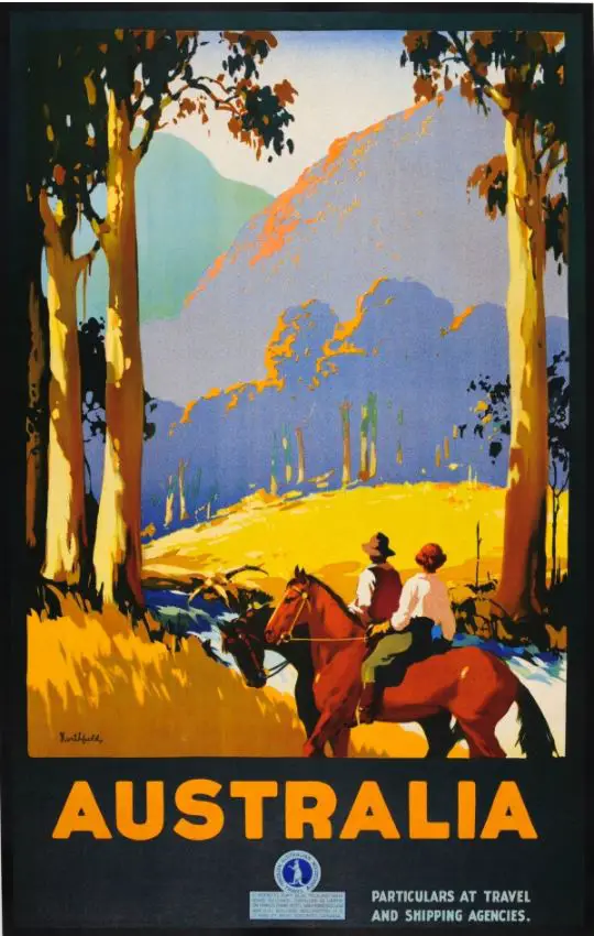
Another Australian, James Northfield (1887-1973), was educated in Melbourne. As a commercial artist, Northfield created posters for the Australian National Travel Association to promote Australian destinations to domestic and overseas audiences.
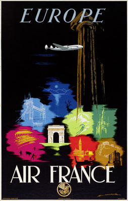
French graphic designer Bernard Villemot (1911-1989) is associated with his work for Air France, Bally, Perrier and Orangina. Villemot initially studied with master art deco poster artist Paul Colin. His work has been in high demand since his death in 1989.

Edmond Maurus designed art deco posters for French airlines Air Union and Air France between 1925 and 1955. The French artist studied at the Germain Pilon School.
Albert Solon (1897-1973) was also known for his art deco posters. The self-taught artist who became a cartoonist, created posters for airlines during the 1920s and ’30s including Farman, SABENA, Air France, Luft Hansa, Imperial Airways, KLM and l’Aéropostale.

American artist Frank Soltesz (1912-1986) studied at the Art Institute of Pittsburgh and went into newspapers and advertising. The president of TWA in 1945, Jack Frye, offered Soltesz a job creating magazine advertisements which were seen in publications such as Life, Esquire, Sports Illustrated, Forbes, Fortune and Time.
French painter Vincent Guerra is largely a mystery, but his work for Air France and Aerovias Guest after WWII are notable contributions to poster design.

Albert Victor Eugène Brenet (1903-2005), who was born in France and studied at the Ecole des Beaux-Arts in Paris. He travelled for magazine LÍllustration and was appointed official artist for the three French military branches during WWII. Post-war he went into commercial illustration including advertising posters for airlines.

Joseph Feher (1908-1987), a Hungarian born and trained artist, studied at the Academy Bella Arte in Florence, Italy and Bauhaus, Germany. He also obtained a scholarship to the School of the Art Institute of Chicago in the late 1920s. From there, his work in commercial art and portraiture began. Feher taught in Chicago and at the Academy of Arts in Honolulu, Hawaii. He was also flown around the continental United States by United Airlines, to paint watercolours of cities for ads and calendars until about 1949.

Italian painter Vittorio Grassi (1878-1958) started out at the Bank of Italy, testing typographic techniques as a means of counterfeit prevention, while he practised his landscape painting. He later moved into commercial work, designing stamps and posters for the Italian Government Tourist Board and the Italian Railroad System among other public agencies.
Otto Nielsen is the Danish painter who designed travel posters for Scandinavian Airlines (SAS) between 1954 and 1976 in his unique oil painting style.

Parisian born artist Jean Even (1910-1986) studied at the Ecole Boulle and Ecole Nationale Supérieure des Beaux-Arts. Even favoured gouache for its matt colours, speedy drying and compatibility with light paper, all qualities excellent for travel.
Another Air France favourite is Lucien Boucher (1889-1971), whose design career began at the Ceramique de Sevres. He debuted a the Salon d’Automne in 1921 before becoming a member two years later. He exhibited at the Salon de L’Araignée in 1924 through 190. Boucher produced lithographs, wood engravings and watercolour drawings. In 1935 he began working for Air France and gained a reputation for his planispheres – a flat representation of the earth.

Robert Falcucci (1900-1989), was a French illustrator and painter who studied at the Ecole Normale Superieure des Arts Decoratifs, Paris. Falcucci spent time directing magazine advertisements for Renault; illustrated a cover of L-Illustration magazine; and worked with couturier Paul Poiret. Arguably, his best-known work his program artwork for the Monte Carlo Rally, and posters for rail line Paris-Lyon-Mediterranean (PLM).

Georges “Géo” Dorival (1879-1968) was a French poster artist who also specialised in glass plates and shadow puppet theatre. He studied at the National School of Decorative Arts in Paris. His best-known travel work includes posters for destinations such as Venice, Cote d’Azur, Mont Blanc, Heyeres and Brittany, as well as the railroads such as the Chemins de Fer de l’Etat.

Parisian born, Roger Broders, was best known for his travel posters of fashionable French resorts of the 1920s and ’30s. Broders created simplified imagery with bold, flat fields of colour and minimal lettering in contemporary typefaces of their time. The artist was commissioned by The Paris Lyon Mediteranée Company (PLM), who sponsored his travel so that he could visit the destinations he was to illustrate. He was said to have been a cigar aficionado, foodie and lover of cafe culture – aside from the cigars, he sounds like my kind of man!
Kurt Wirth (1917-1996) was a Swiss graphic designer and illustrator. He started his own studio in 1937 and was a co-founder of the Swiss Graphic Designers Association. Wirth is known for creating modernist posters for Swissair and Swiss Federal Railways. He also taught at the School of Art of Bern.

Born in Manchester, England in 1919, Harry Stevens started his design career with no formal art training. He designed posters for London Transport from 1960-1978 and various other high-profile clients. He won the Council of Industrial Design Poster Award in 1963 and became a fellow of the Society of Industrial Artists.

Another British artist who created popular mid-century travel posters was Daphne Padden (1927-2009). The daughter of Percy Padden, a travel poster artist of the 1920s and 30s, Daphne worked as a commercial designer before moving into fine art later in her career. She studied at Epsom & Ewell School of Art and earned a National Diploma in Design for painting. Daphne’s freelance clients included the British Transport Commission, P&O Orient Lines and British European Airways.

Now seems a good time to mention more of Daphne’s dad, Percy (1885-1965) . There doesn’t seem to be much information about Mr Padden. What we do know is that he studied at the Royal College of Art and mostly worked for the post office, producing posters advertising cruises on mail boats.

Lancashire-born in 1914, Tom Eckersley, was commissioned by Transport for London, National Savings Bank, Guinness and Gillette among other big names. He studied at the Salford School of Art, where he met student Eric Lombers. Graduating in 1934, Eckersley began a freelance graphic design career in London, in partnership with Lombers. They soon won commissions by London Transport and within a few years were both lecturing at the Westminster School of Art.
Eckersley’s career was interrupted by WWII when he enlisted in the R.A.F. and worked as a cartographer. He also produced “war effort” posters during this time. After the war, he continued to teach and take commissions for poster designs. Eckersley became a fellow of the Society of Typographic Designers and Society of Artists and Designers, along with an honorary fellow of Manchester College of Art & Design and the Royal Colleg of Art.

Born in London in 1913, Lander received his art education at Hammersmith School of Art. He became the chief designer and studio manager at Ralph Mott Studio during the 1930s. Lander produced posters for GWR, LNER, British Railways and the Post Office. He worked in gouache and watercolour.

Image via Original Railway Posters

Image via invaluable.com
Where to buy posters and prints
Galerie 123 , Switzerland
Affiche Passion , France
The Ross Art Group , USA (New York)
The Vintage Poster , USA (California)
International Poster Gallery , USA (Boston)
Antikbar , UK
All Posters
Vintagraph, USA
Printism , Australia
What is your favourite vintage travel poster? Drop a comment below and let me know.
I hope you’ve enjoyed getting acquainted with the artists that inspired travellers of yesteryear and found a little duende of your own. If so, you might also enjoy this artful history of travel postcards .
Peace, love & inspiring travel,
Art Moderne in Cleveland – Coast Guard Station #219
The unique art of lotus weaving in myanmar.
My favourite is my 1950 karnten Austria by an artist called Ludwig depicting a view of a beautiful lake from a hotel . It has such vibrant colours and gives you a sense that you are actually there. For a poster toned that takes great skill . But now I’m thinking about my other posters and it’s like having children do you have a favourite hahaha. Thanks for your time to write about the artists and posters. I still have a few I am trying to find out about.
Hi David, Your Karnten poster sounds wonderful. It can be challenging to find info about the poster artists. It’s a shame considering how talented they were! I am always updating my posts so if you have an artist you’d like me to look into, let me know. I can’t promise I’ll turn up anything you haven’t already, but I would be willing to have a go.
Thanks for stopping by Duende, Zoë (aka Madam ZoZo)
Hi there. Love the site. I wondered if you could help me? I love a poster for Continenral Airways advertising Los Angeles which has a glamorous couple on the beach- the lady has golden hair in the style of a Hollywood star and there is a plane flying overhead.. It looks late ’50s to me. Would you know who the artist would be? My email address is xxx. Thanks Paul Moody
That is a tricky one. I haven’t been able to get much info at all on that particular poster. I agree it looks like the late ’50s given the style and fashion depicted. Continental used that particular logo between 1937-1960 so it is unlikely to be later. I found an aircraft buff who proposed the plane pictured was a DC-7B which also fits with the 1950s timeframe. Many of the well-known artists of that period seem to have been tied up with other airlines at the time and probably had exclusivity agreements. I couldn’t confirm anything further. Should I happen across more details, I’ll let you know.
Zoe aka Madam ZoZo
Leave a Comment Cancel Reply
Save my name, email, and website in this browser for the next time I comment.
Don't subscribe All new comments Replies to my comments Notify me of followup comments via e-mail. You can also subscribe without commenting.
This site uses Akismet to reduce spam. Learn how your comment data is processed .
This website uses cookies to improve your experience. We'll assume you're ok with this, but you can opt-out if you wish. Accept Read More
Create a Retro-Style Travel Poster with Adobe Illustrator
Course comparison
See Better Alternatives
Skills related
People often say.
This course is for anyone wanting to capture a retro or vintage feel in their work using Adobe Illustrator. It will take you through your idea generation to finished poster, with tips and tips to time-saving techniques as you sharpen your skills with the pen and pencil tools and learn time-saving techniques to add depth and detail. Wacom pen tablet or equivalent (optional!) is recommended.
1. Intro 3:09
2. Idea Development 9:37
3. Illustrator Setup 6:54
AI review summary
Most favorable.
Coming soon
Related content for you
No items found.
This course includes
SkillMapper rating :
Start date :
Amount of students :
Downloadable resources :
Certificate of completion :
© SkillMapper SAS
Privacy Policy
Terms and use
Design an Authentically Vintage Travel Poster
WHAT WE’RE CREATING:
Hey Design Cutters, Simon here!
Today I’m really excited to show you how to use your new vintage resources, to create an authentic old time travel poster. We’ll be looking at plenty of fun techniques, from extracting vintage objects from their backgrounds, to applying tons of grungy textures, and bringing your entire piece together.
Let’s get started shall we?

AN EXTENSIVE LIBRARY OF REAL VINTAGE ELEMENTS
What’s interesting with Design Cuts’ latest bundle is that it’s filled with REAL vintage assets. These are not just elements that were drawn or created to look vintage, they’re the real deal. So we’re talking about stuff that was created, and released before the turn of the last century. That means that we can make use of all the artifacts that come along with that: not so precise printing, aged paper textures, 100+ year-old wear and tear, etc.

While this is great, one of the biggest challenges we’ll face when using these resources will be to extract just the element we want for our piece. Don’t be afraid, there’s a technique for that. Other than that, we’ll have loads of fun with textures, type, and all the rest.

BEFORE WE GET STARTED
Before we get started, I need you to grab a very helpful set of Photoshop actions . They were created by the good folks at Media Militia, and are free.

These actions allow to quickly and efficiently remove the white background of some of the assets we’ll use for our composition. Will just a bit of careful masking, the use of the level palette, and this actions, you’ll be able to extract just that one element you’d like to use in your piece. They are a set of very useful tools.
Consider reading the accompanying post , as it contains background information on what the actions leverage to work, and on how to install them.
Once you have the actions set up, we’ll be ready to get started!
STEP 1: CONCEPTUALIZATION
In my case, a complex piece always starts the same way: with pens and a piece of paper.

Using analog tools to quickly create generate ideas allows me to come up with so many more concepts than just dabbling with tools in Photoshop. I highly recommend doing this versus diving straight onto the computer. And I’m not the only one, there has been plenty of literature on the subject ( #1 , #2 , and #3 ).
After 15 to 45 minutes of browsing the bundle’s content and brainstorming, I came up with 8 primary ideas.

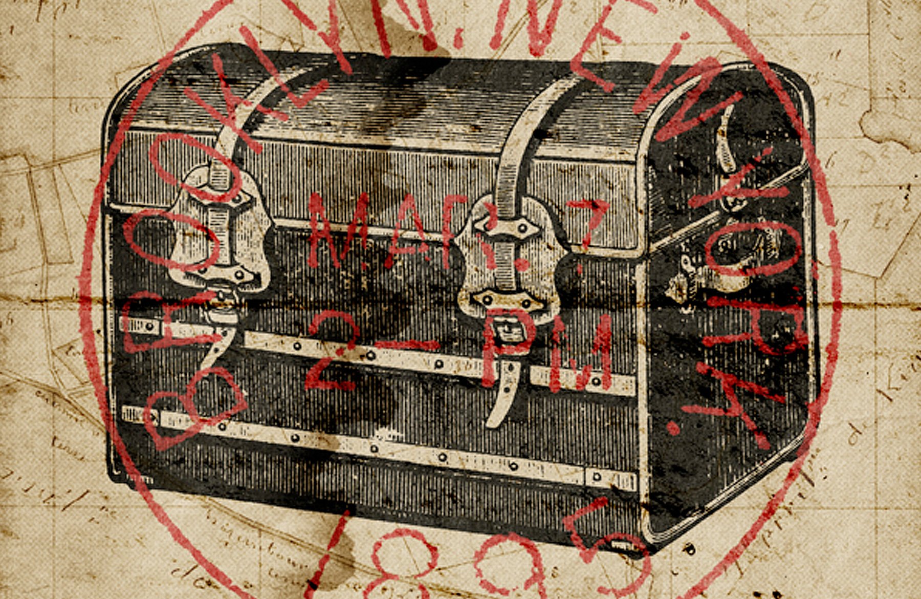
Today, we’ll focus on this one. It’s a poster inspired by some of the travel-oriented assets found in the bundle: globes, maps, and trunk.

The primary assets we’ll use
Here’s a quick rundown of the main assets we’ll use for the poster.
1. This vintage envelope, for its cool postage stamp

2. This XIXth century map of Kirviller, a French village in north-eastern France

3. This old engraving of a travel trunk

4. These engravings of old globes

5. These engravings of an colonial hat, and of binoculars

STEP 2: COLORS
We should talk about the color scheme of our future poster now. In order to get a convincing retro feel for our piece, we’ll grab our colors straight from the source. The bundle features a collection of matchbox tops, and adult beverages labels. It’s time to get the eyedropper tool out, and to sample colors away!

Printing techniques weren’t as diverse as today, or as accurate as today, over a hundred years ago. Printing wasn’t a commodity the way it is now either. This explains why we typically see old labels featuring less colors than today: it was cheaper, faster, and presented less opportunities for a misshape. The artists had to be quite creative to convey often times complex compositions with a reduced array of colors.

I went through both packs of labels, and selected a few. I created my color palette from there, sampling colors that faded because of real exposure, and not thanks to a vintage filter.

We’ll use the first color scheme. Our piece will have a light background, so the textures can shine through our tan color ( #cfbc97 ), with dark iconography (off-black – #2f302d ), and with a bright highlight color (faded red – #c13d34 ).
STEP 3: PREPARING THE ASSETS
Now that we know our general layout, and how our colors are going to flow, we can start preparing our assets for the piece. This is the step in which we’ll extract the various elements we want to use in the piece from their white background.
The postage stamp will be the most demanding of all. This is because it isn’t passed on to use on a white background.
Start by opening up the envelope’s file ( AirMailEnvelopes_12953_piddix.jpg ).

Select the stamp.

Crop the image ( Image > Crop ).

Convert the locked background layer to an independent layer by double-clicking on it. Use a hue/saturation adjustment layer to desaturate the image.

Finally, use a levels adjustment layer to “wash out” the paper texture behind the stamp.

Once that’s done, save this file in a safe place – we might use it again later. I created a Piece assets folder in which I’m placing all of source assets to have them at hand while I’m designing. Save also a flattened copy of the leveled stamp for our next step. The format doesn’t matter (JPG or PNG), as long as the image properly flattened.
Once you have the flattened image ready, open it.

The next step is to run one of Media Militia’s actions. I personally like White BG Removal – Maximum Opacity the most, as it offers a good ratio between background removal and opacity left to the elements that are kept.

Once the action has run its course, we’re left with our element on a transparent background. Victory!

Save the cropped, and isolated stamp as a PNG in your assets folder.

One more version we need to save of that stamp is one featuring only the ring of the stamp.

From there, simply repeat the background removal process on the other assets (trunk, globes, hat, and binoculars). Save the result as transparent PNGs in that asset folder. I’d suggest to start from the white background version of the asset, as you won’t have to fiddle with levels.

Now that we have all of our assets ready, we should probably get started, like, for real.
STEP 4: DOCUMENT SETUP
I’m working with an 18″x24″ canvas, at 300 dpi (RGB).

I’ve placed a few guides for reference. I’m marking the center of the canvas, a border at 1″ from the edges, and another one at 2″ from the edges.

STEP 5: THE BACKGROUND
Start by filling the background with our tan color ( #cfbc97 ).

Next, locate our map ( po_20140825_130507.jpg ) in \Authentic-Vintage-Magic-tees\Vintage Texture Pack4 .

Place it in your document. Don’t forget to keep it as a smart object, as we’ll try ot keep a workflow as non-destructive as possible.

Desaturate it with a clipped hue/saturation adjustment layer .

Adjust its contrast thanks to a clipped levels adjustment layer .

Change its blending mode to Color burn @ 75% opacity .

Finally, we’re going to erase some of the map’s markings at the bottom right corner.

Add a layer mask to the map layer, and paint the spots away. Don’t worry about erasing the map’s grid, as we’ll place another element in there later that will camouflage that removal.

Our background is now ready. Don’t forget to organize your layers properly.

STEP 6: PLACING THE ELEMENTS
It’s time to place our main elements in the frame. Let’s have another look at the sketch I made.
The center of the piece is occupied by the travel trunk, and by the postage stamp. The other travel icons (globes, hat, and binoculars) are located at the corners.
Let’s start by placing the trunk. I’m making it roughly 14″ wide.

Next, add the isolated stamp. It should cover the trunk, and be slightly wider than it.

Next, we’ll be placing the various corner icons. I’m using the grid of the map to place them, rather than the grid I created with the guides. Size wise, I’m trying to have each corner object to have the same visual importance.

Here’s a view with the guides, to get a sense of placement and proportions.

Organize you layers now, because it’s going to get more complicated soon.

Remember the version of the postal stamp we created that only contains the circle? It’s time to get it out of our asset folder. We’ll be enclosing each icon in its own circle. You can rotate the circle each time, so it doesn’t look the same for each icon. Don’t hesitate to use the layer alignment tools to facilitate the job ( Layer > Align and Layer > Distribute ).
It took me a good deal of time to adjust the circle size compared to the icons. There was actually some back and forth tweaking for the sizes of the icons, and of the circle.

And here’s a view of my layers.

STEP 7: ASSIGNING COLOR
This step is actually fairly simple. We’ll leverage the option to give a color overlay to layers.
Start by making the postage stamp red ( #c13d34 ). Double-click on the layer to bring up the blending options panel .

Next, let’s color the trunk with our off-black ( #2f302d ).

The contrast level between the red and the off-black isn’t very strong. To increase it, we’ll darken the trunk a little bit by changing its blending mode to Multiply . Because the color has been assigned to the object through a color overlay , we’ll need to go through a few additional steps.
Start by reducing the trunk layer’s Fill to 0 .

Next, head back to the layer blending options to set the color overlay’s blending mode to Multiply @ 100% opacity .

Next, we need to assign a red color overlay ( #c13d34 ) to the circles around our icons. Let’s start with the one around the hat.

The result looks nice, but the circle is a bit thin.

In order to fix this, we’ll simply give the circle a red stroke of a few pixels. I’m using 8 pixels .

The result is satisfying. From there, we’ll simply apply the same settings to the other circles. In order to do so very quickly, start by right-clicking on the layer of the circle you just edited. Select the Copy layer style option.

Then, select all the circle layers, right-click, and choose the Paste layer style option.

We just applied the color overlay and stroke effortlessly to the three remaining circles.

In a similar fashion, you can now quickly apply an off-black ( #2f302d ) overlay to all the icons.

With that done, it’s time to group each icon with its container. This will be helpful later.

STEP 8: TYPE
A poster wouldn’t be complete without some type. We’ll use the beautiful Governor font, from Lost Type Co-op .

The text we’ll include is Vintage travels . It’ll be split at the top and at the bottom of the poster. My type is set at 90 points . The placement of my type object isn’t final.

Next, we’ll give each type object a warp effect , in order to visually match the curvature of the postage stamp.
Highlight your Vintage type layer, and head to Type > Warp text . Choose Arc , with a 25% bend value .

Repeat the process for the Travels type object, but with a -25% bend value.

From there, you can tweak the placement of the type objects, to line them up with the icons nearby.

Time to organize things neatly.

The type elements look like they are floating in the canvas. In order to fix this, we’ll be adding some framing elements. The various frames available are often of a style that doesn’t match our piece. The solution? To grab ornaments from some of the more complex vintage labels, and cards at hand.
Track down 2LO Vintage Cabinet Card 10.jpeg from \Authentic-Vintage-2-Lil-Owls-Vintage-Other\Vintage Cabinet Cards . We’re going to grab one of curve ornaments that’s shown above the word “Gallery.”

I’d suggest to follow the same process that when isolating the postage stamp.

Once ready, place it twice in your document, to frame the word Vintage .

Don’t forget to give the ornaments an off-dark overlay. This will make them fit the piece better.

You can tweak the warp effect , and the rotation of the text layer to match the curvature of the ornament better as well.

Repeat the process to frame Travels .

And here are the layers so far.

Now, we can finally move to masking (grunge effects), and texturing!
STEP 9: MASKING ELEMENTS
We’ll be leveraging 2 Lil’ Owls dirty grunge textures for our masking, and weathering, effects. These textures might be lifted from old paper, their grain, stains, and tears will work wonders to fade and age our various design elements.

The technique we’ll use for our weathering is simple: we’ll paste the textures in layer masks attached to the various elements.
To paste a texture in a layer mask, simply ALT/OPTION+CLICK a layer mask to access its content. From there, you can do almost whatever you want: painting, erasing, copy and pasting… Make sure the element’s layer and its layer mask are unlinked, so you’ll be able to transform the layer and its layer mask independently from each other.
Let’s start with the icons and their respective circles. Start by adding an unlinked layer mask to each of the layer groups.

Next, open 2LO Dirty grunge 19.jpg . This is the texture we’ll use for each element. In order for the wear pattern to look organic, we’ll simply rotate it and/or resize it a bit each time.

Let’s start with the binoculars’ layer group. Copy the texture, and paste it in the layer mask.

Resize it to fit closer to our icon.

Make it a bit stronger by using the levels palette ( CTRL/CMD+L ).

Admire the result!

Repeat for each icon, simply rotating the texture by 90° each time to change the wear pattern on the icon. You could also copy and paste the layer mask’s content around.

If you look closer, each circle features some artifacts. That comes from the extraction process that was slightly imperfect.

Paint these away by adding a layer mask to the circles themselves.

The result of that speckle erasing makes the overall piece look cleaner.

Next, we’ll be masking the postage stamp. This will give it a vibe closer to a real stamp. We’ll use 2LO Dirty grunge 7.jpg for that.

Next, we need to weather the type elements. We’ll use 2LO Dirty grunge 2.jpg for that.

Start with Vintage . The process is the same.

Finally, we’re going to mask off Travels . I’m using the same layer mask content, rotated so that the wear pattern is different.

And here’s a view of all the layer masks we just added.

And now, let the fun begin.
STEP 10: TEXTURES!
Working with textures is not only fun, it’s also a very good way to unite the piece together. The various grains, stains, and other artifacts the textures will bring to the piece will unite all the disparate elements together visually.
Because we want to stick to our non-destructive workflow, we’ll always use adjustment layers to manipulate the textures. Let’s get to it.
locate po_20140901_205149.jpg from \Authentic-Vintage-Magic-tees\Postage Texture Pack1 . It’s a beautiful paper texture, with a very thick grain, and some faint stamps.

Place it to cover your whole canvas.

Use a clipped hue/saturation adjustment layer to desaturate the texture.

TWeak it using a levels adjustment layer .

Change its blending mode to Soft light @ 50% opacity .

The next texture is po_20140831_122519.jpg , from \Authentic-Vintage-Magic-tees\Postage Texture Pack5 .

Blending mode: Soft light @ 50% opacity .

The next texture is VictorianScrapbook_13061_piddix.jpg . You’ll find it in \Authentic-Vintage-Piddix-Other-Vintage\VictorianScrapbook_piddix\VictorianScrapbook_CoverAndBacks_piddix .

Next is po_20140825_103933.jpg . You’ll find it in \Authentic-Vintage-Magic-tees\Postage Texture Pack5 . This one will give us some nice fake folds.

Blending mode: Color burn @ 100% opacity .

The final texture is the mother of all water stain textures. It’s called 2LO Dirty grunge 2 – 21.jpg , and you’ll find it in \Authentic-Vintage-2-Lil-Dirty-Grunge-Textures\Dirty Grunge 2 .

Blending mode: Soft light @ 100% opacity .

Let’s look at our layers.

We’re almost there!
STEP 11: THE FINISHING TOUCH
Before we can call it a day, we need to add one thing: a halftone effect. This will allow us to emulate some of the feel of that old style printing.
Start by creating a merged copy of all visible layers ( CTRL/CMD+SHIFT+ALT/OPTION+E ). I renamed that layer Halftones .

Transform that layer into a smart object ( Filter > Convert for smart filters on Photoshop CC).

We’ll apply a halftone effect from the Filter gallery ( Filters > Filter gallery > Sketch > Halftone pattern ). I’m using values of 8 for the dot size , and 25 for contrast .

Next, we need to change the effect’s blending mode. Double-click on this symbol in the layer palette.

Change the blending mode to Soft light @ 100% opacity .

Finally, change the layer’s blending mode to Lighter color @ 35% opacity .

And we’re finally done with our poster!
CONCLUDING THOUGHTS
Phew, that was a long one.
I hope you had as much fun going through the tutorial as I had writing it. If you’ve grabbed the bundle, I hope you enjoy your new resources.
If you haven’t yet, go check out the bundle’s collection of vintage design treasures . The diversity of the gems that have been harvested by the bundle’s participants is fantastic, and their uses are many. You can grab all of these best-selling resources for the next few days only, for 97% off the regular price.

Finally, I’d love to see your tutorial outcomes! Please share them on the Design Cuts Facebook page! If you have questions or concerns, don’t hesitate to get in touch! Use the comments below, the Design Cuts Facebook page , or tweet at us .
That’s it for today. Until next time, cheers!
Share this article
Keep learning.
5 lovely comments from our community
Well, it took me a while, but I did it! Great tutorial, lots of fun. Can’t wait to do another one.
Woohoo! That is fantastic news, Nathalie! :) I’m so pleased to hear you enjoyed this tutorial!
I hope you enjoy our other tutorials on offer, if you had a suggestion for any techniques, tips & tricks you’d like to learn please do let me know!
Thanks again, Nathalie! If there is ever anything I could assist you with please do get in touch. I’m always happy to help.
Where is the maps located? I am having difficulty finding that graphic. There are so many of them. Found the one I need. It was a long tutorial but a good one. Thank you.
Hey Jeanne,
The map Simon used in this tutorial is located in the Magic Tees part 1 > Vintage Texture Pack 4 under image file number po_20140825_130507.jpg. I hope this helps, and you’ll enjoy the tutorial. :)
Thank you for your kind words Jeanne! That pack indeed has a bunch of resources, and the file naming scheme isn’t the clearest.
Leave us a comment Cancel reply
Your email address will not be published. Required fields are marked *

- Join for Free

10 Artists to Inspire Your Travel Illustration Journal
- by @amy.mcgregor
Find out how to bring a destination to life through travel illustration and the top artists to inspire your work
Travel. There’s nothing quite like it. The chance to experience new sights, sounds, and smells, to wander off the beaten track and make new discoveries, or simply kick back and relax for a week on a sun-drenched beach.
When we imagine the far-flung places we’d like to visit, reminisce about past adventures, or indeed, advertise a location to others, we turn to photos as the most powerful medium to capture the essence of a place.
But there is another, equally effective and arguably more creative way to bring a destination to life: travel illustration.
Alex Green ( @algreen_1 ) has been an illustrator for over 25 years and specializes in the art of travel illustration . He has worked in many areas including design, fashion, editorial, murals, websites, and live events, with a varied and enviable list of clients including Airbnb, the BBC, Emirates Airlines, Pfizer, The Guardian , The Financial Times , and Oxfam.
In his Domestika course, he demonstrates how to create travel illustrations that have a sense of place and atmosphere from photographic references of a location, and explains how to apply personal experiences to your illustrations to create pieces with your own vision and interpretation.
What is travel illustration?
Travel illustration is simply the art of drawing a place instead of photographing it. You can use a photo as a reference point, draw inspirational settings in real time as you travel, or recall them from memory.
The aim is not necessarily to copy the location exactly as you see it, but to give it your own interpretation and tell a story by focusing on conveying a particular emotion, theme, or atmosphere.

What are the benefits of travel illustration?
Aside from being a great way to practice your creative skills, illustrating a place allows for more freedom of expression and interpretation, giving you the opportunity to explore the limits of your imagination for a truly unique and personalized result.
It may require more time and patience to complete, but illustration also allows you to really connect with a place, bringing it to life through your drawings and recapturing those precious moments you spent there.

10 Artists to Inspire Your Travel Illustration Pieces
Although using your own photos as a point of departure usually means you have a greater connection with your reference, there is no reason why you can’t choose other images of locations you would like to visit. They could be photographs taken by someone else, or something you have found on the internet, as long as they spark your imagination.
Of course, all artists look to other artists for inspiration and Alex is no different. In this Domestika blog, he shares with us the top 10 artists who inspire his work, providing an invaluable tool that can help you begin thinking about how to develop your style, techniques, and give you ideas for your illustrations.
Miroslav Sasek
@miroslavsasek
The Czech artist is both illustrator and author of the This is series of children’s travel books, which bring to life key destinations around the world including New York, Rome, London, and Paris.
Abstract and representational elements contrast in his illustrations, making for a beautifully original take on seemingly-familiar places.

Katsushika Hokusai
@katsushikahokusai
Katsushika Hokusai was a Japanese artist, printmaker, and painter who lived from 1760 to 1849. He is most recognized for his woodblock print series Thirty-Six Views of Mount Fuji , made in response to a domestic travel boom in Japan.
From this collection, one piece in particular stood out among the rest. The Great Wave Off Kanagawa is arguably the most iconic piece of work in Japanese art, and went on to inspire many 19th-century European painters.

Evan Hecox is a multidisciplinary artist and designer based in Colorado, whose work often takes inspiration from travel.
He has a particular talent for capturing the mood and feeling of a place or moment in time, as well as giving new life and beauty to objects that are often overlooked or dismissed as mundane.

Tom Haugomat
@tomhaugomat
The Paris-based illustrator and director has had his work featured in Air France Magazine, Revue XXI, and Le Monde. His illustrations have a distinctly cinematic quality, perhaps as a result of his background making short films.
Perhaps the most interesting element of his work is that his characters have no facial features, although he is still able to convey depth and emotion through his use of color and negative space.

Josh Cochran
@joshcochran
This Grammy-nominated, Brooklyn-based illustrator has clients including Adidas, Apple, and The New Yorker , and he currently teaches at the School of Visual Arts in NYC.
He is known for his bold colors, humorous drawings, and urban murals.

Bruno Mangyoku
@brunomangyoku
Bruno Mangyoku has worked as an illustrator and animation director who is greatly influenced by American graphic novelists such as Daniel Clowes and Charles Burns.
He uses a limited, yet highly contrasting color palette, focusing primarily on character design and silhouettes.

Hokyoung Kim
@hokyoungkim_
The South-Korean artist and illustrator lists clients including The New Yorker , The Washington Post , Apple, and Disney.
She finds inspiration in the Japanese comics and animations she grew up watching, and her work focuses on transmitting a strong sense of mood and atmosphere.

STRAUTNIEKAS
@strautniekas
The freelance illustrator studied at the Fine Arts Academy in Vilnius, before working in advertisement, animation and graphic design, with clients including the Royal Mail, The Independent , Penguin Random House.
His retro style, with soft colors and lines, lend him his unique style.

Christoph Niemann
@abstractsunday
Christoph Niemann is an illustrator, graphic designer, and children’s book author most known for his Sunday Sketches , quirky and humorous illustrations that take everyday objects and turn them into something unexpected.

Jon McNaught
This London-based cartoonist, illustrator, and printmaker has clients including Penguin Books, Faber, The New York Times , and The Wall Street Journal .
His skill lies in taking the mundane and everyday and turning them into works of art, using simple shapes and a limited color palette.

If you enjoyed this references and want to know more about travel illustration, don't miss Alex Green's course Travel Illustration: Recreate your favorite place and learn digital illustration techniques with a splash of acrylic paint to create artwork inspired by a photograph of a place you love.
You may also like:
- What Is an Illustrated Life Journal and How to Start One? - Create a Travel Sketchbook Without Leaving Your House, with Powerpaola - What Is an Inspiration Board and How to Create One for Your Bullet Journal - Exploratory Sketchbook: Find Your Drawing Style , a course Sarah van Dongen - Lifestyle and Travel Photography , a course by Julia Nimke
Recommended courses

Fantasy Acrylic Painting
A course by Jesper Ejsing
Unleash your creativity in acrylic painting. Learn techniques for composition, sketching, and color to bring characters to life.
- 100% ( 20 )

Portrait Sketchbooking: Explore the Human Face
A course by Gabriela Niko
Discover the fundamentals of portraiture by learning to draw facial features and tracking your progress in a sketchbook
- 95% ( 2.6K )

Daily Sketching for Creative Inspiration
A course by Sorie Kim
Improve your drawing process as you explore, imagine, and experiment in your sketchbook on a daily basis
- 98% ( 3.8K )
- Follow Domestika
All Formats
Table of Contents
1. travel agency poster template download, 2. printable travel agency poster template, 3. travel advertising design poster template, 4. retro vintage travel poster template, 5. wyoming travel creative poster template, 6. travel collage new poster template download, 7. mediterranean sea town travel poster, 8. standard flat travel posters set layout, 9. free vintage rocket posters example template, 10. summer holiday and vacation modern poster, 11. basic travel poster collection template, how to create a travel poster (6 steps).
- Graphic Design
- Travel Posters
Have you ever wondered why tourists are increasingly visiting a particular country or place? It’s because of its picturesque location. And how did they know about it? It is because of advertisements. Advertisements can come in different forms. It can be traditional (such as using a printed travel poster ) and digital (by using social media such as Facebook). Travel Poster Templates may sound old school, but it is worth promoting your tourist spots. However, since we are now living in this digital age, this advertisement tool can also be used on social media.

- Illustrator

Step 1: Get to know the elements.
Step 2: who are your target customers, step 3: create a concept., step 4: search for pictures and illustrations., step 5: craft your layout., step 6: print and post your layout., more in posters, travel & tour bi-fold brochure template, travel brochure template, modern vacation rental tri-fold brochure template, travel sale tri-fold brochure template, travel agency bi-fold brochure template, travel & tour tri-fold brochure template, beach vacation rental bi-fold brochure template, condo apartment vacation rental tri-fold brochure template, vacation rental advertising tri-fold brochure template.
- 10+ Event Poster Templates
- Christmas Poster
- Agency Posters
- Sports League Recruitment Poster
- Recruitment Business Poster
- Retirement Posters in PSD
- School Advertisement Poster
- Back to School Poster
- School Posters
- Memorial Day Posters in PSD
- Hospital Poster
- Financial Poster
- School Menu
File Formats
Word templates, google docs templates, excel templates, powerpoint templates, google sheets templates, google slides templates, pdf templates, publisher templates, psd templates, indesign templates, illustrator templates, pages templates, keynote templates, numbers templates, outlook templates.
We’re sorry, but Freepik doesn’t work properly without JavaScript enabled. FAQ Contact
- Notifications
- Go back Remove
- No notifications to show yet You’ll see useful information here soon. Stay tuned!
- Downloads 0/60 What is this?
- My collections
- My subscription
Find out what’s new on Freepik and get notified about the latest content updates and feature releases.
- Vintage travel poster
- Travel flyer
- Travel banner
- Travel brochure
- Travel illustration
- Illustrated travel poster
- Travel design
- Travel postcard
- Event poster
Travel Poster Vectors

- Add to collection
- Save to Pinterest
- travelling poster
- vacation poster
- holiday poster

- trip poster

- tourism traveling

- poster template
- info poster

- adventure flyer
- adventure poster

- sale promotion

- vertical poster

- event poster

- vacation flyer
- tourism flyer
- travel flyer

- marketing infographic

- tourism brochure
- travel brochure

- store flyer
- special promo

- world travel
- world tourism

- social media banner
- social banner

- gradient poster

- travel sale
- holiday flyer

- holiday travel
- travel design

- outdoor adventure

- camera lens

- travel magazine

How to Create Vintage Travel Postcards in Adobe Illustrator
“Vintage” is always one of the top search terms in our library, and we can see why! Vintage graphics are a great way to inject some pizzazz into any project, so we’re going to show you how to turn stock photos into a vintage masterpiece. Whether you’re ramping up for your next advertising campaign or trying to make your friends jealous, this tutorial is an easy way to create show-stopping graphics.
Adobe Illustrator can be a little intimidating, but if you take your time (and take a deep breath) we promise that you’ll become a master of this vintage postcard technique. We’ve already done some of the leg work and created a gallery of stock travel photos that are perfect for this tutorial.
Step 1. Create a New Illustrator File.
Open Adobe Illustrator and create a new file. Typically, postcards have a height of 3-4 inches and a width of 5-6 inches, but feel free to branch out! You can create a vintage postcard on almost any canvas size, which makes it great for marketing campaigns.
Note: If using your design for postal mail, most carriers require extra postage for square and over-sized postcards.
Step 2. Create the Large Text.
Go to Type > Font and select a simple font that has thick lines. If you don’t see anything that you like, you can explore Adobe’s other fonts online by going to Type > Add Fonts from Typekit .
Once you’ve selected a font, type out the word that you want to be the focus of your postcard. For our postcard, we used the Program OT Black font . If the size of the text is too small, click on the Selection Tool (or hit “ V ” on your keyboard), select the text, then drag the corners to adjust the width and height.
You’ll also want the letters to be close together. To adjust the letter spacing, select the text, go to the Character tab (or Command/Ctrl + T ), and adjust the Tracking for the characters (you can see how this is done in the images below).

Step 3. Warp the Text.
Select the text and go to Effect > Warp > Rise . A window will open that will allow you to adjust the shape of the text. Make sure the Preview box is checked and only adjust the Bend slider. You only want a slight bend so it’s probably best to set it below 25 percent, but this will change depending on how long the word is.

Step 4. Expand Appearance.
When you’re done warping the text, click OK. With the text still selected, go to Object > Expand Appearance .

Step 5. Extrude and Bevel.
Make sure that the text is still selected, then go to Effect > 3D > Extrude & Bevel . Set the x and y rotations to anywhere from 10-15 degrees (this changes the length of the shadow under the text) and make sure the last setting is kept at 0 degrees. Click OK.
Click Object > Expand Appearance again.
You can also change the color of the shadow and text to make it easier to see the adjustments that you just made.

Step 6. Separate the Text from the Shadow.
Select the Direct Selection Tool (or hit “ A ” on your keyboard). Click on the middle of the first letter of the text, then shift + click on the middle of each of the remaining letters. Do not select the shadow. Once the letters are selected, cut and paste them onto the canvas ( Command/Ctrl + X , then Command/Ctrl + V ).
Move the letters back into their original position on top of the shadow.

Step 7. Open the Text Photo.
Select a photo that will be the text filler. To open the image, just drag it onto the canvas from a folder on your computer. Right click ( Command/Ctrl + click ) on the image and go to Arrange > Send to Back . Use the Selection Tool to adjust the size and rotation of the photo so that it lines up well with the text.

Download the photo of a tropical coastline we used.
Step 8. Copy the Photo.
Make a copy of the photo and put it behind the text ( right click + Arrange > Send to Back ). Align it with the original photo. In a few steps, we’ll explain why we’re doing this.

Step 9. Make a Clipping Mask.
Click on the Direct Selection Tool and click on the photo. Hold the shift key down and click on the middle of the first letter. Go to Object > Clipping Mask > Make , or hit Command/Ctrl + 7 on your keyboard.
At this point, you will see one copy of the photo disappear and the letter should be filled in with the photo. Now, only one copy of the photo remains in the background of the canvas.
Copy and paste the photo onto the canvas again. Send the new copy to the back and align it with the existing photo.
We do this because every time you create a clipping mask, you need to paste another copy of the photo onto the canvas so that it can be used for the next letter. If you paste a new copy of the photo while the previous one is still on the canvas, you can make sure that they both line up exactly so that the filler inside each letter looks like a single, continuous photo.

Step 10. Outline the Text.
Once you fill in each letter, you might decide that you want to outline the letters to add definition. To do this, click on the Direct Selection Tool and click on the path outlining each letter (not the shadow). To find the path, hover your mouse over the edges of the letter until a pink line shows up and the word “ path ” or “ anchor ” shows up, then click. Shift + click on the paths of each letter, go to the Appearance panel, click on the Stroke button , and select a color.
If the Appearance panel is not already open on the right sidebar, go to Window > Appearance .

Step 11. Open the Background Photo.
Select an image for your background, then drag it onto your Illustrator canvas. Move it behind the text like the previous photos. Adjust the size as needed.

Download the photo of Dubrovnik, Croatia we used.
Step 12. (Optional) Add a Border.
Select the Rectangle Tool and draw a rectangle around the border of the image. Change the outline color and the Stroke weight to adjust the appearance of the border. When you make the stroke thicker, the border might extend beyond the edges of your canvas. Just use the Selection Tool to make the rectangle slightly smaller and bring the entire border back onto the canvas.

Step 13. Add the Script.
Most vintage postcards in this style also feature script that goes before and/or after the large text. Sometimes the script will say, “Welcome to,” or “Greetings from,” followed by the location written out in the large block letters.
For our postcard, we’re going to have the script say, “Wish you were,” right before the “here” that we’ve already created on the canvas. We used the Kon Tiki Lounge JF Regular font.
Type the script onto your canvas. Adjust the color and size as needed.

Step 14. (Optional) Warp the Script.
Select the script then go to Effect > Warp > Rise . Adjust the Bend until you are satisfied with how the script looks with the block letters. Once you’re done, go to Object > Expand Appearance .

You’re all done! Adobe Illustrator is no easy feat, so give yourself a pat on the back. Now you have a great vintage trick up your sleeve for your next graphic design adventure.
Looking for more inspiration? Embrace your wanderlust with more royalty-free cityscape images from our library .
Discover the World
Recommended for you

DaVinci Resolve vs Premiere Pro: Which should you choose?

After Effects Tutorial: How to Create Drop Shadow Effects

Top DaVinci Resolve Intro Templates
IMAGES
VIDEO
COMMENTS
In honor of St. Patrick's Day, this tutorial will walk you through the steps of how to design a poster in a vintage style. By starting in Illustrator and then switching over to Photoshop, we'll have the benefit of Illustrator's easy-to-use drawing tools for crisp illustrations, but also take advantage of Photoshop's brushes and blending modes to finish it off with authentic-looking ink ...
Illustrator Tutorial: Travel Poster Design | Flyer design IllustratorI hope this Adobe illustrator class will be helpful to start your graphic design journey...
This video will walk you through the steps of creating a "Visit Ireland" travel poster in a vintage style, using both Illustrator and Photoshop. Download u...
Making a flat scenery artwork in Adobe Illustrator and Photoshop Travel Poster Style In this lesson we are going to search of those fantastic places in the c...
Outlines of each subsection of section 1. I've broken this up into 3 smaller sections as well. The area on the right, the large section in the middle and the small rocks on the left. Start with making an outline of the area using the Pen tool. Then connect anchor points all around to make the shapes.
Create a Retro Style, Airline Destination, Travel Poster. In this Premium Tuts+ tutorial Ben Mounsey shows us more inspirational 1950's retro influence, this time in the travel tourism field. ... Creating a Vintage Ski Poster Design with Illustrator CS4. Neal McCullough shows us how to create a vintage vector ski poster. He starts with a rough ...
1. How to illustrate a travel poster: Hello, my name is Omar Escalante. I am a travel poster illustrator. When I have the chance to travel, I take the opportunity to illustrate those unique places and turn it into a travel poster. This time I am in the city of Antigua, Guatemala. And T goes a small city surrounded by volcanoes in southern ...
Learn how to design a vintage travel poster in Adobe Illustrator and Photoshop by creating a "Visit Ireland" poster. The course teaches you to use Illustrator for illustrations and Photoshop for textures, brushes, and blending modes. The course covers setting up documents, creating backgrounds, drawing elements, arranging typography, adding ...
By combining the capabilities of Illustrator and Photoshop, you will be able to follow along with this video tutorial to create a collage poster reminiscent of an album or abstract poster. 15 Vintage Poster Templates for Illustrator . The posters have a classic, old-world charm with various designs ranging from travel destinations to ...
Hi Everyone! Do you want to learn Travel poster design or Flyer design illustration?In this illustrator tutorial, I will show you how to create a creative t...
Joseph Feher. Joseph Feher (1908-1987), a Hungarian born and trained artist, studied at the Academy Bella Arte in Florence, Italy and Bauhaus, Germany. He also obtained a scholarship to the School of the Art Institute of Chicago in the late 1920s. From there, his work in commercial art and portraiture began.
This course is for anyone wanting to capture a retro or vintage feel in their work using Adobe Illustrator. It will take you through your idea generation to finished poster, with tips and tips to time-saving techniques as you sharpen your skills with the pen and pencil tools and learn time-saving techniques to add depth and detail.
Step 2. Next, make a new layer for the backdrop below our guide layer. Using the Rectangle Tool (M) and a turquoise color as Fill (no Stroke ), draw a shape to cover the canvas. Now we have our ocean backdrop. In the image below you can see the color palette I'm using, but if you prefer, you can pick your own. 3.
Select the stamp. Crop the image ( Image > Crop ). Convert the locked background layer to an independent layer by double-clicking on it. Use a hue/saturation adjustment layer to desaturate the image. Finally, use a levels adjustment layer to "wash out" the paper texture behind the stamp.
Alex Green has been an illustrator for over 25 years and specializes in the art of travel illustration.He has worked in many areas including design, fashion, editorial, murals, websites, and live events, with a varied and enviable list of clients including Airbnb, the BBC, Emirates Airlines, Pfizer, The Guardian, The Financial Times, and Oxfam.
In this Graphic Design tip of the day, learn how to set up the structure to draw a poster (specifically in this case a travel poster). This process can be u...
3. Travel Advertising Design Poster Template. If you are looking for a poster to advertise your town, you can use this ready-made travel poster template. It has a sample description you can use to promote your town's beautiful spots. You can customize this template by using Illustrator, Pages, or Photoshop.
Travel Poster Vectors. Images 41.92k Collections 67. ADS. ADS. ADS. Page 1 of 100. Find & Download the most popular Travel Poster Vectors on Freepik Free for commercial use High Quality Images Made for Creative Projects.
Create with artist-designed Travel Poster templates for Photoshop, Illustrator, InDesign, Premiere Pro, and Premiere Rush. Save templates with Creative Cloud Libraries. ... 22,081 results for travel poster in templates ... psdt Poster Mockup Texture Letterhead Template Branding Identity Blank Paper Glued Wall Urban. psdt ...
Hello everyone, in this tutorial we will learn to create Travel Poster Design in adobe illustrator with step by step process. Image use : https://bit.ly/3nG9...
Step 1. Create a New Illustrator File. Open Adobe Illustrator and create a new file. Typically, postcards have a height of 3-4 inches and a width of 5-6 inches, but feel free to branch out! You can create a vintage postcard on almost any canvas size, which makes it great for marketing campaigns. Note: If using your design for postal mail, most ...
Today's tutorial will teach you how to create a Travel Poster Poster design in illustrator tutorial. I hope you guys enjoy and learn from this video. Thanks ...
Hi, everyone in this illustrator tutorial we will learn to create a complete travel poster design from scratch in illustrator we will also cover various tech...