
Ultimate Guide to Travel Graphs| Cambridge IGCSE Mathematics
Kulni gamage.
- Created on July 20, 2023
[Please watch the video attached at the end of this blog for a visual explanation on the Ultimate Guide to Travel Graphs]
Travel graphs fall under the bigger topic of Algebra, but unlike the other lessons under this topic, this is really simple and easy to understand… as long as you read the question carefully and pay attention to the readings of the graphs ?!
What is a travel graph?
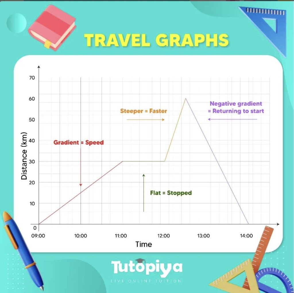
A travel graph is a line graph that tells us how much distance has been covered by the object in question within a particular time. We can use travel graphs to represent the motion of cars, people, trains, buses, etc. This means travel graphs can tell us whether an object is still (stationary), moving at a constant speed, accelerating, or decelerating. The y -axis represents the distance travelled while the x -axis shows the time it takes to travel a distance such as that.

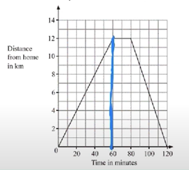
James went on a cycling ride. The travel graph shows James’s distance from home on this cycle ride. Find James’s speed for the first 60 minutes.
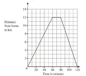
We are told that James is going on a cycling ride and that the distance he travelled is what is shown here. What is required of us is to find James’s speed for the first 60 minutes. This means you need to mark the point at 60 minutes on the x -axis as shown in the picture below.
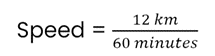
We have learnt when learning about Speed, Time and Distance that speed = distance/ time.
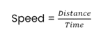
Therefore, in a distance-time graph, the slope that we see (also called the gradient) is what will give us the speed.
We can see that this particular cycle has travelled 12 km in 60 minutes.
When we substitute these values into the formula above, it would look like this:
When this formula is solved, then we get James’s speed for the first 60 minutes , which is 0.2 km/min .
A train journey takes one hour. The diagram shows the speed-time graph for this journey. Calculate the total distance of this journey.
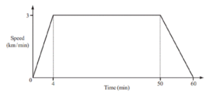
We need to be careful here because this time what we have in this question is a speed-time graph and not a distance-time graph.
In a speed-time graph, the gradient of a slope represents either acceleration or deceleration, which will be concepts touched upon in later lessons. The distance travelled is found by calculating the area under a speed-time graph.
In order to calculate the distance travelled by the train therefore, we need to calculate the area under the graph that is drawn. To make things easier, we can separate this graph into shapes:
2 triangles and 1 rectangle

Triangle 1: Area of a triangle = ½ × base of triangle × height of triangle Area = ½ × 4 km × 3 km/min Area = 6 km2
Rectangle: Length of the rectangle can be found by finding out the difference between 50 and 4, which equals to 46 min. The height of the rectangle is 3 km/min. Area = length × base Area = 46 min × 3 km/min Area = 138 km
Triangle 2: Area of a triangle = ½ × base of triangle × height of triangle Area = ½ × 10 km × 3 km/min Area = 15 km
Total Area under the graph = Total distance travelled by the train Therefore, Total Distance = Triangle 1 + Rectangle + Triangle 2 Total Distance = 6 km + 138 km + 15 km Total Distance = 159 km
Those are the basic tips and tricks you would need to learn in this particular chapter!
Travel Graphs at Exams
Pay attention to what sort of graph is given to you. Is it a distance-time graph? A speed-time graph? Depending on the type of graph, remember, the value represented by the gradient changes, and so does the value represented by the area under the graph.
Practice as many questions as you can on this topic. They are quite simple once you get the hang of them. You can find some questions in this quiz to check where you stand!
If you are struggling with IGCSE revision or the Mathematics subject in particular, you can reach out to us at Tutopiya to join revision sessions or find yourself the right tutor for you.
Watch the video below for a visual explanation of the lesson on the ultimate guide to travel graphs!

See author's posts
Recent Posts
- Top 10 Reasons to Choose Edexcel IGCSE: Global Recognition, Flexible Curriculum & More
- Tutopiya Unveils AI Tutor for IGCSE Maths Exams
- Educate and Empower: Subscribe to Tutopiya, Gift Education to Africa
- IGCSE Curriculum: Top 10 Benefits for Students
- Edexcel IGCSE: Benefits, Subjects, Syllabus, Pricing, and Tips for Edexcel IGCSE Success
- Navigating the AI Education Landscape: Trends in Singapore
- IGCSE Tutors Dubai: Affordable Group Classes, Boost Grades, Expert Tutors, Proven Results
- Empowering Minds: The Inspiring Journey of Fathima Safra Azmi
- Mastering IGCSE: Ace Your Exams in 3 Months with Our Unlimited Learning Program
- IGCSE Exam 2024 Revision: 10 Tips and Tricks to Score A*
Get Started
Learner guide
Tutor guide
Curriculums
IGCSE Tuition
PSLE Tuition
SIngapore O Level Tuition
Singapore A Level Tuition
SAT Tuition
Math Tuition
Additional Math Tuition
English Tuition
English Literature Tuition
Science Tuition
Physics Tuition
Chemistry Tuition
Biology Tuition
Economics Tuition
Business Studies Tuition
French Tuition
Spanish Tuition
Chinese Tuition
Computer Science Tuition
Geography Tuition
History Tuition
TOK Tuition
Privacy policy
22 Changi Business Park Central 2, #02-08, Singapore, 486032
All rights reserved
©2022 tutopiya
Travel Graphs
This section covers travel graphs, speed, distance, time, trapezium rule and velocity.
Speed, Distance and Time
The following is a basic but important formula which applies when speed is constant (in other words the speed doesn't change):
Remember, when using any formula, the units must all be consistent. For example speed could be measured in m/s, distance in metres and time in seconds.
If speed does change, the average (mean) speed can be calculated: Average speed = total distance travelled total time taken
In calculations, units must be consistent, so if the units in the question are not all the same (e.g. m/s, m and s or km/h, km and h), change the units before starting, as above.
The following is an example of how to change the units:
Change 15km/h into m/s. 15km/h = 15/60 km/min (1) = 15/3600 km/s = 1/240 km/s (2) = 1000/240 m/s = 4.167 m/s (3)
In line (1), we divide by 60 because there are 60 minutes in an hour. Often people have problems working out whether they need to divide or multiply by a certain number to change the units. If you think about it, in 1 minute, the object is going to travel less distance than in an hour. So we divide by 60, not multiply to get a smaller number.
If a car travels at a speed of 10m/s for 3 minutes, how far will it travel? Firstly, change the 3 minutes into 180 seconds, so that the units are consistent. Now rearrange the first equation to get distance = speed × time. Therefore distance travelled = 10 × 180 = 1800m = 1.8km
Velocity and Acceleration
Velocity is the speed of a particle and its direction of motion (therefore velocity is a vector quantity, whereas speed is a scalar quantity).
When the velocity (speed) of a moving object is increasing we say that the object is accelerating . If the velocity decreases it is said to be decelerating. Acceleration is therefore the rate of change of velocity (change in velocity / time) and is measured in m/s².
A car starts from rest and within 10 seconds is travelling at 10m/s. What is its acceleration?
Distance-Time Graphs
These have the distance from a certain point on the vertical axis and the time on the horizontal axis. The velocity can be calculated by finding the gradient of the graph. If the graph is curved, this can be done by drawing a chord and finding its gradient (this will give average velocity) or by finding the gradient of a tangent to the graph (this will give the velocity at the instant where the tangent is drawn).
Velocity-Time Graphs/ Speed-Time Graphs
A velocity-time graph has the velocity or speed of an object on the vertical axis and time on the horizontal axis. The distance travelled can be calculated by finding the area under a velocity-time graph. If the graph is curved, there are a number of ways of estimating the area (see trapezium rule below). Acceleration is the gradient of a velocity-time graph and on curves can be calculated using chords or tangents, as above.
The distance travelled is the area under the graph. The acceleration and deceleration can be found by finding the gradient of the lines.
On travel graphs, time always goes on the horizontal axis (because it is the independent variable).
Trapezium Rule
This is a useful method of estimating the area under a graph. You often need to find the area under a velocity-time graph since this is the distance travelled.
Area under a curved graph = ½ × d × (first + last + 2(sum of rest))
d is the distance between the values from where you will take your readings. In the above example, d = 1. Every 1 unit on the horizontal axis, we draw a line to the graph and across to the y axis. 'first' refers to the first value on the vertical axis, which is about 4 here. 'last' refers to the last value, which is about 5 (green line).] 'sum of rest' refers to the sum of the values on the vertical axis where the yellow lines meet it. Therefore area is roughly: ½ × 1 × (4 + 5 + 2(8 + 8.8 + 10.1 + 10.8 + 11.9 + 12 + 12.7 + 12.9 + 13 + 13.2 + 13.4)) = ½ × (9 + 2(126.8)) = ½ × 262.6 = 131.3 units²

| Home Page | Order Maths Software | About the Series | Maths Software Tutorials | | Year 7 Maths Software | Year 8 Maths Software | Year 9 Maths Software | Year 10 Maths Software | | Homework Software | Tutor Software | Maths Software Platform | Trial Maths Software | | Feedback | About mathsteacher.com.au | Terms and Conditions | Our Policies | Links | Contact |
Copyright © 2000-2022 mathsteacher.com Pty Ltd. All rights reserved. Australian Business Number 53 056 217 611
Copyright instructions for educational institutions
Please read the Terms and Conditions of Use of this Website and our Privacy and Other Policies . If you experience difficulties when using this Website, tell us through the feedback form or by phoning the contact telephone number.
Transum Shop :: Laptops aid Learning :: School Books :: Tablets :: Educational Toys :: STEM Books
Menu Level 1 Level 2 Level 3 Level 4 Exam Help More Graphs
This is level 4; Draw a travel graph from the given description. Click on the points at the ends of where the straight line segments of the graphs should be.
This is Travel Graphs level 4. You can also try: Level 1 Level 2 Level 3

For Students:
- Times Tables
- TablesMaster
- Investigations
- Exam Questions

For Teachers:
- Starter of the Day
- Shine+Write
- Random Names
- Maths Videos
- Laptops in Lessons
- Maths On Display
- Class Admin
- Create An Account
- About Transum
- Privacy Policy
©1997-2024 WWW.TRANSUM.ORG
Description of Levels
Level 1 - Reading information from distance-time graphs
Level 2 - Matching distance-time graphs with their descriptions
Level 3 - Reading information from speed-time graphs
Level 4 - Draw a travel graph from the given description
Exam Style Questions - A collection of problems in the style of GCSE or IB/A-level exam paper questions (worked solutions are available for Transum subscribers).
More Graphs including lesson Starters, visual aids, investigations and self-marking exercises.
Answers to this exercise are available lower down this page when you are logged in to your Transum account. If you don’t yet have a Transum subscription one can be very quickly set up if you are a teacher, tutor or parent.
Log in Sign up
Distance-Time Graphs
For a basic introduction to distance-time graphs see Hurdles Race . For more details play the video below.
Don't wait until you have finished the exercise before you click on the 'Check' button. Click it often as you work through the questions to see if you are answering them correctly. You can double-click the 'Check' button to make it float at the bottom of your screen.
iGCSE Mathematics (0580) :C2.10 Interpret and use graphs in practical situations including travel graphs and conversion graphs. iGCSE Style Questions Paper 1
iGCSE Physics iGCSE Maths iGCSE Chemistry iGCSE Biology
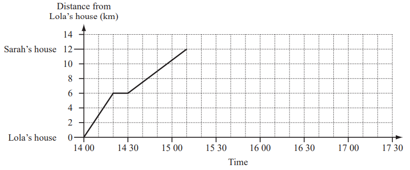
The travel graph shows Lola’s journey from her house to Sarah’s house. (a) Lola stopped at a shop on the way to Sarah’s house. For how many minutes did she stop?
(b) Write down the time she arrived at Sarah’s house.
Ans: 15 10
(c) Calculate Lola’s average speed from leaving the shop to arriving at Sarah’s house. Give your answer in kilometres per hour.
Ans: 9 [km/h]
(d) Lola stayed at Sarah’s house for 1 hour 20minutes. She then cycled home without stopping. Her journey took 50minutes. Complete the travel graph.
Ans: horizontal line from (15 10, 12) to (16 30, 12) line from (16 30, 12) to (17 20, 0)
The graph can be used to convert between miles and kilometres.
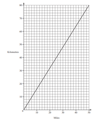
A train travels 24 miles in 20 minutes. Find its average speed in kilometres per hour.
Ans: 114 to 117
(a) Maria travels by bus to the shopping mall. She leaves home at 11 50 and arrives at the shopping mall at 1217. How many minutes does it take Maria to travel from home to the shopping mall?
Ans: 27 min
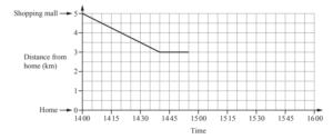
Maria walks home from the shopping mall. The travel graph shows part of her journey. (i) Maria stops at her friend’s house on the way home. How far from the shopping mall does her friend live?
(ii) Maria leaves her friend’s house at 1455. She walks the rest of the way home at a constant speed of 4km/h. Complete the travel graph.
Ans: Ruled line from 14 55 to 15 40
Travel Graphs – Distance & Time
Speed, Distance and Time The following is a basic but important formula which applies when speed is constant (in other words the speed doesn’t change): Speed = distance time
Remember, when using any formula, the units must all be consistent. For example speed could be measured in m/s, distance in metres and time in seconds. If speed does change, the average (mean) speed can be calculated: Average speed = total distance travelled total time taken
Example : If a car travels at a speed of 10m/s for 3 minutes, how far will it travel? Firstly, change the 3 minutes into 180 seconds, so that the units are consistent. Now rearrange the first equation to get distance = speed × time. Therefore distance travelled = 10 × 180 = 1800m = 1.8km
Units In calculations, units must be consistent, so if the units in the question are not all the same (e.g. m/s, m and s or km/h, km and h), change the units before starting, as above.
The following is an example of how to change the units:
Example : Change 15km/h into m/s. 15km/h = 15/60 km/min (1) = 15/3600 km/s = 1/240 km/s (2) = 1000/240 m/s = 4.167 m/s (3)
In line (1), we divide by 60 because there are 60 minutes in an hour. Often people have problems working out whether they need to divide or multiply by a certain number to change the units. If you think about it, in 1 minute, the object is going to travel less distance than in an hour. So we divide by 60, not multiply to get a smaller number.
Velocity and Acceleration Velocity is the speed of a particle and its direction of motion (therefore velocity is a vector quantity, whereas speed is a scalar quantity). When the velocity (speed) of a moving object is increasing we say that the object is accelerating . If the velocity decreases it is said to be decelerating. Acceleration is therefore the rate of change of velocity (change in velocity / time) and is measured in m/s².
Example : A car starts from rest and within 10 seconds is travelling at 10m/s. What is its acceleration? Acceleration = change in velocity = 10 = 1m/s² time 10
Distance-time graphs : These have the distance from a certain point on the vertical axis and the time on the horizontal axis. The velocity can be calculated by finding the gradient of the graph. If the graph is curved, this can be done by drawing a chord and finding its gradient (this will give average velocity) or by finding the gradient of a tangent to the graph (this will give the velocity at the instant where the tangent is drawn).
Velocity-time graphs/ speed-time graphs : A velocity-time graph has the velocity or speed of an object on the vertical axis and time on the horizontal axis. The distance travelled can be calculated by finding the area under a velocity-time graph. If the graph is curved, there are a number of ways of estimating the area (see trapezium rule below). Acceleration is the gradient of a velocity-time graph and on curves can be calculated using chords or tangents, as above.
On travel graphs, time always goes on the horizontal axis (because it is the independent variable).
Trapezium Rule
This is a useful method of estimating the area under a graph. You often need to find the area under a velocity-time graph since this is the distance travelled.
Area under a curved graph = ½ × d × (first + last + 2(sum of rest))
d is the distance between the values from where you will take your readings. In the above example, d = 1. Every 1 unit on the horizontal axis, we draw a line to the graph and across to the y axis. ‘first’ refers to the first value on the vertical axis, which is about 4 here. ‘last’ refers to the last value, which is about 5 (green line).] ‘sum of rest’ refers to the sum of the values on the vertical axis where the yellow lines meet it. Therefore area is roughly: ½ × 1 × (4 + 5 + 2(8 + 8.8 + 10.1 + 10.8 + 11.9 + 12 + 12.7 + 12.9 + 13 + 13.2 + 13.4)) = ½ × (9 + 2(126.8)) = ½ × 262.6 = 131.3 units²
Cambridge IGCSE Mathematics
Website by Oliver Bowles, Richard Wade & Jim Noble
Updated 6 March 2024
InThinking Subject Sites
Subscription websites for Cambridge IGCSE teachers & their classes
Find out more
- thinkigcse.net
- IGCSE Economics
- IGCSE Geography
- IGCSE History
InThinking Subject Sites for Cambridge IGCSE Teachers and their Classes
Supporting igcse educators.
- Comprehensive help & advice on teaching IGCSE.
- Written by experts with vast subject knowledge.
- Innovative ideas on ATL & pedagogy.
- Detailed guidance on all aspects of assessment.
Developing great materials
- More than one million words across 4 sites.
- Masses of ready-to-go resources for the classroom.
- Dynamic links to current affairs & real world issues.
- Updates every week 52 weeks a year.
Integrating student access
- Give your students direct access to relevant site pages.
- Single student login for all of your school’s subscriptions.
- Create reading, writing, discussion, and quiz tasks.
- Monitor student progress & collate in online gradebook.
Meeting schools' needs
- Global reach with thousands of users worldwide.
- Use our materials to create compelling unit plans.
- Save time & effort which you can reinvest elsewhere.
- Consistently good feedback from subscribers.
For information about pricing, click here
Download brochure
- Travel Graphs
- Algebra and Graphs
- All Activities
How can you describe your position? What happens when you move?
Can you describe this movement?
This is a really fun practical activity that will get you to do just that.

Students using a motion sensor to track their 'journey' and reproduce travel graphs.
Part A - Practical
In the activity below, the idea is to try and reproduce the journeys that were made by the person who recorded these journeys in the first place. The graphs describe the position of a person as time passes. The journeys are made over a few seconds and a few metres.
With Motion Sensors
Notes - Graphs - 4. Travel Graphs. Powerpoint
Subject: Mathematics
Age range: 14-16
Resource type: Assessment and revision
Last updated
14 March 2013
- Share through email
- Share through twitter
- Share through linkedin
- Share through facebook
- Share through pinterest

Creative Commons "Sharealike"
Your rating is required to reflect your happiness.
It's good to leave some feedback.
Something went wrong, please try again later.
Maryam-Khan
Empty reply does not make any sense for the end user
phill_g_tucker
Handoutfinder.
Excellent. Although there is one mistake: says 30 minutes is a quarter of an hour when it's really half. But that's easily fixed! Keep up the good work
A comprehensive revision aid on travel graphs. It is very useful in that it drums into pupils the importance of taking time to interpret the graphs before attempting to answer questions. Provides an interesting extension which encourages pupils to think about the rate at whick different shaped glasses would fill with water.
Really useful powerpoint, mistake on slide 4 point 2 it says quarter of an hour but should say half. Very good though
Report this resource to let us know if it violates our terms and conditions. Our customer service team will review your report and will be in touch.
Not quite what you were looking for? Search by keyword to find the right resource:

- school Campus Bookshelves
- menu_book Bookshelves
- perm_media Learning Objects
- login Login
- how_to_reg Request Instructor Account
- hub Instructor Commons
- Download Page (PDF)
- Download Full Book (PDF)
- Periodic Table
- Physics Constants
- Scientific Calculator
- Reference & Cite
- Tools expand_more
- Readability
selected template will load here
This action is not available.
12.10: Traveling Salesperson Problem
- Last updated
- Save as PDF
- Page ID 129677

Learning Objectives
After completing this section, you should be able to:
- Distinguish between brute force algorithms and greedy algorithms.
- List all distinct Hamilton cycles of a complete graph.
- Apply brute force method to solve traveling salesperson applications.
- Apply nearest neighbor method to solve traveling salesperson applications.
We looked at Hamilton cycles and paths in the previous sections Hamilton Cycles and Hamilton Paths. In this section, we will analyze Hamilton cycles in complete weighted graphs to find the shortest route to visit a number of locations and return to the starting point. Besides the many routing applications in which we need the shortest distance, there are also applications in which we search for the route that is least expensive or takes the least time. Here are a few less common applications that you can read about on a website set up by the mathematics department at the University of Waterloo in Ontario, Canada:
- Design of fiber optic networks
- Minimizing fuel expenses for repositioning satellites
- Development of semi-conductors for microchips
- A technique for mapping mammalian chromosomes in genome sequencing
Before we look at approaches to solving applications like these, let's discuss the two types of algorithms we will use.
Brute Force and Greedy Algorithms
An algorithm is a sequence of steps that can be used to solve a particular problem. We have solved many problems in this chapter, and the procedures that we used were different types of algorithms. In this section, we will use two common types of algorithms, a brute force algorithm and a greedy algorithm . A brute force algorithm begins by listing every possible solution and applying each one until the best solution is found. A greedy algorithm approaches a problem in stages, making the apparent best choice at each stage, then linking the choices together into an overall solution which may or may not be the best solution.
To understand the difference between these two algorithms, consider the tree diagram in Figure 12.214. Suppose we want to find the path from left to right with the largest total sum. For example, branch A in the tree diagram has a sum of 10 + 2 + 11 + 13 = 36 10 + 2 + 11 + 13 = 36 .
To be certain that you pick the branch with greatest sum, you could list each sum from each of the different branches:
A : 10 + 2 + 11 + 13 = 36 10 + 2 + 11 + 13 = 36
B : 10 + 2 + 11 + 8 = 31 10 + 2 + 11 + 8 = 31
C : 10 + 2 + 15 + 1 = 28 10 + 2 + 15 + 1 = 28
D : 10 + 2 + 15 + 6 = 33 10 + 2 + 15 + 6 = 33
E : 10 + 7 + 3 + 20 = 40 10 + 7 + 3 + 20 = 40
F : 10 + 7 + 3 + 14 = 34 10 + 7 + 3 + 14 = 34
G : 10 + 7 + 4 + 11 = 32 10 + 7 + 4 + 11 = 32
H : 10 + 7 + 4 + 5 = 26 10 + 7 + 4 + 5 = 26
Then we know with certainty that branch E has the greatest sum.
Now suppose that you wanted to find the branch with the highest value, but you only were shown the tree diagram in phases, one step at a time.
After phase 1, you would have chosen the branch with 10 and 7. So far, you are following the same branch. Let’s look at the next phase.
After phase 2, based on the information you have, you will choose the branch with 10, 7 and 4. Now, you are following a different branch than before, but it is the best choice based on the information you have. Let’s look at the last phase.
After phase 3, you will choose branch G which has a sum of 32.
The process of adding the values on each branch and selecting the highest sum is an example of a brute force algorithm because all options were explored in detail. The process of choosing the branch in phases, based on the best choice at each phase is a greedy algorithm. Although a brute force algorithm gives us the ideal solution, it can take a very long time to implement. Imagine a tree diagram with thousands or even millions of branches. It might not be possible to check all the sums. A greedy algorithm, on the other hand, can be completed in a relatively short time, and generally leads to good solutions, but not necessarily the ideal solution.
Example 12.42
Distinguishing between brute force and greedy algorithms.
A cashier rings up a sale for $4.63 cents in U.S. currency. The customer pays with a $5 bill. The cashier would like to give the customer $0.37 in change using the fewest coins possible. The coins that can be used are quarters ($0.25), dimes ($0.10), nickels ($0.05), and pennies ($0.01). The cashier starts by selecting the coin of highest value less than or equal to $0.37, which is a quarter. This leaves $ 0.37 − $ 0.25 = $ 0.12 $ 0.37 − $ 0.25 = $ 0.12 . The cashier selects the coin of highest value less than or equal to $0.12, which is a dime. This leaves $ 0.12 − $ 0.10 = $ 0.02 $ 0.12 − $ 0.10 = $ 0.02 . The cashier selects the coin of highest value less than or equal to $0.02, which is a penny. This leaves $ 0.02 − $ 0.01 = $ 0.01 $ 0.02 − $ 0.01 = $ 0.01 . The cashier selects the coin of highest value less than or equal to $0.01, which is a penny. This leaves no remainder. The cashier used one quarter, one dime, and two pennies, which is four coins. Use this information to answer the following questions.
- Is the cashier’s approach an example of a greedy algorithm or a brute force algorithm? Explain how you know.
- The cashier’s solution is the best solution. In other words, four is the fewest number of coins possible. Is this consistent with the results of an algorithm of this kind? Explain your reasoning.
- The approach the cashier used is an example of a greedy algorithm, because the problem was approached in phases and the best choice was made at each phase. Also, it is not a brute force algorithm, because the cashier did not attempt to list out all possible combinations of coins to reach this conclusion.
- Yes, it is consistent. A greedy algorithm does not always yield the best result, but sometimes it does.
Your Turn 12.42
The traveling salesperson problem.
Now let’s focus our attention on the graph theory application known as the traveling salesperson problem (TSP) in which we must find the shortest route to visit a number of locations and return to the starting point.
Recall from Hamilton Cycles, the officer in the U.S. Air Force who is stationed at Vandenberg Air Force base and must drive to visit three other California Air Force bases before returning to Vandenberg. The officer needed to visit each base once. We looked at the weighted graph in Figure 12.219 representing the four U.S. Air Force bases: Vandenberg, Edwards, Los Angeles, and Beal and the distances between them.
Any route that visits each base and returns to the start would be a Hamilton cycle on the graph. If the officer wants to travel the shortest distance, this will correspond to a Hamilton cycle of lowest weight. We saw in Table 12.11 that there are six distinct Hamilton cycles (directed cycles) in a complete graph with four vertices, but some lie on the same cycle (undirected cycle) in the graph.
a → b → c → d → a
a → b → d → c → a
a → c → b → d → a
a → d → c → b → a
a → c → d → b → a
a → d → b → c → a
Since the distance between bases is the same in either direction, it does not matter if the officer travels clockwise or counterclockwise. So, there are really only three possible distances as shown in Figure 12.220.
The possible distances are:
396 + 410 + 106 + 159 = 1071 207 + 410 + 439 + 159 = 1215 396 + 439 + 106 + 207 = 1148 396 + 410 + 106 + 159 = 1071 207 + 410 + 439 + 159 = 1215 396 + 439 + 106 + 207 = 1148
So, a Hamilton cycle of least weight is V → B → E → L → V (or the reverse direction). The officer should travel from Vandenberg to Beal to Edwards, to Los Angeles, and back to Vandenberg.
Finding Weights of All Hamilton Cycles in Complete Graphs
Notice that we listed all of the Hamilton cycles and found their weights when we solved the TSP about the officer from Vandenberg. This is a skill you will need to practice. To make sure you don't miss any, you can calculate the number of possible Hamilton cycles in a complete graph. It is also helpful to know that half of the directed cycles in a complete graph are the same cycle in reverse direction, so, you only have to calculate half the number of possible weights, and the rest are duplicates.
In a complete graph with n n vertices,
- The number of distinct Hamilton cycles is ( n − 1 ) ! ( n − 1 ) ! .
- There are at most ( n − 1 ) ! 2 ( n − 1 ) ! 2 different weights of Hamilton cycles.
TIP! When listing all the distinct Hamilton cycles in a complete graph, you can start them all at any vertex you choose. Remember, the cycle a → b → c → a is the same cycle as b → c → a → b so there is no need to list both.
Example 12.43
Calculating possible weights of hamilton cycles.
Suppose you have a complete weighted graph with vertices N, M, O , and P .
- Use the formula ( n − 1 ) ! ( n − 1 ) ! to calculate the number of distinct Hamilton cycles in the graph.
- Use the formula ( n − 1 ) ! 2 ( n − 1 ) ! 2 to calculate the greatest number of different weights possible for the Hamilton cycles.
- Are all of the distinct Hamilton cycles listed here? How do you know? Cycle 1: N → M → O → P → N Cycle 2: N → M → P → O → N Cycle 3: N → O → M → P → N Cycle 4: N → O → P → M → N Cycle 5: N → P → M → O → N Cycle 6: N → P → O → M → N
- Which pairs of cycles must have the same weights? How do you know?
- There are 4 vertices; so, n = 4 n = 4 . This means there are ( n − 1 ) ! = ( 4 − 1 ) ! = 3 ⋅ 2 ⋅ 1 = 6 ( n − 1 ) ! = ( 4 − 1 ) ! = 3 ⋅ 2 ⋅ 1 = 6 distinct Hamilton cycles beginning at any given vertex.
- Since n = 4 n = 4 , there are ( n − 1 ) ! 2 = ( 4 − 1 ) ! 2 = 6 2 = 3 ( n − 1 ) ! 2 = ( 4 − 1 ) ! 2 = 6 2 = 3 possible weights.
- Yes, they are all distinct cycles and there are 6 of them.
- Cycles 1 and 6 have the same weight, Cycles 2 and 4 have the same weight, and Cycles 3 and 5 have the same weight, because these pairs follow the same route through the graph but in reverse.
TIP! When listing the possible cycles, ignore the vertex where the cycle begins and ends and focus on the ways to arrange the letters that represent the vertices in the middle. Using a systematic approach is best; for example, if you must arrange the letters M, O, and P, first list all those arrangements beginning with M, then beginning with O, and then beginning with P, as we did in Example 12.42.
Your Turn 12.43
The brute force method.
The method we have been using to find a Hamilton cycle of least weight in a complete graph is a brute force algorithm, so it is called the brute force method . The steps in the brute force method are:
Step 1: Calculate the number of distinct Hamilton cycles and the number of possible weights.
Step 2: List all possible Hamilton cycles.
Step 3: Find the weight of each cycle.
Step 4: Identify the Hamilton cycle of lowest weight.
Example 12.44
Applying the brute force method.
On the next assignment, the air force officer must leave from Travis Air Force base, visit Beal, Edwards, and Vandenberg Air Force bases each exactly once and return to Travis Air Force base. There is no need to visit Los Angeles Air Force base. Use Figure 12.221 to find the shortest route.
Step 1: Since there are 4 vertices, there will be ( 4 − 1 ) ! = 3 ! = 6 ( 4 − 1 ) ! = 3 ! = 6 cycles, but half of them will be the reverse of the others; so, there will be ( 4 − 1 ) ! 2 = 6 2 = 3 ( 4 − 1 ) ! 2 = 6 2 = 3 possible distances.
Step 2: List all the Hamilton cycles in the subgraph of the graph in Figure 12.222.
To find the 6 cycles, focus on the three vertices in the middle, B, E, and V . The arrangements of these vertices are BEV, BVE, EBV, EVB, VBE , and VEB . These would correspond to the 6 cycles:
1: T → B → E → V → T
2: T → B → V → E → T
3: T → E → B → V → T
4: T → E → V → B → T
5: T → V → B → E → T
6: T → V → E → B → T
Step 3: Find the weight of each path. You can reduce your work by observing the cycles that are reverses of each other.
1: 84 + 410 + 207 + 396 = 1097 84 + 410 + 207 + 396 = 1097
2: 84 + 396 + 207 + 370 = 1071 84 + 396 + 207 + 370 = 1071
3: 370 + 410 + 396 + 396 = 1572 370 + 410 + 396 + 396 = 1572
4: Reverse of cycle 2, 1071
5: Reverse of cycle 3, 1572
6: Reverse of cycle 1, 1097
Step 4: Identify a Hamilton cycle of least weight.
The second path, T → B → V → E → T , and its reverse, T → E → V → B → T , have the least weight. The solution is that the officer should travel from Travis Air Force base to Beal Air Force Base, to Vandenberg Air Force base, to Edwards Air Force base, and return to Travis Air Force base, or the same route in reverse.
Your Turn 12.44
Now suppose that the officer needed a cycle that visited all 5 of the Air Force bases in Figure 12.221. There would be ( 5 − 1 ) ! = 4 ! = 4 × 3 × 2 × 1 = 24 ( 5 − 1 ) ! = 4 ! = 4 × 3 × 2 × 1 = 24 different arrangements of vertices and ( 5 − 1 ) ! 2 = 4 ! 2 = 24 2 = 12 ( 5 − 1 ) ! 2 = 4 ! 2 = 24 2 = 12 distances to compare using the brute force method. If you consider 10 Air Force bases, there would be ( 10 − 1 ) ! = 9 ! = 9 ⋅ 8 ⋅ 7 ⋅ 6 ⋅ 5 ⋅ 4 ⋅ 3 ⋅ 2 ⋅ 1 = 362 , 880 ( 10 − 1 ) ! = 9 ! = 9 ⋅ 8 ⋅ 7 ⋅ 6 ⋅ 5 ⋅ 4 ⋅ 3 ⋅ 2 ⋅ 1 = 362 , 880 different arrangements and ( 10 − 1 ) ! 2 = 9 ! 2 = 9 ⋅ 8 ⋅ 7 ⋅ 6 ⋅ 5 ⋅ 4 ⋅ 3 ⋅ 2 ⋅ 1 2 = 181 , 440 ( 10 − 1 ) ! 2 = 9 ! 2 = 9 ⋅ 8 ⋅ 7 ⋅ 6 ⋅ 5 ⋅ 4 ⋅ 3 ⋅ 2 ⋅ 1 2 = 181 , 440 distances to consider. There must be another way!
The Nearest Neighbor Method
When the brute force method is impractical for solving a traveling salesperson problem, an alternative is a greedy algorithm known as the nearest neighbor method , which always visit the closest or least costly place first. This method finds a Hamilton cycle of relatively low weight in a complete graph in which, at each phase, the next vertex is chosen by comparing the edges between the current vertex and the remaining vertices to find the lowest weight. Since the nearest neighbor method is a greedy algorithm, it usually doesn’t give the best solution, but it usually gives a solution that is "good enough." Most importantly, the number of steps will be the number of vertices. That’s right! A problem with 10 vertices requires 10 steps, not 362,880. Let’s look at an example to see how it works.
Suppose that a candidate for governor wants to hold rallies around the state. They plan to leave their home in city A , visit cities B, C, D, E , and F each once, and return home. The airfare between cities is indicated in the graph in Figure 12.223.
Let’s help the candidate keep costs of travel down by applying the nearest neighbor method to find a Hamilton cycle that has a reasonably low weight. Begin by marking starting vertex as V 1 Figure 12.224. The lowest of these is $100, which is the edge between A and F .
Mark F as V 2 Figure 12.225. The lowest of these is $150, which is the edge between F and D .
Mark D as V 3 Figure 12.226. The lowest of these is $120, which is the edge between D and B .
So, mark B as V 4 Figure 12.227. The lower amount is $160, which is the edge between B and E .
Now you can mark E as V 5 Figure 12.228. Make a note of the weight of the edge from E to C , which is $180, and from C back to A , which is $210.
The Hamilton cycle we found is A → F → D → B → E → C → A . The weight of the circuit is $ 100 + $ 150 + $ 120 + $ 160 + $ 180 + $ 210 = $ 920 $ 100 + $ 150 + $ 120 + $ 160 + $ 180 + $ 210 = $ 920 . This may or may not be the route with the lowest cost, but there is a good chance it is very close since the weights are most of the lowest weights on the graph and we found it in six steps instead of finding 120 different Hamilton cycles and calculating 60 weights. Let’s summarize the procedure that we used.
Step 1: Select the starting vertex and label V 1 V 1 for "visited 1st." Identify the edge of lowest weight between V 1 V 1 and the remaining vertices.
Step 2: Label the vertex at the end of the edge of lowest weight that you found in previous step as V n V n where the subscript n indicates the order the vertex is visited. Identify the edge of lowest weight between V n V n and the vertices that remain to be visited.
Step 3: If vertices remain that have not been visited, repeat Step 2. Otherwise, a Hamilton cycle of low weight is V 1 → V 2 → ⋯ → V n → V 1 V 1 → V 2 → ⋯ → V n → V 1 .
Example 12.45
Using the nearest neighbor method.
Suppose that the candidate for governor wants to hold rallies around the state but time before the election is very limited. They would like to leave their home in city A , visit cities B , C , D , E , and F each once, and return home. The airfare between cities is not as important as the time of travel, which is indicated in Figure 12.229. Use the nearest neighbor method to find a route with relatively low travel time. What is the total travel time of the route that you found?
Step 1: Label vertex A as V 1 V 1 . The edge of lowest weight between A and the remaining vertices is 85 min between A and D .
Step 2: Label vertex D as V 2 V 2 . The edge of lowest weight between D and the vertices that remain to be visited, B, C, E , and F , is 70 min between D and F .
Repeat Step 2: Label vertex F as V 3 V 3 . The edge of lowest weight between F and the vertices that remain to be visited, B, C, and E , is 75 min between F and C .
Repeat Step 2: Label vertex C as V 4 V 4 . The edge of lowest weight between C and the vertices that remain to be visited, B and E , is 100 min between C and B .
Repeat Step 2: Label vertex B as V 5 V 5 . The only vertex that remains to be visited is E . The weight of the edge between B and E is 95 min.
Step 3: A Hamilton cycle of low weight is A → D → F → C → B → E → A . So, a route of relatively low travel time is A to D to F to C to B to E and back to A . The total travel time of this route is: 85 min + 70 min + 75 min + 100 min + 95 min + 90 min = 515 min or 8 hrs 35 min 85 min + 70 min + 75 min + 100 min + 95 min + 90 min = 515 min or 8 hrs 35 min
Your Turn 12.45
Check your understanding, section 12.9 exercises.

Numbers, Facts and Trends Shaping Your World
Read our research on:
Full Topic List
Regions & Countries
- Publications
- Our Methods
- Short Reads
- Tools & Resources
Read Our Research On:
What the data says about abortion in the U.S.
Pew Research Center has conducted many surveys about abortion over the years, providing a lens into Americans’ views on whether the procedure should be legal, among a host of other questions.
In a Center survey conducted nearly a year after the Supreme Court’s June 2022 decision that ended the constitutional right to abortion , 62% of U.S. adults said the practice should be legal in all or most cases, while 36% said it should be illegal in all or most cases. Another survey conducted a few months before the decision showed that relatively few Americans take an absolutist view on the issue .
Find answers to common questions about abortion in America, based on data from the Centers for Disease Control and Prevention (CDC) and the Guttmacher Institute, which have tracked these patterns for several decades:
How many abortions are there in the U.S. each year?
How has the number of abortions in the u.s. changed over time, what is the abortion rate among women in the u.s. how has it changed over time, what are the most common types of abortion, how many abortion providers are there in the u.s., and how has that number changed, what percentage of abortions are for women who live in a different state from the abortion provider, what are the demographics of women who have had abortions, when during pregnancy do most abortions occur, how often are there medical complications from abortion.
This compilation of data on abortion in the United States draws mainly from two sources: the Centers for Disease Control and Prevention (CDC) and the Guttmacher Institute, both of which have regularly compiled national abortion data for approximately half a century, and which collect their data in different ways.
The CDC data that is highlighted in this post comes from the agency’s “abortion surveillance” reports, which have been published annually since 1974 (and which have included data from 1969). Its figures from 1973 through 1996 include data from all 50 states, the District of Columbia and New York City – 52 “reporting areas” in all. Since 1997, the CDC’s totals have lacked data from some states (most notably California) for the years that those states did not report data to the agency. The four reporting areas that did not submit data to the CDC in 2021 – California, Maryland, New Hampshire and New Jersey – accounted for approximately 25% of all legal induced abortions in the U.S. in 2020, according to Guttmacher’s data. Most states, though, do have data in the reports, and the figures for the vast majority of them came from each state’s central health agency, while for some states, the figures came from hospitals and other medical facilities.
Discussion of CDC abortion data involving women’s state of residence, marital status, race, ethnicity, age, abortion history and the number of previous live births excludes the low share of abortions where that information was not supplied. Read the methodology for the CDC’s latest abortion surveillance report , which includes data from 2021, for more details. Previous reports can be found at stacks.cdc.gov by entering “abortion surveillance” into the search box.
For the numbers of deaths caused by induced abortions in 1963 and 1965, this analysis looks at reports by the then-U.S. Department of Health, Education and Welfare, a precursor to the Department of Health and Human Services. In computing those figures, we excluded abortions listed in the report under the categories “spontaneous or unspecified” or as “other.” (“Spontaneous abortion” is another way of referring to miscarriages.)
Guttmacher data in this post comes from national surveys of abortion providers that Guttmacher has conducted 19 times since 1973. Guttmacher compiles its figures after contacting every known provider of abortions – clinics, hospitals and physicians’ offices – in the country. It uses questionnaires and health department data, and it provides estimates for abortion providers that don’t respond to its inquiries. (In 2020, the last year for which it has released data on the number of abortions in the U.S., it used estimates for 12% of abortions.) For most of the 2000s, Guttmacher has conducted these national surveys every three years, each time getting abortion data for the prior two years. For each interim year, Guttmacher has calculated estimates based on trends from its own figures and from other data.
The latest full summary of Guttmacher data came in the institute’s report titled “Abortion Incidence and Service Availability in the United States, 2020.” It includes figures for 2020 and 2019 and estimates for 2018. The report includes a methods section.
In addition, this post uses data from StatPearls, an online health care resource, on complications from abortion.
An exact answer is hard to come by. The CDC and the Guttmacher Institute have each tried to measure this for around half a century, but they use different methods and publish different figures.
The last year for which the CDC reported a yearly national total for abortions is 2021. It found there were 625,978 abortions in the District of Columbia and the 46 states with available data that year, up from 597,355 in those states and D.C. in 2020. The corresponding figure for 2019 was 607,720.
The last year for which Guttmacher reported a yearly national total was 2020. It said there were 930,160 abortions that year in all 50 states and the District of Columbia, compared with 916,460 in 2019.
- How the CDC gets its data: It compiles figures that are voluntarily reported by states’ central health agencies, including separate figures for New York City and the District of Columbia. Its latest totals do not include figures from California, Maryland, New Hampshire or New Jersey, which did not report data to the CDC. ( Read the methodology from the latest CDC report .)
- How Guttmacher gets its data: It compiles its figures after contacting every known abortion provider – clinics, hospitals and physicians’ offices – in the country. It uses questionnaires and health department data, then provides estimates for abortion providers that don’t respond. Guttmacher’s figures are higher than the CDC’s in part because they include data (and in some instances, estimates) from all 50 states. ( Read the institute’s latest full report and methodology .)
While the Guttmacher Institute supports abortion rights, its empirical data on abortions in the U.S. has been widely cited by groups and publications across the political spectrum, including by a number of those that disagree with its positions .
These estimates from Guttmacher and the CDC are results of multiyear efforts to collect data on abortion across the U.S. Last year, Guttmacher also began publishing less precise estimates every few months , based on a much smaller sample of providers.
The figures reported by these organizations include only legal induced abortions conducted by clinics, hospitals or physicians’ offices, or those that make use of abortion pills dispensed from certified facilities such as clinics or physicians’ offices. They do not account for the use of abortion pills that were obtained outside of clinical settings .
(Back to top)

The annual number of U.S. abortions rose for years after Roe v. Wade legalized the procedure in 1973, reaching its highest levels around the late 1980s and early 1990s, according to both the CDC and Guttmacher. Since then, abortions have generally decreased at what a CDC analysis called “a slow yet steady pace.”
Guttmacher says the number of abortions occurring in the U.S. in 2020 was 40% lower than it was in 1991. According to the CDC, the number was 36% lower in 2021 than in 1991, looking just at the District of Columbia and the 46 states that reported both of those years.
(The corresponding line graph shows the long-term trend in the number of legal abortions reported by both organizations. To allow for consistent comparisons over time, the CDC figures in the chart have been adjusted to ensure that the same states are counted from one year to the next. Using that approach, the CDC figure for 2021 is 622,108 legal abortions.)
There have been occasional breaks in this long-term pattern of decline – during the middle of the first decade of the 2000s, and then again in the late 2010s. The CDC reported modest 1% and 2% increases in abortions in 2018 and 2019, and then, after a 2% decrease in 2020, a 5% increase in 2021. Guttmacher reported an 8% increase over the three-year period from 2017 to 2020.
As noted above, these figures do not include abortions that use pills obtained outside of clinical settings.
Guttmacher says that in 2020 there were 14.4 abortions in the U.S. per 1,000 women ages 15 to 44. Its data shows that the rate of abortions among women has generally been declining in the U.S. since 1981, when it reported there were 29.3 abortions per 1,000 women in that age range.
The CDC says that in 2021, there were 11.6 abortions in the U.S. per 1,000 women ages 15 to 44. (That figure excludes data from California, the District of Columbia, Maryland, New Hampshire and New Jersey.) Like Guttmacher’s data, the CDC’s figures also suggest a general decline in the abortion rate over time. In 1980, when the CDC reported on all 50 states and D.C., it said there were 25 abortions per 1,000 women ages 15 to 44.
That said, both Guttmacher and the CDC say there were slight increases in the rate of abortions during the late 2010s and early 2020s. Guttmacher says the abortion rate per 1,000 women ages 15 to 44 rose from 13.5 in 2017 to 14.4 in 2020. The CDC says it rose from 11.2 per 1,000 in 2017 to 11.4 in 2019, before falling back to 11.1 in 2020 and then rising again to 11.6 in 2021. (The CDC’s figures for those years exclude data from California, D.C., Maryland, New Hampshire and New Jersey.)
The CDC broadly divides abortions into two categories: surgical abortions and medication abortions, which involve pills. Since the Food and Drug Administration first approved abortion pills in 2000, their use has increased over time as a share of abortions nationally, according to both the CDC and Guttmacher.
The majority of abortions in the U.S. now involve pills, according to both the CDC and Guttmacher. The CDC says 56% of U.S. abortions in 2021 involved pills, up from 53% in 2020 and 44% in 2019. Its figures for 2021 include the District of Columbia and 44 states that provided this data; its figures for 2020 include D.C. and 44 states (though not all of the same states as in 2021), and its figures for 2019 include D.C. and 45 states.
Guttmacher, which measures this every three years, says 53% of U.S. abortions involved pills in 2020, up from 39% in 2017.
Two pills commonly used together for medication abortions are mifepristone, which, taken first, blocks hormones that support a pregnancy, and misoprostol, which then causes the uterus to empty. According to the FDA, medication abortions are safe until 10 weeks into pregnancy.
Surgical abortions conducted during the first trimester of pregnancy typically use a suction process, while the relatively few surgical abortions that occur during the second trimester of a pregnancy typically use a process called dilation and evacuation, according to the UCLA School of Medicine.
In 2020, there were 1,603 facilities in the U.S. that provided abortions, according to Guttmacher . This included 807 clinics, 530 hospitals and 266 physicians’ offices.

While clinics make up half of the facilities that provide abortions, they are the sites where the vast majority (96%) of abortions are administered, either through procedures or the distribution of pills, according to Guttmacher’s 2020 data. (This includes 54% of abortions that are administered at specialized abortion clinics and 43% at nonspecialized clinics.) Hospitals made up 33% of the facilities that provided abortions in 2020 but accounted for only 3% of abortions that year, while just 1% of abortions were conducted by physicians’ offices.
Looking just at clinics – that is, the total number of specialized abortion clinics and nonspecialized clinics in the U.S. – Guttmacher found the total virtually unchanged between 2017 (808 clinics) and 2020 (807 clinics). However, there were regional differences. In the Midwest, the number of clinics that provide abortions increased by 11% during those years, and in the West by 6%. The number of clinics decreased during those years by 9% in the Northeast and 3% in the South.
The total number of abortion providers has declined dramatically since the 1980s. In 1982, according to Guttmacher, there were 2,908 facilities providing abortions in the U.S., including 789 clinics, 1,405 hospitals and 714 physicians’ offices.
The CDC does not track the number of abortion providers.
In the District of Columbia and the 46 states that provided abortion and residency information to the CDC in 2021, 10.9% of all abortions were performed on women known to live outside the state where the abortion occurred – slightly higher than the percentage in 2020 (9.7%). That year, D.C. and 46 states (though not the same ones as in 2021) reported abortion and residency data. (The total number of abortions used in these calculations included figures for women with both known and unknown residential status.)
The share of reported abortions performed on women outside their state of residence was much higher before the 1973 Roe decision that stopped states from banning abortion. In 1972, 41% of all abortions in D.C. and the 20 states that provided this information to the CDC that year were performed on women outside their state of residence. In 1973, the corresponding figure was 21% in the District of Columbia and the 41 states that provided this information, and in 1974 it was 11% in D.C. and the 43 states that provided data.
In the District of Columbia and the 46 states that reported age data to the CDC in 2021, the majority of women who had abortions (57%) were in their 20s, while about three-in-ten (31%) were in their 30s. Teens ages 13 to 19 accounted for 8% of those who had abortions, while women ages 40 to 44 accounted for about 4%.
The vast majority of women who had abortions in 2021 were unmarried (87%), while married women accounted for 13%, according to the CDC , which had data on this from 37 states.

In the District of Columbia, New York City (but not the rest of New York) and the 31 states that reported racial and ethnic data on abortion to the CDC , 42% of all women who had abortions in 2021 were non-Hispanic Black, while 30% were non-Hispanic White, 22% were Hispanic and 6% were of other races.
Looking at abortion rates among those ages 15 to 44, there were 28.6 abortions per 1,000 non-Hispanic Black women in 2021; 12.3 abortions per 1,000 Hispanic women; 6.4 abortions per 1,000 non-Hispanic White women; and 9.2 abortions per 1,000 women of other races, the CDC reported from those same 31 states, D.C. and New York City.
For 57% of U.S. women who had induced abortions in 2021, it was the first time they had ever had one, according to the CDC. For nearly a quarter (24%), it was their second abortion. For 11% of women who had an abortion that year, it was their third, and for 8% it was their fourth or more. These CDC figures include data from 41 states and New York City, but not the rest of New York.

Nearly four-in-ten women who had abortions in 2021 (39%) had no previous live births at the time they had an abortion, according to the CDC . Almost a quarter (24%) of women who had abortions in 2021 had one previous live birth, 20% had two previous live births, 10% had three, and 7% had four or more previous live births. These CDC figures include data from 41 states and New York City, but not the rest of New York.
The vast majority of abortions occur during the first trimester of a pregnancy. In 2021, 93% of abortions occurred during the first trimester – that is, at or before 13 weeks of gestation, according to the CDC . An additional 6% occurred between 14 and 20 weeks of pregnancy, and about 1% were performed at 21 weeks or more of gestation. These CDC figures include data from 40 states and New York City, but not the rest of New York.
About 2% of all abortions in the U.S. involve some type of complication for the woman , according to an article in StatPearls, an online health care resource. “Most complications are considered minor such as pain, bleeding, infection and post-anesthesia complications,” according to the article.
The CDC calculates case-fatality rates for women from induced abortions – that is, how many women die from abortion-related complications, for every 100,000 legal abortions that occur in the U.S . The rate was lowest during the most recent period examined by the agency (2013 to 2020), when there were 0.45 deaths to women per 100,000 legal induced abortions. The case-fatality rate reported by the CDC was highest during the first period examined by the agency (1973 to 1977), when it was 2.09 deaths to women per 100,000 legal induced abortions. During the five-year periods in between, the figure ranged from 0.52 (from 1993 to 1997) to 0.78 (from 1978 to 1982).
The CDC calculates death rates by five-year and seven-year periods because of year-to-year fluctuation in the numbers and due to the relatively low number of women who die from legal induced abortions.
In 2020, the last year for which the CDC has information , six women in the U.S. died due to complications from induced abortions. Four women died in this way in 2019, two in 2018, and three in 2017. (These deaths all followed legal abortions.) Since 1990, the annual number of deaths among women due to legal induced abortion has ranged from two to 12.
The annual number of reported deaths from induced abortions (legal and illegal) tended to be higher in the 1980s, when it ranged from nine to 16, and from 1972 to 1979, when it ranged from 13 to 63. One driver of the decline was the drop in deaths from illegal abortions. There were 39 deaths from illegal abortions in 1972, the last full year before Roe v. Wade. The total fell to 19 in 1973 and to single digits or zero every year after that. (The number of deaths from legal abortions has also declined since then, though with some slight variation over time.)
The number of deaths from induced abortions was considerably higher in the 1960s than afterward. For instance, there were 119 deaths from induced abortions in 1963 and 99 in 1965 , according to reports by the then-U.S. Department of Health, Education and Welfare, a precursor to the Department of Health and Human Services. The CDC is a division of Health and Human Services.
Note: This is an update of a post originally published May 27, 2022, and first updated June 24, 2022.

Support for legal abortion is widespread in many countries, especially in Europe
Nearly a year after roe’s demise, americans’ views of abortion access increasingly vary by where they live, by more than two-to-one, americans say medication abortion should be legal in their state, most latinos say democrats care about them and work hard for their vote, far fewer say so of gop, positive views of supreme court decline sharply following abortion ruling, most popular.
1615 L St. NW, Suite 800 Washington, DC 20036 USA (+1) 202-419-4300 | Main (+1) 202-857-8562 | Fax (+1) 202-419-4372 | Media Inquiries
Research Topics
- Age & Generations
- Coronavirus (COVID-19)
- Economy & Work
- Family & Relationships
- Gender & LGBTQ
- Immigration & Migration
- International Affairs
- Internet & Technology
- Methodological Research
- News Habits & Media
- Non-U.S. Governments
- Other Topics
- Politics & Policy
- Race & Ethnicity
- Email Newsletters
ABOUT PEW RESEARCH CENTER Pew Research Center is a nonpartisan fact tank that informs the public about the issues, attitudes and trends shaping the world. It conducts public opinion polling, demographic research, media content analysis and other empirical social science research. Pew Research Center does not take policy positions. It is a subsidiary of The Pew Charitable Trusts .
Copyright 2024 Pew Research Center
Terms & Conditions
Privacy Policy
Cookie Settings
Reprints, Permissions & Use Policy
- Other Sports
- FanNation FanNation FanNation
- SI.COM SI.COM SI.COM
- SI SWIMSUIT SI SWIMSUIT SI SWIMSUIT
- SI Sportsbook SI Sportsbook SI Sportsbook
- SI Tickets SI Tickets SI Tickets
- SI Showcase SI Showcase SI Showcase
- SI Resorts SI Resorts SI Resorts

© Jared Anderson - Louisville Report
Notes and Observations from Louisville's 2024 Spring Game
The Cardinals concluded spring ball with the second spring game of the Jeff Brohm era.
- Author: Matthew McGavic
In this story:
LOUISVILLE, Ky. - Spring ball is now in the books for the Louisville football program.
Friday evening, the Cardinals gathered at L&N Stadium and held their second spring game under head coach Jeff Brohm, which was fully open to the public and fans. The program had the offense go against the defense for two halves like a normal games, with the exception of a running clock used in the second half. The offense came out on top with a come-from-behind 45-37 win over the offense.
Considering a handful players were out due to injuries and a lot of the first team or other impact players were held out during the second half, there is bound to be an overreaction or two. But that being said, below is our notebook of the more notable happenings that transpired during the chilly evening at L&N Stadium:
- As far as who was getting the majority of the reps with the first team, it was mostly what was expected. Micah Carter and D'Angelo Hutchinson both got first team reps at defensive end and safety, respectively, due to injuries at the position, Stanquan Clark slid in to replace the recently-departed Jaylin Alderman, as did Maurice Turner in place of Peny Boone, and Chris Bell got regular run with the ones. Outside of that, the first team offense and defense was consistent with what it has been all spring.
- Brohm has noted multiple times throughout spring how banged up Louisville, and from what I could tell he wasn't wrong. These are who were on the sideline not dressed or in street clothes (from what I could see): Ja'Corey Brooks, Jimmy Calloway, Renato Brown, Selah Brown, Mason Reiger, Adonijah Green and Jared Dawson.
- While it was the offense who won the spring game, to be quite honest, I thought that it was the defense who played an overall better game. Despite going down 14-0 after the first couple drives, the defense the strung together multiple stops in the rest of the half to take a 23-21 lead at the break. They were even leading 37-24 midway through the fourth quarter until the offense scored three straight touchdowns. Of the 20 drives on the night, the defense allowed the offense to get points on seven of them, and just six were touchdowns.
- Having said that, I'll start with what I saw from the offense first since they won. Quarterback Tyler Shough, like he has all throughout spring up to this point, showed that he is the clear QB1. His arm strength is incredible, he can make plays on the run, and he shows that he's fearless and not afraid to take some risk. He ended the night going 8-of-12 for 177 yards, two touchdown and one pick to Quincy Riley, who made a phenomenal play on a seam route.
- I went into the spring game thinking that Harrison Bailey had the slight leg up on Pierce Clarkson in the battle for the backup quarterback spot. Now, I think Clarkson seems to be the favorite. For starters, he got the first reps after Shough did. Secondly, he flat out looked better than Bailey, who looked shaky early on in the spring game before settling in. Clarkson's mobility is a clear strength of his that the coaching staff wants to utilize, and it seems that he has continued to develop his arm strength, as evidenced by his 62-yard touchdown to walk-on receiver Jaeden King. Clarkson went 9-of-14 for 117 yards, a score and a pick
- Speaking of walk-ons, one who could very well be working towards earning a scholarship (if there's room) is Kris Hughes. He made several plays all night, hauling in five catches for 63 yards, as well as a 70-yard run on a reverse to end the night.
- While Hughes was the walk-on star of the game, the true MVP of the night in my opinion was wide receiver Chris Bell. He had an 80-yard touchdown in single coverage up the left sideline on the first play of the night, then later had a 45-yard score in which he beat what looked to be Cover 3 deep up the seam. He had just three catches, but they were good for 126 yards and two touchdowns. While Books and Caullin Lacy should be penciled in as starters, I'm thinking Bell should join them in the starting wide receiver group this fall.
- As far as other pass catchers go, Antonio Meeks had a couple nice plays, Jaleel Skinner had a 36-yard touchdown up the seam in the fourth quarter, converted quarterback Sam Young had a 70-yard score that came off of a tipped pass, and Cataurus Hicks got in the mix a few times.
- While there were a handful a solid runs on the night, the rushing attack was mainly bottled up for most of the night. In fact, Louisville's three main running backs - Turner, Donald Chaney, Isaac Brown and Keyjuan Brown - had just 112 combined rushing yards. Though I attribute this more so to the playmakers in the front seven and how this area of the field was always swarming to the ball vs. the offensive line not doing the RBs any favors. In fact, I thought the pass protection all throughout the night was very good.
- Speaking of which, as you can imagine, several defensive linemen and linebackers made plays throughout the evening. Stanquan Clark made plays all over the field with his relentless tackling style, and he also got a pick early in the fourth quarter on a late pass from Clarkson. Trent Carter, who has stood out in some recent open practices, made a couple stop. At the LEO spot, Maurice Davis had a sack, then later in the game actually dropped back into flat zone coverage and was able to close out on a swing pass for a fourth down stop. Dezmond Tell had a sack. T.J. Capers played well against the run, as did most of the linebacking corps. Even walk-on M.J. Campbell made a couple plays on the edge.
- Something I personally was looking for was the depth in the secondary, and they did not disappoint. Of course, Riley looked as great as I expected him to be, but Devin Neal continues to look like an All-ACC caliber safety, Marcus Washington appears to have made some progress, and both Aaron Williams and walk-on Jadon Minkins *should* have had interceptions.
(Photo via Jared Anderson - Louisville Report)
You can follow Louisville Report for future coverage by liking us on Facebook, Twitter and Instagram: Facebook - @LouisvilleReport Twitter - @UofLReport Instagram - @louisville_report You can also follow Deputy Editor Matthew McGavic at @Matt_McGavic on Twitter
Latest Cardinals News

Report: Vikings Sign Former Louisville Edge Rusher Jonathan Greenard

Projecting Louisville Football's 2024 Two-Deep Depth Chart

2024 NFL Combine Results: Top Performers, Records for Each Drill

Louisville Makes Updated Top Eight for Top-100 '25 QB Husan Longstreet

'25 Top-Ranked DL Elijah Griffin Names Louisville to Top 12
- Undergraduate Students
- Masters Students
- PhD/Doctoral Students
- Postdoctoral Scholars
- Faculty & Staff
- Families & Supporters
- Prospective Students
- Explore Your Interests / Self-Assessment
- Build your Network / LinkedIn
- Search for a Job / Internship
- Create a Resume / Cover Letter
- Prepare for an Interview
- Negotiate an Offer
- Prepare for Graduate School
- Find Funding Opportunities
- Prepare for the Academic Job Market
- Search for a Job or Internship
- Advertising, Marketing, and Public Relations
- Arts & Entertainment
- Consulting & Financial Services
- Engineering & Technology
- Government, Law & Policy
- Hospitality
- Management & Human Resources
- Non-Profit, Social Justice & Education
- Retail & Consumer Services
- BIPOC Students & Scholars
- Current & Former Foster Youth
- Disabled Students & Scholars
- First-Generation Students & Scholars
- Formerly Incarcerated Students & Scholars
- International Students & Scholars
- LGBTQ+ Students & Scholars
- Students & Scholars with Dependents
- Transfer Students
- Undocumented Students & Scholars
- Women-Identifying Students & Scholars
Graph Academy
2024 ui/ux intern:human-ai interface (openai+note-taking app).
- Share This: Share 2024 UI/UX Intern:Human-AI Interface (OpenAi+Note-taking app) on Facebook Share 2024 UI/UX Intern:Human-AI Interface (OpenAi+Note-taking app) on LinkedIn Share 2024 UI/UX Intern:Human-AI Interface (OpenAi+Note-taking app) on X
Flexible. Preferred periods (May 2024 – Sep 2024)
About the Role:
As a Design Intern, you will take on the thrilling challenge of creating intricate infographics that serve as an individual’s second brain . Your mission is to make complex nodes and links more readable and understandable, transforming how people interact with AI and knowledge .
You’ll also refine the user interactions between AI and humans, designing intuitive interfaces for AI chat interfaces. This is uncharted territory – an opportunity to be part of a team doing what no one has done before.
What We Offer:
– A chance to work on revolutionary projects in Silicon Valley’s heart.
– The opportunity to design critical elements of a trailblazing AI product.
– A platform to showcase your unique vision and creativity.
– Mentorship from industry leaders and innovators.
– An environment that values diverse backgrounds and perspectives.
Who We’re Looking For:
– Students with a burning passion for note-taking apps and data visualization.
– Individuals with a distinctive vision for text editors who have extensively used tools like ChatGPT.
– Creative minds eager to step beyond traditional boundaries and influence the future of AI products.
– Candidates with strong character who can think outside the box – no prior design experience required.
Preferences:
While this is an unpaid internship, we seek candidates who:
– Are deeply passionate about creating meaningful connections through design.
– Have experimented with various forms of note-taking software or text editors.
– Possess a diverse background and experiences that fuel innovation.
– Are not afraid to define their path in shaping next-generation AI products.
If you’re driven by curiosity and have the guts to venture into unknown realms of technology, we want you!
To apply, please send us:
1. A brief cover letter explaining why you’re the perfect fit for this role.
2.Portfolio & Personal website (if available).
Join us at Graph Academy , where your designs will breathe life into AI-human synergy!
Amsterdam Bans New Hotels
Rashaad Jorden , Skift
April 19th, 2024 at 3:14 AM EDT
Today's podcast looks at Amsterdam's hotel ban, Hyatt's Indian leisure travel, and new Apple technology in hotel rooms.
Rashaad Jorden

Skift Daily Briefing Podcast
Listen to the day’s top travel stories in under four minutes every weekday.
Good morning from Skift. It’s Friday, April 19. Here’s what you need to know about the business of travel today.
🎧 Subscribe
Apple Podcasts | Spotify | Overcast | Google Podcasts | Amazon Podcasts
Episode Notes
Amsterdam is banning hotel developments as part of its strategy to fight mass tourism, writes Global Tourism Reporter Dawit Habtemariam.
Amsterdam’s municipal government announced the Dutch capital will no longer issue permits for new hotels. The only exception would be if another hotel in the city closes and the number of beds doesn’t increase. Habtemariam notes Amsterdam officials are looking to limit annual overnight stays in the city to 20 million.
The new hotel restriction is Amsterdam’s latest attempt to discourage mass tourism. The city raised its tourist tax 5 percentage points earlier this year.
Next, Hyatt is ramping up its efforts to attract Indian leisure travelers , writes India Reporter Bulbul Dhawan.
Hyatt CEO Mark Hoplamazian said India’s leisure travel market is mainly driven by domestic travelers, and that the company is looking to open 50 more hotels across 28 markets in India. The company currently operates 50 hotels in 17 Indian markets. Hoplamazian added he’s seen more interest in investments in India’s hospitality industry.
Finally, Apple is putting wireless streaming technology in hotel rooms for the first time as part of its partnership with IHG Hotels & Resorts, writes Travel Technology Reporter Justin Dawes.
Apple’s Airplay technology is now available in rooms at more than 60 IHG properties throughout North America. Airplay enables guests to stream content from their iPhone or iPad to the LG television in their hotel rooms. An IHG executive said the company is looking to create a “home-away-from-home” experience that many guests crave.
Producer/Presenter: Jane Alexander
Skift India Report
The Skift India Report is your go-to newsletter for all news related to travel, tourism, airlines, and hospitality in India.
Have a confidential tip for Skift? Get in touch
Tags: apple , domestic leisure travel , hyatt , india , leisure travel , leisure travelers , netherlands , skift podcast , the netherlands
Photo credit: An Amsterdam canal and street scene. Guarav Jain / Unsplash
TikTok Notes 12+
Share, connect, discover, tiktok ltd..
- #15 in Social Networking
- 3.2 • 14 Ratings
iPhone Screenshots
Description.
TikTok Notes is a lifestyle platform that offers informative photo-text content about people's lives, where you can see individuals sharing their travel tips, daily recipes...
Ratings and Reviews
Audio would be cool but it’s an ok app, I think it needs audios bcs it’s too silent and it makes me hear the voices
No monetization features
TikTok is testing Notes in Canada and Australia the two countries they refuse to offer content creators any compensation or monetization like creator fund or TikTok shop. TikTok treats Canadians and Australian like lab rats, they harvest our viral content for the platform and have us test their app for them but under no circumstances will monetize us. Once we were done testing and they release features like TikTok shop they release it to everybody else except Canadians and Australian. Meanwhile, Canadian and Australian content creators will watch the screenshots of 10,000 a month deposits from US creators. We will watch in disbelief as TikTok invest infinite resources into going to bat for content creators in week of a potential band. But they'll invest no time or no dime into Canadian and US content creators. This is really revealing as to how they view content craters in these countries. If the CCP truly doesn't have any influence in TikTok, why is it that these are the same two countries that have ongoing high tensions with China right now? This is not a coincidence and the CCP has directives to TikTok and it is glaringly obvious. The audacity to have these two markets to test this new app when after five years, they have never provided any monetization in terms of a creator fund or TikTok shop to these incredible content creators. Canadian and Australian content craters are nothing more than lab rats, or cattle to be harvested for our content and our data and our user testing. But we hold no value to TikTok outside of that. This is why Canadian content creators have been increasingly moving to Meta/Facebook, and YouTube, because these platforms actually provide a path forward as a content creator.
Very interesting application
Being true is content, and I like it very much.
App Privacy
The developer, TikTok Ltd. , indicated that the app’s privacy practices may include handling of data as described below. For more information, see the developer's privacy policy .
Data Linked to You
The following data may be collected and linked to your identity:
- Contact Info
- Identifiers
Data Not Linked to You
The following data may be collected but it is not linked to your identity:
- User Content
- Search History
- Diagnostics
Privacy practices may vary, for example, based on the features you use or your age. Learn More
Information
English, Albanian, Arabic, Bengali, Bulgarian, Burmese, Cambodian, Catalan, Cebuano, Croatian, Czech, Danish, Dutch, Estonian, Filipino, French, German, Greek, Hindi, Hungarian, Icelandic, Indonesian, Irish, Italian, Japanese, Javanese, Kazakh, Korean, Latvian, Lithuanian, Malay, Norwegian Bokmål, Polish, Portuguese, Romanian, Russian, Simplified Chinese, Slovak, Slovenian, Spanish, Swedish, Thai, Traditional Chinese, Turkish, Ukrainian, Uzbek, Vietnamese
- App Support
- Privacy Policy
More By This Developer
IMAGES
VIDEO
COMMENTS
To make things easier, we can separate this graph into shapes: 2 triangles and 1 rectangle. Triangle 1: Area of a triangle = ½ × base of triangle × height of triangle. Area = ½ × 4 km × 3 km/min. Area = 6 km2. Rectangle: Length of the rectangle can be found by finding out the difference between 50 and 4, which equals to 46 min.
A travel graph is a line graph which describes a journey - it shows how distance changes with time. ... Note that the green line is steeper than the blue one. Key point.
8.!Shown below are six distance-time graphs!Each sentence in the table describes one of the graphs.!Write the letter of the correct graph next to each sentence. Mr.Jones travels to work and immediately returns F Mr.Jones leaves work and travels home at a steady speed Mr.Jones leaves home and travels to work at a steady speed Mr.Jones stays at work
Trapezium Rule. This is a useful method of estimating the area under a graph. You often need to find the area under a velocity-time graph since this is the distance travelled. Area under a curved graph = ½ × d × (first + last + 2 (sum of rest)) d is the distance between the values from where you will take your readings.
🌟🗺️ Embark on a mathematical journey with Tutopiya's comprehensive tutorial on Travel Graphs in Cambridge IGCSE Math!Discover the power of graph representa...
Travel graphs are line graphs that are used to describe the motion of objects such as cars, trains, walkers and cyclists. The distance travelled is represented on the vertical axis and the time taken to travel that distance is represented on the horizontal axis. Example 9. The following graph gives the distance of a cyclist from his home.
Notes In Y8, you covered distance-time graphs and this year we will move on to velocity-time graphs. Although the graphs of a distance-time and a velocity-time graph may be equal, they describe very different journeys, as shown by the starter. E.g.1 The gradient of a distance-time graph is the rate of change of distance with respect to time
Show her journey on a displacement-time graph. Notes The following was covered at GCSE: Displacement-time graphs Velocity is the gradient — the steeper the line, ... E.g. 1 A train takes minutes to travel between two stations. The train accelerates from rest at a rate of m/s2 for s. It then travels at a constant speed and is finally brought ...
(b) Explain how you can tell from the graph that it took less time to travel the first 70km of the journey than it took to travel the final 70km of the journey. The distance-time graph shows a 140km journey from Meadow Green to Tarn Close. Distance in km Tarn Close 140 120 100 Time Meadow Green O 12:00 13:00 14:00 15:00 (a) (i) (ii) 16:00
Using the relations stated above, we can inspect either the graph or the equation of the graph, in order to sketch a related travel graph. For example, if a velocity-time graph is a series of sections, with mostly straight lines: Find the gradient of each section to plot the acceleration-time graph.
Revision notes on 2.1.4 Drawing Travel Graphs for the Edexcel International A Level Maths: Mechanics 1 syllabus, written by the Maths experts at Save My Exams.
Learn better and improve your grades. Find more lesson videos like this and learn more about mathematics in the Prime Learn App.👉Visit us at - http://www.pr...
More resources available at www.misterwootube.com
Reading travel graphs. A travel graph shows the distance travelled away from a set point against the time. This allows us to identify the speed at which they have travelled, points at which they ...
Draw a speed-time graph to show the journey of a Sky Train travelling between two stations. The train starts and finishes it's journey at rest. The whole journey takes three minutes. The total distance between the stations is 1350 metres. The train travels with constant acceleration then constant speed then finally its deceleration is constant.
Edexcel Internal Review 3 . 3. P, Q and R are three stations on a railway line.. P Q R 26 miles 4 miles PQ = 26 miles. QR = 4 miles.. A passenger train leaves P at 12 00. It arrives at Q at 12 30.. Information about the journey from P to Q is shown on the travel graph opposite.. The passenger train stops at
The travel graph shows part of her journey. (i) Maria stops at her friend's house on the way home. How far from the shopping mall does her friend live? Answer/Explanation. Ans: 2 km (ii) Maria leaves her friend's house at 1455. She walks the rest of the way home at a constant speed of 4km/h. Complete the travel graph. Answer/Explanation
What is a speed-time graph? Speed-time graphs show speed at different times . Speed is on the vertical axis, and time is on the horizontal axis; The gradient of the graph is the acceleration. If the graph is a curve you can draw the tangent at a point on the graph and find its gradient . This will be an estimate of the acceleration at that point
On travel graphs, time always goes on the horizontal axis (because it is the independent variable). Trapezium Rule. This is a useful method of estimating the area under a graph. You often need to find the area under a velocity-time graph since this is the distance travelled. Area under a curved graph = ½ × d × (first + last + 2 (sum of rest))
Travel Graphs - irp-cdn.multiscreensite.com
In this second activity students are asked to make the link between distance-time graphs and speed-time graphs. This is a matching activity. Print out and cut up the graphs from this sheet. Match a graph with a number (distance-time) with a graph with a letter (speed-time). Some of these graphs have been left blank for you to complete!
Notes - Graphs - 4. Travel Graphs. Powerpoint. Subject: Mathematics. Age range: 14-16. Resource type: Assessment and revision. File previews. ppt, 286.5 KB. A few years ago I wrote a set of notes for pupils and put them on my website.
The Brute Force Method. The method we have been using to find a Hamilton cycle of least weight in a complete graph is a brute force algorithm, so it is called the brute force method. The steps in the brute force method are: Step 1: Calculate the number of distinct Hamilton cycles and the number of possible weights.
The CDC says that in 2021, there were 11.6 abortions in the U.S. per 1,000 women ages 15 to 44. (That figure excludes data from California, the District of Columbia, Maryland, New Hampshire and New Jersey.) Like Guttmacher's data, the CDC's figures also suggest a general decline in the abortion rate over time.
Spring Game. LOUISVILLE, Ky. - Spring ball is now in the books for the Louisville football program. Friday evening, the Cardinals gathered at L&N Stadium and held their second spring game under ...
Chaos ensued in the United Arab Emirates after the country witnessed the heaviest rainfall in 75 years, with some areas recording more than 250 mm of precipitation in fewer than 24 hours, the ...
Flexible. Preferred periods (May 2024 - Sep 2024) About the Role: As a Design Intern, you will take on the thrilling challenge of creating intricate infographics that serve as an individual's second brain. Your mission is to make complex nodes and links more readable and understandable, transforming how people interact with AI and knowledge.
Habtemariam notes Amsterdam officials are looking to limit annual overnight stays in the city to 20 million. The new hotel restriction is Amsterdam's latest attempt to discourage mass tourism.
Read reviews, compare customer ratings, see screenshots and learn more about TikTok Notes. Download TikTok Notes and enjoy it on your iPhone, iPad and iPod touch. TikTok Notes is a lifestyle platform that offers informative photo-text content about people's lives, where you can see individuals sharing their travel tips, daily recipes...
CNN —. A year's worth of rain unleashed immense flash flooding in Dubai Tuesday as roads turned into rivers and rushing water inundated homes and businesses. Shocking video showed the tarmac ...