How to View Mobile Websites in Desktop Safari on macOS [Tutorial]

In today's guide we will show you how you can open mobile websites on your Mac in Safari running macOS. Let's dive right into it!

Want to View Mobile Websites in Desktop Safari Just Like How You Would See it on iOS or Any Other Mobile Device? - Here's How
Open up Safari on your Mac, type in a URL, hit Return and you'll see a desktop version of the website, as you should. But what if you want to see the mobile version of the website? Sure, you can do so by resizing Safari by dragging inwards from the corners, which is a trick that works on a very few websites by the way, but I'm talking about the real-deal mobile website as you'd see on your iPhone or an Android device. Well, it's pretty easy. Follow the steps below and you'll know it too.
Related Story How to Fix The Ongoing Wi-Fi Connectivity Issues in iOS 17
1. Open up Safari on your Mac.
2. Now click on 'Safari' in the menu bar.
3. Now click on Preferences , then Advanced .
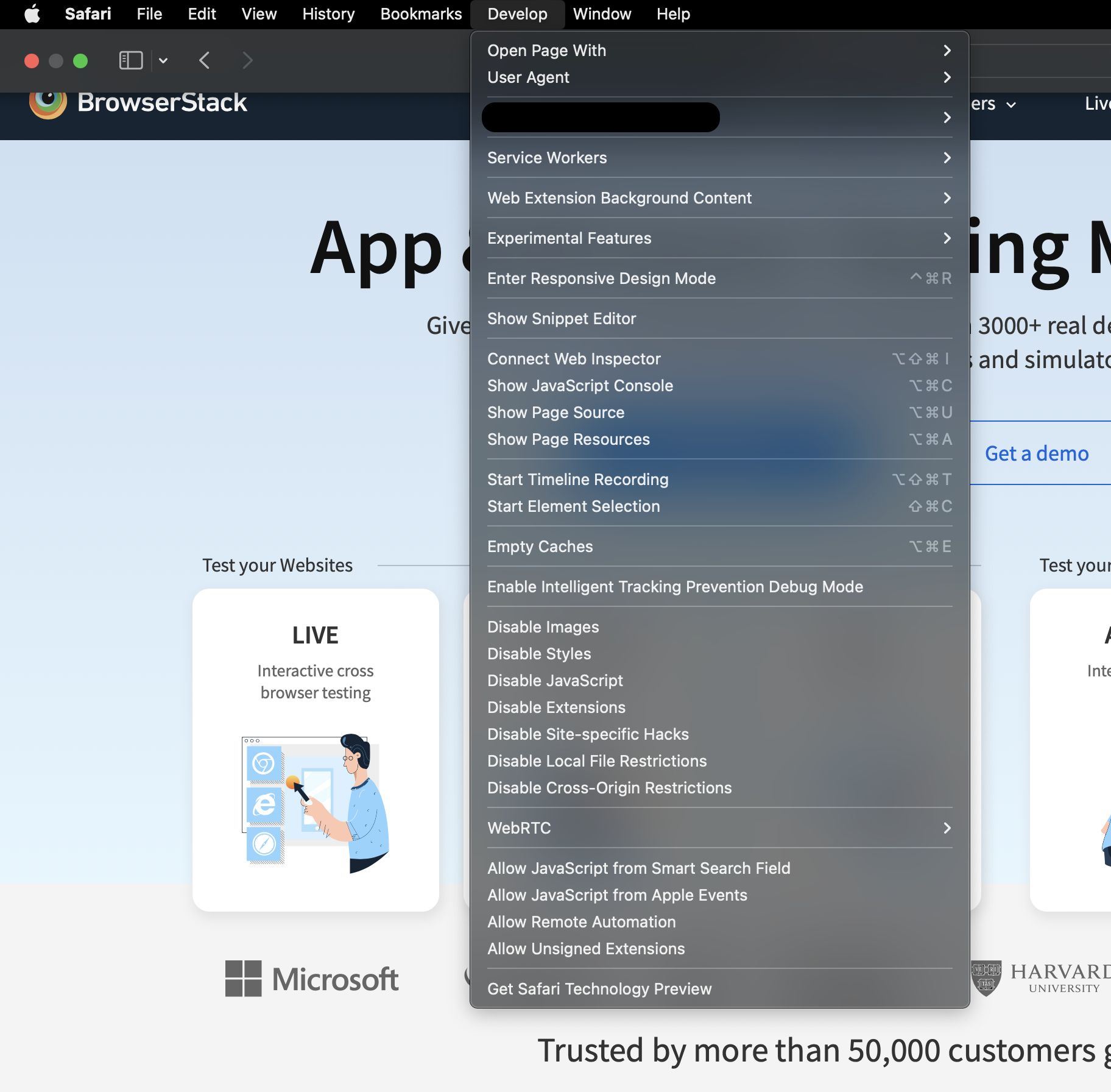
4. At the very bottom you'll see an option called 'See Develop menu in menu bar.'
5. You'll see a brand new entry in the menu bar called Develop . Click on it to open.
6. Now select User Agent then select 'Safari - iPhone.'

7. Now open up any website in Safari and the mobile version will open up.

If you wish to revert the changes, just open up the Develop menu, hover your mouse over User Agent then select Default at the top. That's it.
Now, at this point you must be wondering: why do I wanna open mobile websites in desktop Safari? Well, first of all, you know how to do it. Secondly, if you are a developer, you can test your website without having to open it up on an iPhone immediately. Last but not the least, it's fun! So why not share your newfound knowledge with the people around you, eh?
Further Reading

How To Find Out Wi-Fi Router IP Address Using iPhone, iPad Or Mac

Reset macOS Dock to Original Apps Arrangement and Settings [Tutorial]

Use Siri On AirPods Pro Without Saying Hey Siri [Tutorial]

Force Your Mac To Use IPv6 Only [Tutorial]
Trending stories, kingdom come deliverance 2 dev says combat will be more accessible, explains why the game still uses cryengine, sapphire launches nitro+ b650i wifi ultra platinum, it’s first amd am5 motherboard, amd radeon rx 7000 gpu deals: 7900 xtx for $799, 7900 gre for $510, 7800 xt for $457, 7700 xt for $351, 7600 xt for $299, amd pushes out huge chunk of firmware files for rdna 3+ gpus as prep work for strix apus, snapdragon x plus to feature 10-core cpu cluster, according to geekbench 6, with two ‘ml’ scores showing different results, popular discussions, amd radeon rx 7000 & nvidia geforce rtx 40 gpus available below msrp across all models in germany, nvidia acknowledges “strong competition” in ai market, reaffirms company’s business not just hardware but software too, amd launches ryzen pro 8000 desktop apus, bringing graphics & ai leadership to businesses, it’s time to bid farewell to amd rdna 2 “radeon rx 6000” gpus, inventory hits rock bottom.
How To Change Safari To Mobile View

- Software & Applications
- Browsers & Extensions
Introduction
When browsing the web, it's essential to have a seamless and user-friendly experience, especially when accessing websites on mobile devices. However, there are instances where websites may not automatically display in mobile view, leading to a less optimized browsing experience. Fortunately, Safari, the default web browser for Apple devices, offers a simple solution to this issue. By changing the view to mobile mode, users can enjoy a more responsive and visually appealing layout that is tailored to smaller screens.
In this guide, we will explore the step-by-step process of changing Safari to mobile view, allowing you to effortlessly access websites in a format optimized for mobile devices. Whether you're using an iPhone, iPad, or any other Apple device, this feature ensures that you can enjoy a seamless browsing experience, regardless of the website you're visiting.
By following the instructions outlined in this guide, you will gain valuable insights into leveraging Safari's mobile view feature, empowering you to navigate websites with ease and efficiency. Let's dive into the simple yet impactful steps that will enable you to unlock the full potential of Safari's mobile browsing capabilities.
Step 1: Open Safari on your device
To begin the process of changing Safari to mobile view, the first step is to open the Safari web browser on your Apple device. Whether you're using an iPhone, iPad, or any other Apple product, Safari is the default browser, offering a seamless and intuitive browsing experience. You can easily locate the Safari icon on your device's home screen, typically featuring a compass-like design with blue and white colors.
Upon tapping the Safari icon, the browser will launch, presenting you with a familiar interface that embodies Apple's signature clean and minimalist design. The address bar, located at the top of the screen, allows you to enter website URLs or conduct web searches directly from the browser's home screen. Additionally, Safari offers a range of features and functionalities, including tabbed browsing, bookmarking, and seamless integration with other Apple services.
As Safari opens, you'll notice the familiar layout that provides easy access to essential browsing tools and settings. The user-friendly nature of Safari makes it an ideal choice for navigating the web on Apple devices, offering a cohesive and streamlined experience across various platforms. Whether you're accessing your favorite websites, conducting research, or simply exploring the vast expanse of the internet, Safari serves as a reliable gateway to the digital world.
By opening Safari on your device, you are one step closer to unlocking the full potential of Safari's mobile view feature. This initial step sets the stage for seamlessly transitioning into the subsequent steps, where you will delve into the process of accessing websites in mobile mode, enhancing your browsing experience with optimized layouts and responsive designs.
With Safari now open on your device, you are ready to embark on the journey of transforming your browsing experience into a more mobile-friendly and visually appealing format. The next steps will guide you through the process of accessing websites in mobile view, ensuring that you can enjoy a tailored and optimized browsing experience on your Apple device.
As you proceed to the next steps, remember that Safari's mobile view feature empowers you to interact with websites in a manner that is optimized for smaller screens, offering enhanced usability and visual coherence. Let's continue on this journey to discover the seamless and user-centric capabilities of Safari's mobile browsing mode.
Step 2: Access the website you want to view in mobile mode
Once Safari is open on your Apple device, the next step involves accessing the specific website you wish to view in mobile mode. Whether it's a news site, an e-commerce platform, a blog, or any other web destination, Safari's mobile view feature allows you to seamlessly transition the website's layout to a format optimized for smaller screens.
To access the desired website, simply tap on the address bar at the top of the Safari browser . This action prompts the on-screen keyboard to appear, enabling you to enter the URL of the website you intend to visit. Alternatively, if you have previously bookmarked the website or it appears in your browsing history, you can access it by tapping the corresponding bookmark or history entry.
As you enter the website's URL or select it from your bookmarks or history, Safari initiates the process of loading the web page. The loading indicator, typically represented by a spinning wheel or progress bar, signifies that Safari is retrieving the content of the website and preparing it for display on your device's screen.
Upon successful loading, the website's content becomes visible within the Safari browser, presenting you with the familiar layout and visual elements that define the site. At this stage, you have effectively accessed the website and are poised to proceed with the next steps to enable mobile view.
It's important to note that Safari's mobile view feature is particularly beneficial when accessing websites that may not automatically display in a mobile-optimized format. By taking control of the viewing mode, you can ensure that the website's layout is tailored to the dimensions and capabilities of your Apple device, offering improved readability, navigation, and overall user experience.
As you move forward in the process, the ability to access the website of your choice in preparation for enabling mobile view sets the stage for a seamless transition into the subsequent steps. With the website now accessible within Safari, you are ready to delve into the next phase of activating the mobile view feature, ultimately enhancing your browsing experience and interaction with the website's content.
By accessing the website you wish to view in mobile mode, you are taking a proactive step towards optimizing your browsing experience on your Apple device. The upcoming steps will guide you through the process of activating mobile view, allowing you to witness the transformative impact it has on the website's layout and usability. Let's proceed to the next steps and unlock the full potential of Safari's mobile browsing capabilities.
Step 3: Tap on the "AA" icon in the address bar
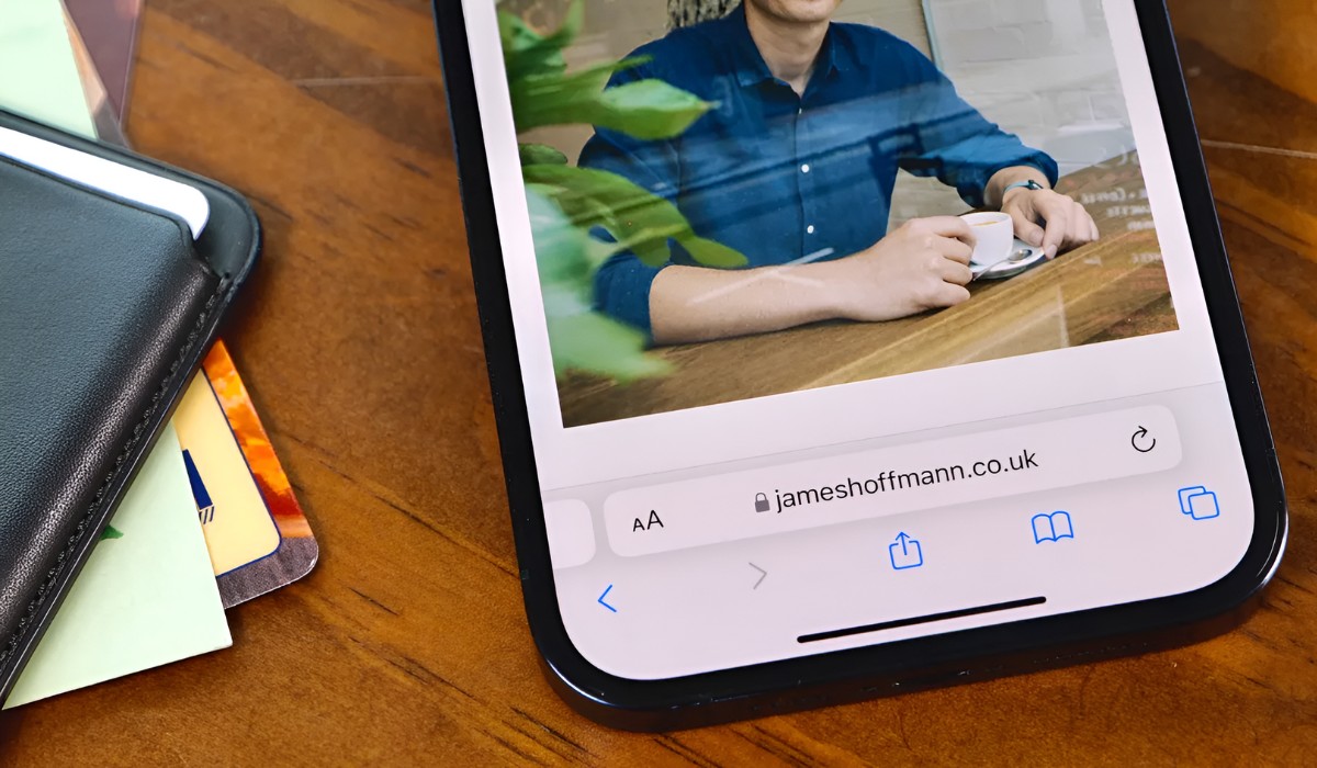
Upon accessing the website you wish to view in mobile mode, the next crucial step involves tapping on the "AA" icon located within the address bar of the Safari browser. This seemingly simple yet powerful action serves as the gateway to activating the mobile view feature, enabling you to transform the website's layout into a format optimized for smaller screens.
The "AA" icon, symbolizing the customization and viewing options within Safari, is strategically positioned within the address bar, offering convenient access to a range of display settings and functionalities. By tapping on this icon, you initiate a pivotal interaction that sets in motion the process of tailoring the website's layout to suit the dimensions and capabilities of your Apple device.
Upon tapping the "AA" icon, Safari unveils a dropdown menu that presents a selection of viewing options and site-specific settings. This menu serves as a versatile control center, empowering you to customize the website's display, adjust text size, enable reader mode, and crucially, request the mobile version of the website. The intuitive design and accessibility of this menu reflect Apple's commitment to user-centric experiences, ensuring that users can effortlessly navigate and personalize their browsing environment.
As the dropdown menu appears, you will notice the "Request Mobile Website" option among the available choices. This option holds the key to seamlessly transitioning the website's layout into a mobile-optimized format, enhancing its visual coherence and usability on your Apple device. By selecting "Request Mobile Website," you signal to Safari that you prefer to view the website in a mode tailored for mobile devices, prompting the browser to initiate the transformation process.
The act of tapping on the "AA" icon and selecting "Request Mobile Website" represents a pivotal moment where you exercise control over your browsing experience, harnessing Safari's adaptive capabilities to align the website's presentation with the unique attributes of your device. This deliberate action underscores the user empowerment embedded within Safari's design, allowing you to curate your browsing environment to suit your preferences and needs.
By tapping on the "AA" icon and navigating the dropdown menu to request the mobile version of the website, you are actively shaping your browsing experience, ensuring that the website's layout aligns with the mobile-friendly standards that enhance readability, navigation, and overall user engagement. This proactive step sets the stage for the final phase of the process, where you will witness the seamless transition of the website into a visually optimized and responsive mobile view.
As you proceed to the next steps, the impact of tapping on the "AA" icon and selecting "Request Mobile Website" will become evident, as Safari seamlessly adapts the website's layout to suit the dimensions and capabilities of your Apple device. This transformative process underscores the user-centric ethos of Safari's mobile browsing capabilities, offering a compelling demonstration of its adaptability and responsiveness to user preferences.
The upcoming steps will guide you through the final phase of the process, culminating in the seamless transition to the mobile view of the website. By tapping on the "AA" icon and selecting "Request Mobile Website," you have initiated a significant shift in the website's presentation, setting the stage for an enhanced and tailored browsing experience on your Apple device. Let's proceed to the next steps and witness the culmination of Safari's mobile browsing capabilities as the website seamlessly transitions into a visually optimized mobile view.
Step 4: Select "Request Mobile Website"
After tapping on the "AA" icon within the address bar and unveiling the dropdown menu, the pivotal moment arrives as you select the "Request Mobile Website" option. This deliberate action serves as the catalyst for initiating the seamless transition of the website's layout into a mobile-optimized format, aligning it with the dimensions and capabilities of your Apple device.
By choosing the "Request Mobile Website" option, you communicate your preference for a browsing experience tailored to the mobile environment, signaling to Safari that you seek a visually optimized and responsive layout. This proactive step underscores your control over the browsing experience, leveraging Safari's adaptive capabilities to enhance the website's presentation and usability.
As you select "Request Mobile Website," Safari promptly responds to your preference, triggering a behind-the-scenes process that reconfigures the website's elements to align with mobile-friendly standards. This transformation encompasses various aspects of the website's layout, including text size, image scaling, and overall visual coherence, ensuring that the content is presented in a manner conducive to effortless navigation and enhanced readability on your Apple device.
The selection of "Request Mobile Website" encapsulates the user-centric ethos of Safari's design, empowering you to curate your browsing environment in alignment with your preferences and needs. This feature exemplifies Apple's commitment to delivering a seamless and intuitive browsing experience, where users can effortlessly transition websites into mobile view, fostering a cohesive and visually appealing interaction with online content.
As Safari processes your request for the mobile version of the website, the browser seamlessly orchestrates the transition, culminating in the presentation of the website in a visually optimized and responsive mobile view. This transformative moment underscores the adaptability and responsiveness of Safari's mobile browsing capabilities, showcasing its ability to seamlessly align website layouts with the unique attributes of Apple devices.
With the selection of "Request Mobile Website," you have effectively steered the browsing experience towards a visually optimized and responsive format, ensuring that the website's layout is tailored to the dimensions and capabilities of your Apple device. This proactive step sets the stage for the final phase of the process, where you will witness the culmination of Safari's mobile browsing capabilities as the website seamlessly transitions into a visually optimized mobile view.
Step 5: Refresh the page to see the mobile view
After selecting "Request Mobile Website" and initiating the process of transitioning the website into a mobile-optimized format, the final step involves refreshing the page to witness the seamless transformation into the mobile view. This straightforward yet pivotal action serves as the definitive moment where the website's layout aligns with the dimensions and capabilities of your Apple device, offering an enhanced and tailored browsing experience.
To refresh the page in Safari , simply tap the circular arrow icon located within the address bar or swipe down on the screen to trigger the refresh action. This action prompts Safari to reload the website's content, incorporating the requested mobile view settings into the display. As the page refreshes, the website seamlessly transitions into the visually optimized and responsive mobile view, reflecting the adaptability and user-centric design of Safari's browsing capabilities.
The act of refreshing the page signifies the culmination of the process, where the website's layout is harmoniously tailored to suit the mobile environment, ensuring improved readability, navigation, and overall user engagement. The seamless transition into the mobile view underscores Safari's commitment to delivering a cohesive and visually appealing browsing experience, where websites effortlessly adapt to the unique attributes of Apple devices.
As the page refreshes, you will witness the transformative impact of Safari's mobile view feature, as the website's elements realign to optimize the presentation for smaller screens. Text becomes more legible, images scale appropriately, and the overall layout exudes a cohesive and user-friendly aesthetic, enhancing your interaction with the website's content.
By refreshing the page to see the mobile view, you affirm the proactive steps taken to curate your browsing experience, ensuring that the website's layout seamlessly aligns with the mobile-friendly standards that enhance usability and visual coherence. This final action encapsulates the user empowerment embedded within Safari's design, allowing you to effortlessly transition websites into a visually optimized and responsive mobile view, fostering a seamless and tailored browsing experience on your Apple device.
The culmination of the process, marked by the refreshing of the page, signifies the successful activation of Safari's mobile view feature, showcasing its adaptability and responsiveness to user preferences. As the website seamlessly transitions into the visually optimized mobile view, you are presented with a browsing experience that embodies the seamless integration of user-centric design and technological innovation, elevating your interaction with online content on Apple devices.
In conclusion, the process of changing Safari to mobile view represents a pivotal aspect of enhancing the browsing experience on Apple devices. By following the step-by-step guide outlined in this article, users can seamlessly transition websites into a visually optimized and responsive mobile view, ensuring improved readability, navigation, and overall user engagement.
The journey begins with opening Safari on the device, setting the stage for a seamless transition into the subsequent steps. Accessing the desired website and tapping on the "AA" icon within the address bar signify proactive steps towards curating the browsing experience, culminating in the selection of "Request Mobile Website" to initiate the transformative process.
The final step involves refreshing the page to witness the seamless transition into the mobile view, where the website's layout harmoniously aligns with the dimensions and capabilities of the Apple device. This definitive action underscores Safari's commitment to delivering a cohesive and visually appealing browsing experience, where websites effortlessly adapt to the unique attributes of Apple devices.
By embracing Safari's mobile view feature, users unlock the full potential of their browsing experience, ensuring that websites are presented in a format optimized for smaller screens. The adaptability and responsiveness of Safari's mobile browsing capabilities exemplify Apple's dedication to delivering user-centric design and technological innovation, fostering a seamless and tailored interaction with online content.
Ultimately, the process of changing Safari to mobile view empowers users to curate their browsing environment, ensuring that websites seamlessly align with mobile-friendly standards, enhancing usability and visual coherence. This transformative capability underscores the user empowerment embedded within Safari's design, offering a compelling demonstration of its adaptability and responsiveness to user preferences.
As users navigate the digital landscape on their Apple devices, the ability to effortlessly transition websites into a visually optimized and responsive mobile view underscores the seamless integration of user-centric design and technological innovation, elevating the interaction with online content and fostering a cohesive browsing experience.
In essence, the process of changing Safari to mobile view embodies the seamless fusion of user empowerment, technological adaptability, and visual coherence, ensuring that the browsing experience on Apple devices is tailored to the unique attributes of mobile environments, ultimately enhancing user engagement and interaction with online content.
Leave a Reply Cancel reply
Your email address will not be published. Required fields are marked *
Save my name, email, and website in this browser for the next time I comment.
- Crowdfunding
- Cryptocurrency
- Digital Banking
- Digital Payments
- Investments
- Console Gaming
- Mobile Gaming
- VR/AR Gaming
- Gadget Usage
- Gaming Tips
- Online Safety
- Software Tutorials
- Tech Setup & Troubleshooting
- Buyer’s Guides
- Comparative Analysis
- Gadget Reviews
- Service Reviews
- Software Reviews
- Mobile Devices
- PCs & Laptops
- Smart Home Gadgets
- Content Creation Tools
- Digital Photography
- Video & Music Streaming
- Online Security
- Online Services
- Web Hosting
- WiFi & Ethernet
- Browsers & Extensions
- Communication Platforms
- Operating Systems
- Productivity Tools
- AI & Machine Learning
- Cybersecurity
- Emerging Tech
- IoT & Smart Devices
- Virtual & Augmented Reality
- Latest News
- AI Developments
- Fintech Updates
- Gaming News
- New Product Launches
- AI Writing How Its Changing the Way We Create Content
- How to Find the Best Midjourney Alternative in 2024 A Guide to AI Anime Generators
Related Post
Ai writing: how it’s changing the way we create content, unleashing young geniuses: how lingokids makes learning a blast, 10 best ai math solvers for instant homework solutions, 10 best ai homework helper tools to get instant homework help, 10 best ai humanizers to humanize ai text with ease, sla network: benefits, advantages, satisfaction of both parties to the contract, related posts.
What Is Safari On IPhone

How To Inspect On IPhone Safari

What Happened To Safari Reader In IOS 7

How Do I Refresh The Browser

How To Open Tiktok Bio Links In Safari

What Is The Browser On My Phone
Where Is The Browser On My Phone

How Do I Grant Permission To Use My Webcam
Recent stories.

How to Find the Best Midjourney Alternative in 2024: A Guide to AI Anime Generators

How to Know When it’s the Right Time to Buy Bitcoin

How to Sell Counter-Strike 2 Skins Instantly? A Comprehensive Guide

10 Proven Ways For Online Gamers To Avoid Cyber Attacks And Scams

- Privacy Overview
- Strictly Necessary Cookies
This website uses cookies so that we can provide you with the best user experience possible. Cookie information is stored in your browser and performs functions such as recognising you when you return to our website and helping our team to understand which sections of the website you find most interesting and useful.
Strictly Necessary Cookie should be enabled at all times so that we can save your preferences for cookie settings.
If you disable this cookie, we will not be able to save your preferences. This means that every time you visit this website you will need to enable or disable cookies again.

We explain and teach technology, solve tech problems and help you make gadget buying decisions.
3 Best Ways to Open Sites in Mobile Mode in Safari for iPadOS
Safari is a vastly improved web browser on iPads running iPadOS. You can customize websites, use content blockers, manage multiple file downloads , perform tons of keyboard shortcuts, and a whole lot more . It also loads websites in desktop mode, which makes web browsing more convenient.

By default, Safari for iPadOS masquerades itself as a desktop browser (with a Safari for Mac user agent string to boot). And with the desktop-oriented nature of iPadOS , that makes total sense.
However, the iPad still primarily resorts to touch-based input, and there are multiple instances where certain desktop sites will not work with your favorite gestures.
So you may want to switch certain sites to mobile mode whenever their desktop versions don’t respond all that well. But how do you do that?
Thankfully, Safari for iPadOS offers multiple ways to launch sites in mobile mode. Let’s check the three best methods that work flawlessly.
1. Load Single Site in Mobile Mode – Temporarily
You can easily instruct Safari to switch a tab to mobile view whenever you face issues with the site’s desktop view. Start by tapping the ᴀA icon to the left corner of the Safari address bar.

On the menu that shows up, tap Show Mobile Website. As soon as you do that, Safari will reload the tab automatically and show you the mobile version of the website.
The site within the tab will continue to show up in mobile mode, even if you navigate to a different page on the same site.
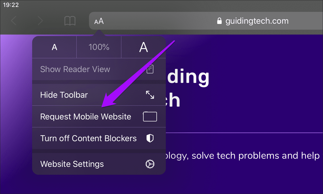
Note: The change only applies to the active tab that you are currently viewing and not to the entire browser. You must repeat this action for other tabs if you want to switch the other sites to mobile view.
If you want to roll back to the desktop mode, bring up the ᴀA icon-based menu again, and then tap the Show Desktop Site option. Safari will revert the tab to desktop mode automatically in case you stray away to another website.
2. Load Single Site in Mobile Mode – Permanently
If you want to load a specific website in mobile mode permanently, regardless of whichever tab it is that you are on, then you must make a slight configuration to the content settings of the site. Bring up the ᴀA menu, and then tap Website Settings.
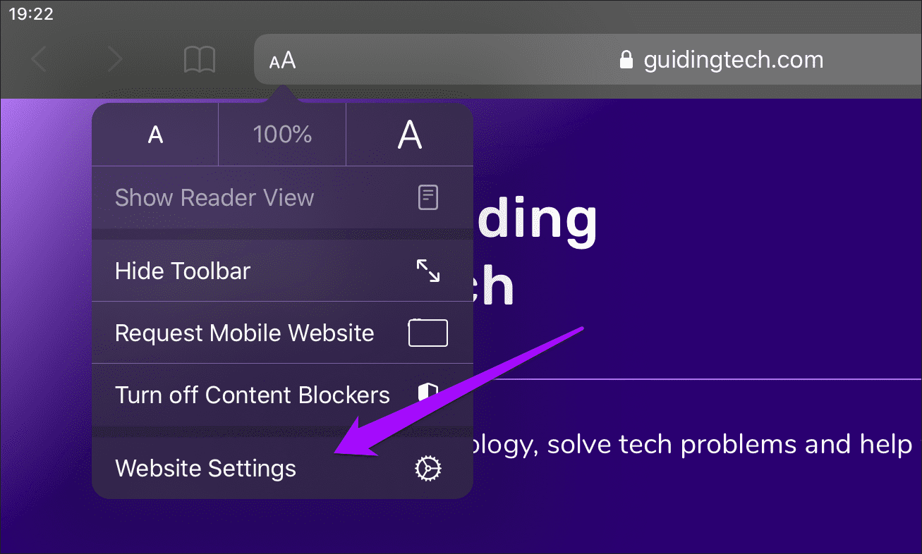
On the Website Settings sheet that shows up, turn off the switch next to Request Desktop Site and tap Done to apply your changes.
Safari will automatically refresh the website and relaunch it in mobile mode. And it will continue to do so, even when you launch the site (and all related web pages) in other tabs. That will continue even if you quit the Safari app and reopen it.
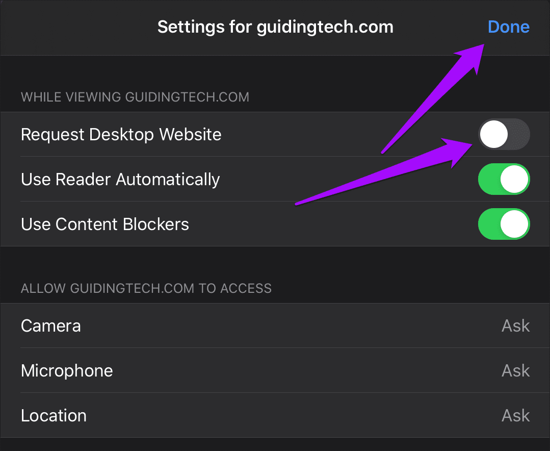
If you want to go back to using the desktop version of the website, make sure to open the site in the tab you are currently on, bring up the Website Settings sheet from the ᴀA icon-based menu, and then turn on the switch next to Request Desktop Site.
Alternatively, you can request the desktop version temporarily by tapping the Show Desktop Site option on the ᴀA menu.
3. Load All Sites in Mobile Mode
Getting sick and tired of sites loading in desktop mode? You can actually configure Safari to load all websites in mobile mode by default. That is ideal if you don’t have a keyboard or mouse set up on your iPad , and instead want a great touch-based experience with Safari.
Start by opening the Settings app on your iPad. Go down the left-hand side, select Safari, and then flick through the list of Safari settings until you get to the Settings for Websites section. Tap the Request Desktop Website option underneath it.
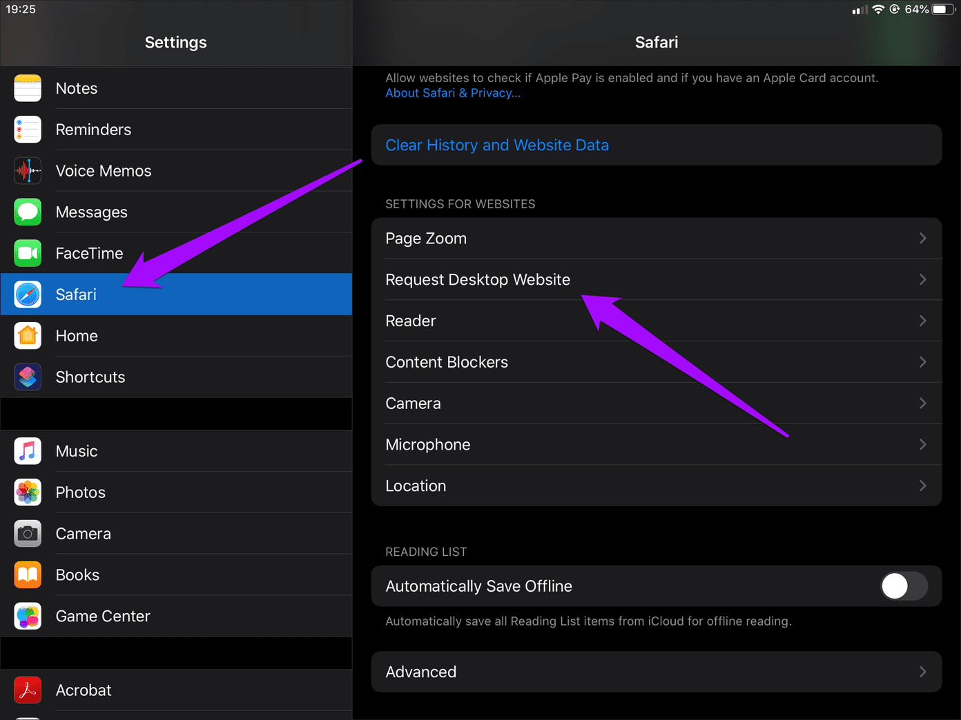
On the Request Desktop Website screen that shows up, turn off the switch next to All Websites. That should prompt Safari to load all sites in mobile mode.

Note: Safari will continue to open sites in mobile mode until you go back to the Request Desktop Website setting within Settings > Safari and turn on the switch next to All Websites.
If there are sites that you’ve manually configured to show up in mobile mode using the previous method, then the Request Desktop Website screen will show up slightly differently.

In this case, you will see a list of all excluded sites, and the All Websites option will show up as Other Websites — turn off the switch next to it to make Safari load all sites in mobile mode.
Mobile Mode to the Rescue
Apple did the right thing by configuring Safari on iPadOS to launch sites in desktop mode by default. However, using a keyboard and a mouse to interact with some of the more complicated sites will certainly make a difference. So the next time a website gives you grief, know that mobile mode is a few taps away.
Next up: Did you know that you can use multiple Safari windows in iPadOS? Here’s everything you need to know about using them.
Was this helpful?
Last updated on 28 November, 2022
The above article may contain affiliate links which help support Guiding Tech. However, it does not affect our editorial integrity. The content remains unbiased and authentic.
Leave a Reply Cancel reply
Your email address will not be published. Required fields are marked *

The article above may contain affiliate links which help support Guiding Tech. The content remains unbiased and authentic and will never affect our editorial integrity.
DID YOU KNOW
Dilum Senevirathne
Dilum Senevirathne is a freelance tech writer specializing in topics related to iOS, iPadOS, macOS, Microsoft Windows, and Google web apps. Besides Guiding Tech, you can read his work at iPhone Hacks, Online Tech Tips, Help Desk Geek, MakeUseOf, and Switching to Mac.
More in iOS
6 Best Fixes for Speed Limit Not Showing in Apple Maps on iPhone
13 Ways to Connect iPhone to Mac and Smoothen Your Workflow
Join the newsletter.
Get Guiding Tech articles delivered to your inbox.
How to Open Safari Developer Tools & Enable Mobile View Mode

John on May 12, 2021

In this tutorial, we will learn how to open the Safari developer console and enable mobile view for responsive web development.
How to Enable Safari Developer Tools
If you don't have developer tools enabled in Safari, you will need to do this before the console can be opened by using the following steps:
- From the main menu go to Safari > Preferences (or use the CMD + , keyboard shortcut.)
- Go to the Advanced tab.
- Check "Show Developer menu in menu bar"
Open the Safari Developer Console
Now open the developer console in responsive mode by going to the menu and selecting Develop > Enter Responsive Design Mode :
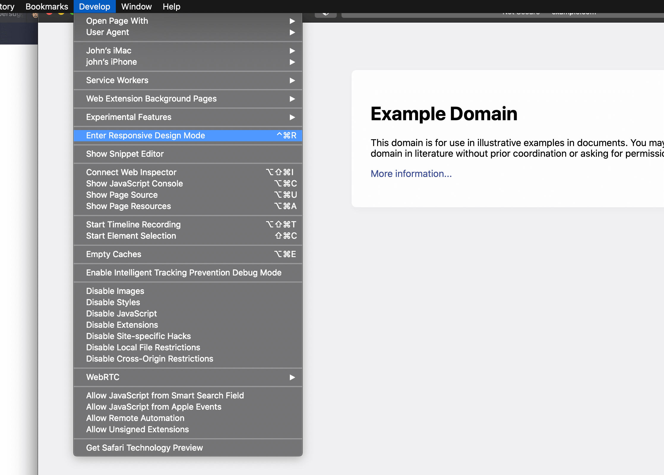
Alternatively, use the keyboard shortcut CTRL + CMD + R to enter responsive developer mode.
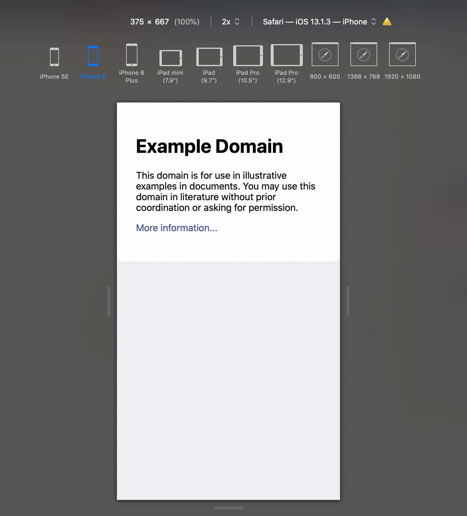
Now you can work on your website in a variety of different mobile device screen sizes by selecting them at the top of the page:
Related Tutorials

How to Stop DDOS Attacks & Prevent Future Downtime
-1589655824.jpg)
How to Enable Night Light Mode on Windows 10
How to View Desktop Site on iPhone with Safari

How to Use Grep Command to Search Files in Linux

How to Find Words on a Page using Safari on iPhone
How to Clear & Save Disk Storage Space on a Mac
Stack Exchange Network
Stack Exchange network consists of 183 Q&A communities including Stack Overflow , the largest, most trusted online community for developers to learn, share their knowledge, and build their careers.
Q&A for work
Connect and share knowledge within a single location that is structured and easy to search.
How can I quickly open a mobile view of a page in a desktop browser?
Since we're now in a mobile-first world, it becomes more and more important to be able to test websites easily on mobile phones, or on emulated mobile phones. I collaborate with people who work on websites and social media offerings, and I would like to encourage them to regularly open websites from their desktop browsers in a mobile view. I'm specifically thinking of the browser's built-in "mobile view" feature, which is often hidden among all the other developer tools a browser provides, but I'm happy to consider anything which is just as quick to set up.
How can you open a mobile view of a website from a desktop browser?
- 23 "Since we're now in a mobile-first world" Woah there a minute... context is for kings. – Lightness Races in Orbit Feb 6, 2018 at 12:49
- 3 Just a comment - don't know the context really, but if I was asked to be opening webpages from my desktop/laptop in mobile view first ....what's the point of using the desktop? I hope by "encourage", you're not forcing it via some code or other method. Especially since many webpages that do format for mobile are pared down quite a bit and don't have full functionality. – BruceWayne Feb 6, 2018 at 16:27
- 1 Add a change user agent or similar extension or plug in to your browser, and set a smart phone user agent. – Salman A Feb 6, 2018 at 17:10
- 1 “I would like to encourage people to regularly open websites from their desktop browsers in a mobile view.” ...That's goofy. And waste all that desktop screen real estate? Desktop and mobile both have their place, and that's why responsive solutions have been developed. Let's deliver the best experience possible for every user, and let people browse on the device that's most comfortable for them. Anyway, valid question, as web designers and developers need to emulate multiple devices when building sites. – Mentalist Feb 7, 2018 at 2:52
- 2 @Mentalist I meant people who are working on websites and social media offerings. – Flimm Feb 7, 2018 at 7:28
6 Answers 6
- In Windows/Linux, press Ctrl + Shift + M
- In macOS, press option + command + M
You can also find the menu item under ("Tools"), "Web Developer", "Responsive Design Mode".
Chrome and Edge:
You need to have "Developer Tools" open first:
- In Windows/Linux, press Ctrl + Shift + I or just F12
- In macOS, press option + command + I
Once developer tools is open and focused, you can toggle device emulation:
- In macOS, press command + shift + M
There is a small button in the developer tools toolbar that enables device emulation, if you prefer to click a button rather than press a keyboard shortcut.
It looks like Apple have disabled by default the keyboard shortcut for entering responsive design mode. You can follow this tutorial on configuring a keyboard shortcut for it .
You can find the menu item by clicking "Develop", "Enter Responsive Design Mode". If you can't see the "Develop" menu item, you need to enable it by opening "Preferences", "Advanced", and ticking "Show Develop menu in menu bar".
- 1 Note that ctrl shift M works only if developer tools are already open – Naramsim Feb 6, 2018 at 10:29
- 3 @Naramsim Thanks. That only applies to Chrome. I've edited my answer. – Flimm Feb 6, 2018 at 11:19
- 3 For Windows/Chrome, F12 is a potentially easier way to get to Dev Tools... although if the next keystroke is going to be Ctrl-Shift-M, I suppose starting with Ctrl-Shift-I may be more logical. – sǝɯɐſ Feb 6, 2018 at 13:21
- I believe on previous versions of Safari Cmd+Shift+R would open responsive design mode. Seems to not exist on latest version unless you manually bind it – Downgoat Feb 6, 2018 at 23:52
- 1 Chrome remembers if you wanted a mobile preview, so once you've enabled it, you can toggle between mobile/desktop simply using F12 – Pieter De Bie Feb 8, 2018 at 12:26
Flimm’s answer is 100% correct. Just in case remembering the shortcuts is too much of a hassle, it’s this blue button in the Developer Tools to toggle between the web view and mobile/tablet view:
Or with Firefox:
After enabling the device toolbar, you can then choose the make and model of the device you wish to emulate from the dropdown menu.
- 1 What piece of software does the first part refer to? – Kamil Maciorowski Feb 7, 2018 at 5:22
- @KamilMaciorowski DevTools is the developer tool found in Chrome and Opera. – OptimusCrime Feb 7, 2018 at 7:46
- @KamilMaciorowski This is not a software, this is available on any of your web browser. Specifically if you're using chrome, right click on any window and click on inspect and you will see this window in your browser docked below or to the right of the browser. These are more commonly known as Dev Tools. – Shobhit Garg Feb 7, 2018 at 16:13
- @Shobbit Garg Is that the windows, which opens when I press CTRL + Shift + C? – daniel.heydebreck Feb 8, 2018 at 8:22
- @daniel.neumann Unfortunately I use mac, so I cannot test and see what happens when you press those keys. But referring to the shortcuts listed above, this window should open by pressing "ctrl + shift + I" on chrome, "ctrl + shift + M" on firefox or pressing f12 on IE/Edge. – Shobhit Garg Feb 8, 2018 at 15:04
For the purpose of testing, i use the following websites :-
- http://www.jamus.co.uk/demos/rwd-demonstrations/
- http://mattkersley.com/responsive/
Both of the above sites allow me to view my web application in multiple device widths.
You can set the user agent and window size from the command line or launch config of a shortcut.
For example:
& "C:\Program Files\Google\Chrome\Application\chrome.exe" --new-window --window-size=375,812 --user-agent="Mozilla/5.0 (Linux; Android 8.0; Pixel 2 Build/OPD3.170816.012) AppleWebKit/537.36 (KHTML, like Gecko) Chrome/87.0.4280.67 Mobile Safari/537.36" --user-data-dir=C:\workspace\tmp\chrome https://google.com
The --user-data flag is mandatory to make this work . Create a folder for it.
Add a "user agent switcher" extension in your browser and specify a mobile user agent. If the website is smart enough it will serve you mobile optimized version.
I will not recommend any specific extension. The ideal one should have presets for mobile browsers built-in and the ability to enable or disable user agent switching on per-website basis.
- 1 This is incorrect. Mobile layouts should work based on device / screen dimensions via CSS media queries, not user agent strings - it's not 2006 any more. – PiX06 Feb 7, 2018 at 13:51
- Most browsers' tool that allows a mobile view also lets you set a user-agent at the same time. – Flimm Feb 7, 2018 at 14:33
- 1 @PiX06 then no effort is necessary. Just resize the browser window! – Salman A Feb 7, 2018 at 15:04
- Unfortunately, I find myself with many questions: If I'm resizing the browser window anyway, why do I need to bother with user agents? To which dimensions should I resize the window? How do I measure the window? – Mathieu K. Feb 9, 2018 at 5:26
The above answers are great for those who like to stick with a single browser, or have limited desktop "workspace" (eg. single monitor less than 21" at a low res).
There is actually an even more interesting solution I've recently discovered: https://blisk.io/
I will refrain from using the (sort of) "affiliate link" for any personal gain (There is a "token based system" that you can earn credits to get things like free "team cloud space" & "premium features" to use with it), but Blisk is actually pretty snazzy.
This Chromium-based "browser built for development" provides a multitude of ways to demo the page in various devices with a vertical "pane" on the LEFT side, much like you see Chrome Developer Tools default to the right vertical column.
It's work a look. Though there are some limits to its "freemium extended functionality", it still works very well to "preview" both the PC and Mobile versions of your pages / sites in a side-by-side comparison. The paid features seem pretty rad too if you work in remote teams (though I personally think it need a better "test drive" program before hooking people on the monthly cost).
Full disclosure: there is an EXTREMELY annoying "time limit" per day on the mobile preview part (toggles open/closed from the icon to the right of the address bar - change the "device preview" from the tiny link-to-the-menu in the top right corner "Show device list").
BliskDemoScreenshot
Also: I've found a few really nifty tricks with Browser Extensions like the 2 different "User-Agent Switcher"'s from Chrome/Firefox that go a bit further by letting you toggle between browser user-agent strings of various Operating Systems AND the browsers for them.
I prefer the "esolutions.se" flavor because of how easy it is to add custom user-agent strings to the list for as many customizations as you could ever want (runs offline also, which can be handy in certain cases): https://chrome.google.com/webstore/detail/user-agent-switcher/clddifkhlkcojbojppdojfeeikdkgiae
Anyway, that's my 2 cents. :P
- not available for Linux :-( – david.perez Mar 3, 2020 at 14:52
You must log in to answer this question.
Not the answer you're looking for browse other questions tagged browser ..
- The Overflow Blog
- Why configuration is so complicated
- Is GenAI the next dot-com bubble?
- Featured on Meta
- New Focus Styles & Updated Styling for Button Groups
- Upcoming initiatives on Stack Overflow and across the Stack Exchange network
- Google Cloud will be Sponsoring Super User SE
Hot Network Questions
- Spectral Estimation Techniques
- Can you tile a 15x16 rectangle using eight rectangles whose sizes are 1x2, 2x3, 3x4, ... 8x9?
- JQ returns json lines without commas
- Why does the USAF still use the C-17 Globemaster III?
- Snail matrix in Java - version III (generalizing)
- In simple words, how does UK's Conservative party manage to retain dominance?
- Would normal atoms and antimatter atoms be attracted to each other?
- Can hotel booking companies make up any "original price" they want, or does the claimed original price have to be somehow grounded in reality?
- What type of cable is this (optic fiber) connecting to router?
- Platform Events a nightmare - How to make them work in real life
- Using CC BY SA video with my own copyrighted music
- How do believers in hell respond to the argument "What finite crime deserves an infinite punishment?"?
- Worthwhile to put a telescope on the far side of the Sun?
- CountryData syntax
- Can you use "in any way" and "at all" together in a single sentence?
- Why are all the closed surfaces that appear in Gauss' law section very long or infinitely continued?
- Why has the number of Germans in Kazakhstan begun to increase?
- What governs our "perception?" about the platonic realm of sets?
- EC261 with multiple connections
- Possible to dot your Is with hearts?
- Can a function have a set as its value?
- First Isomorphism theorem for rings - what am I missing
- Earliest real-world uses of Calculus and Linear Algebra
- Add language version option unavailable
- PC & Mobile
How to View the Mobile Version of a Website on a PC
Lee Stanton Lee Stanton is a versatile writer with a concentration on the software landscape, covering both mobile and desktop applications as well as online technologies. Read more November 9, 2021
If you’re a web developer or own an online business, you might be curious to know how a mobile site looks on a desktop. The appearance and functionality of your mobile site could be crucial as more than half of Internet traffic comes from phones. Customers are more likely to stay on a site longer or buy something if it’s visually appealing. A desktop view could also help you make edits and fix possible issues sooner.

Fortunately, this is a relatively straightforward process. In this article, we’ll show you how to view a mobile version of a website on different devices and browsers.
How to View the Mobile Version of a Website in Chrome on a Mac
In Chrome, you can test the front end and see if all of the website’s components are operating properly by using a built-in developer tool called DevTools. Because it provides predefined device choices, DevTools is the greatest way for the developer to rapidly shift the view from desktop to mobile and vice versa without any developer extensions.
You can also change the screen size to fit your needs and adjust the screen width and height to see how your website will look on different screen sizes. To do so on a Mac, follow these steps:

When you’re finished, just shut the developer tools window to close the mobile version of the website.
How to View the Mobile Version of a Website in Chrome on a Windows PC
If you want to view a mobile version of a website on windows PC in Chrome, it’s pretty a similar process:

- In Chrome, go to the website you wish to see in the mobile version.

- The Developer Tools window will open.

- You can now modify the screen’s dimensions to suit your needs.
How to View the Mobile Version of a Website in Chrome on a Chromebook
Accessing the mobile version of a website in Chrome using a Chromebook is very similar to the first two methods.

This will bring up the user interface for the mobile site. You may also pick the preferred device experience by selecting the make and model from the dropdown box. The webpage will refresh as a desktop site whenever you close the developer tools console.
How to View the Mobile Version of a Website in Firefox on a Mac
You can use other web browsers like Firefox to view a mobile site on a Mac desktop. Resizing the browser window is one of the methods most web developers use to evaluate the responsive design website. However, most of the time, this alternative will not appear acceptable.
That’s where the Firefox browser’s web development capabilities come in handy. You can browse your web pages in multiple resolutions if you know how to access mobile versions of websites in Firefox. Follow these steps:
- Open the mobile version of the website you wish to see.

How to View the Mobile Version of a Website in Firefox on a Windows PC
Windows PCs also have the option to view mobile versions of websites using Firefox. Here’s how to do so:

How to View the Mobile Version of a Website in Safari on a Mac
We’ve covered how to view a mobile website on a desktop using Chrome and Firefox. But what about the default browser that comes with Mac devices, Safari? Luckily, it is possible to view a mobile version of a website in Safari as well.


Additional FAQ
Can i view the desktop version of a website on my phone.
The answer is yes! You can switch from the mobile version to the desktop version to check it out without using a computer. The steps to shift the mobile version to the desktop version in Chrome are as follows:
1. Go to the website you want to see in desktop view.
2. Tap on the three-dot icon to access the menu.
3. Select the “Desktop View” option now.
Keep in mind that these steps can vary depending on the phone you’re using.
Making Mobile Web Designing Easier
The developer tools are great to analyze and modify a mobile version of a website on a desktop without switching devices. You can change the screen size to observe how the components function on various devices. You can adjust different components and create the website for multiple screen sizes using the responsive mode.
When designing a website, the designer should always keep in mind how the front end of the site appears on phones, tablets, and desktops. Using the methods described in the article can also help the developer to do so and also to identify which components of a website are creating issues to fix them.
Have you ever tried viewing a mobile version of a site on your desktop? Which browser do you prefer to use to do so? Let us know in the comments section below.
Related Posts

Disclaimer: Some pages on this site may include an affiliate link. This does not effect our editorial in any way.

Lee Stanton March 14, 2024

Lee Stanton February 23, 2024

Lee Stanton February 19, 2024
Send To Someone
Missing device.
Please enable JavaScript to submit this form.

How to View Your Website on Mobile in 30 Seconds or Less
Ever wonder what your website looks like on a smartphone? There’s a simple way to do it even if you don’t have your phone handy. Use your computer. It’s easy to do and we’ll show you how.
And if you want to see the desktop view of your website on your phone? We’ll walk you through that, too. We’ll even show you the options for different ways to view your site using website builder tools.
Use Desktop Browser View to See the Mobile Version of Your Site
Popular browsers like Google Chrome and Safari have many semi-secret features that most casual users don’t know about. One of those is the ability to view the mobile version of a website from your desktop computer.
Why should you care? According to analytics firm Statista, nearly 60 percent of website traffic comes from people using mobile devices—and this doesn’t even include those using tablets. Knowing this, you can’t afford to give your mobile visitors a subpar experience.
If you have or manage a website, especially one with an ecommerce component, you want to make sure your site is mobile-friendly . The easiest way to identify issues is to see how your site looks when viewed on a smartphone. The more responsive your site , the better the visitor experience.
Every popular browser lets you see your site through the “eyes” of a mobile phone. While the interfaces vary among browsers, all make it easy to do. Let’s take a look at how this works in two of the most popular browsers, Google Chrome and Safari.
View your mobile site on Google Chrome desktop browser
Step 1 – Open the Inspect Element tool
There are four ways to access the Inspect Element tool in Google Chrome.
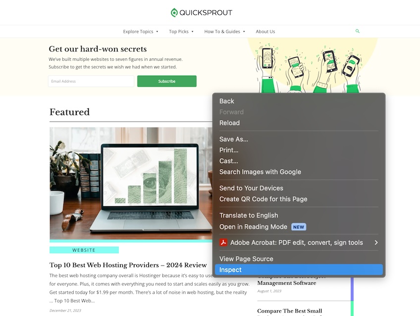
Option 1: Open Chrome, navigate to your site, then right-click anywhere on the page. In the drop-down menu that appears, select Inspect .
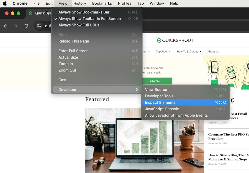
Option 2: In the top navigation menu, select View > Developer > Inspect Elements.
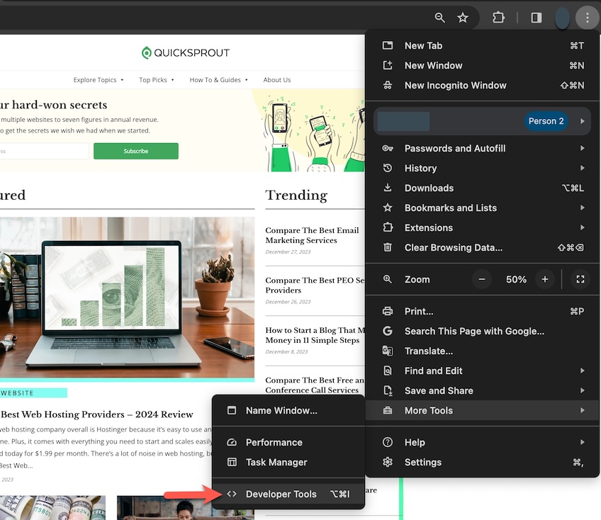
Option 3: Select the three-dot icon in the top right corner of the Chrome window, then choose More Tools > Developer Tools .
Option 4: Use a keyboard shortcut. On Windows, it is Control+Shift+C , and on Mac Command+Option+C .
Step 2 – Activate the Toggle Device Toolbar
Once you open the Inspect Element tool, the screen is then divided into two parts. One side will show your site and the other side is filled with code and technical data.
On the side of the screen with the code, navigate to the Toggle Device Toolbar icon in the upper left corner. It looks like a desktop monitor with a mobile phone icon in front of it. This is the icon you click to change the view of your site on the other side of the screen.
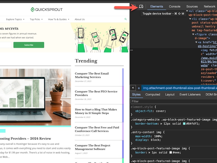
Click the icon to go back and forth between mobile and desktop view. The image on the left will change to reflect the current view.
Here’s how the screen looks when you choose mobile view. You’ll also see a new set of icons above the mobile image. More on that in the next step.
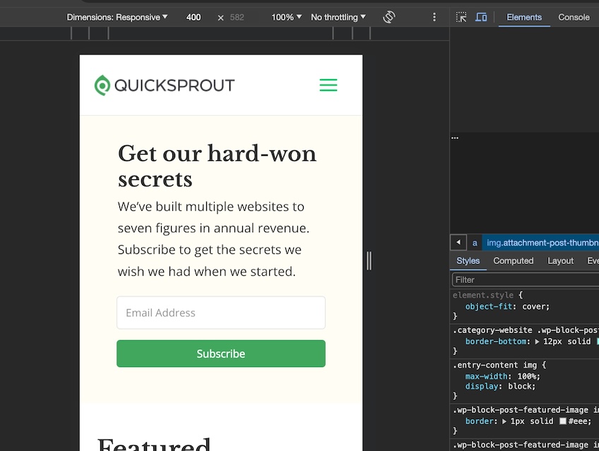
Step 3 – Select device to preview
Now you can explore how your site looks in different mobile scenarios. You can choose preset options or customize your own.
When you select the Dimensions: Responsive dropdown menu, you can choose a device-specific option.
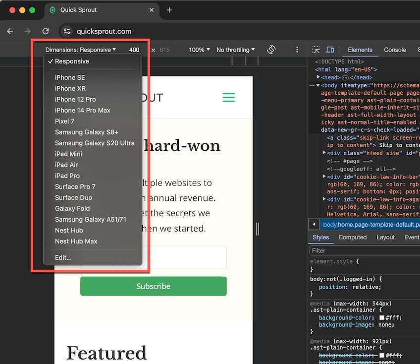
You can also edit this list to add or delete devices. This lets you fully customize the website views on mobile devices that matter most to you.
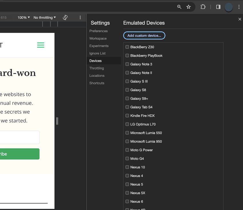
You can also fully customize the mobile size by manually changing the width and height dimensions.
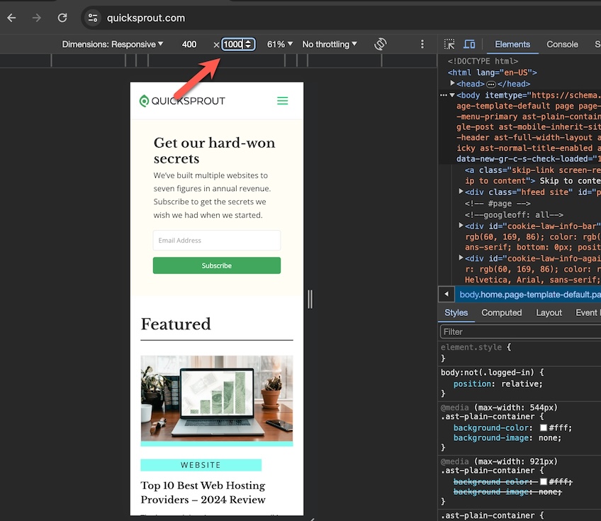
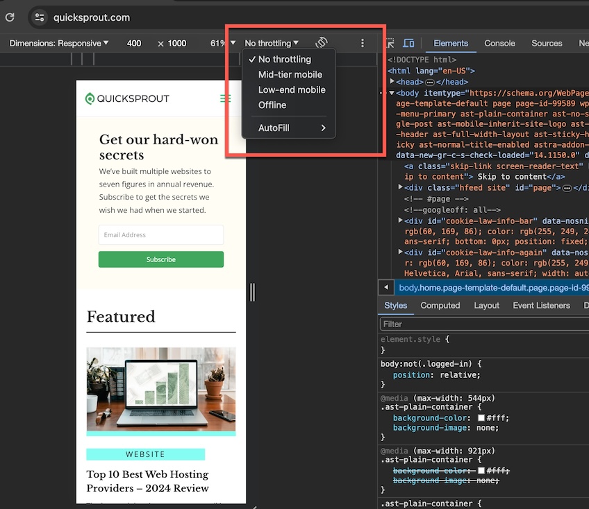
You can even test different internet speed scenarios with the Throttling dropdown menu. If you’re not familiar with bandwidth throttling, it is a tool some web hosting providers use to control shared server resources.
View your mobile site on Safari desktop browser
You must enable Safari’s developer tools for this to work. In MacOS Sonoma, do this by choosing Safari > Settings from the top navigation menu, then toggle the Show features for web developers checkbox options to ON. You’ll see Develop added to the top navigation menu.
Step 1 – Open Inspect Element tool in Safari
There are three ways to open the Inspect Element tool in Safari.
Option 1: Navigate to your site, then right-click anywhere on the page and select Inspect Element from the drop-down menu.

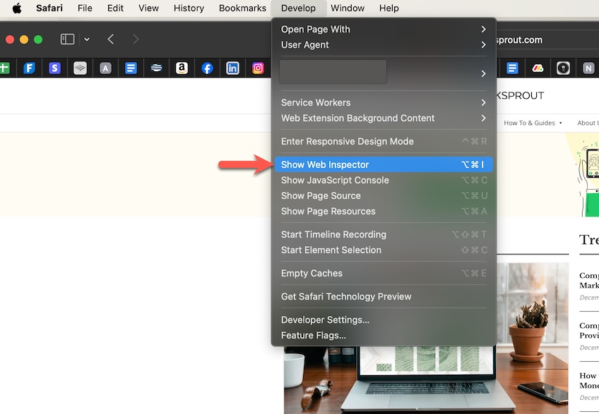
Option 2: From the top navigation menu, select Develop > Show Web Inspector .
Option 3: Use the keyboard shortcut Command + Option + I (capital letter ‘i”).
Step 2 – View device display options
Once you’re in Web Inspector mode, the Safari screen is divided in half. One side displays your site, and the other shows code and other developer-specific information.
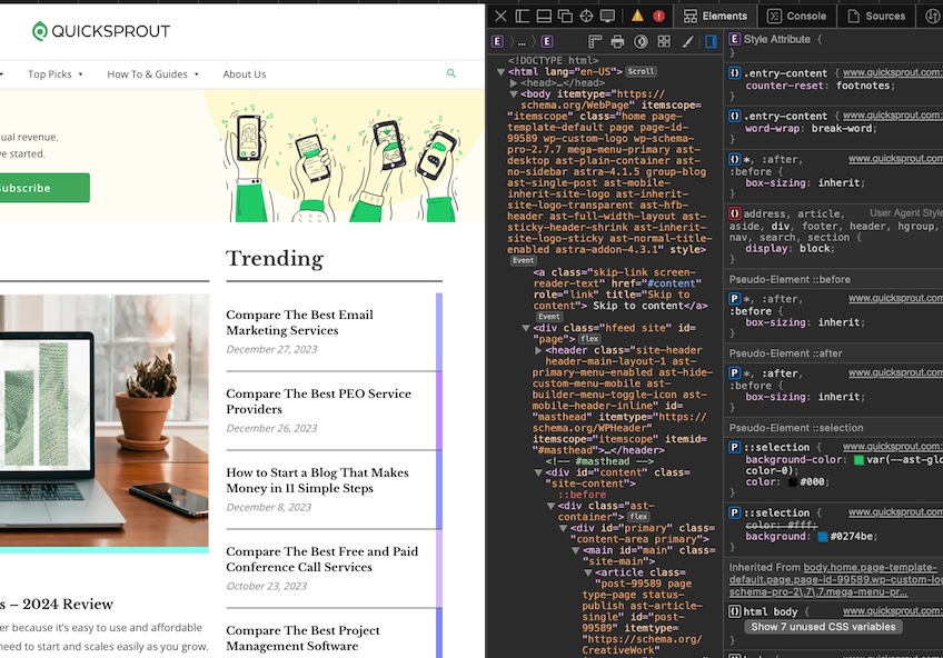
Don’t be alarmed. It may look intimidating, but unless you plan to tweak HTML or CSS code, you don’t need to go into Web Inspector mode at all. Safari gives you a direct menu option for viewing your site on mobile.
Jump straight into mobile view by choosing Develop > Enter Responsive Design Mode from the top navigation menu.
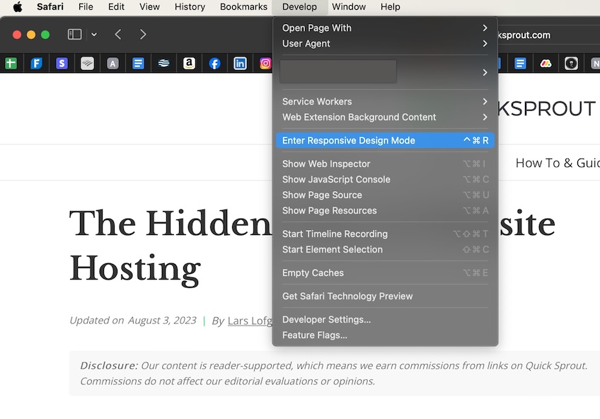
This is how the screen will look after you select Enter Responsive Design Mode without first opening Web Inspector .
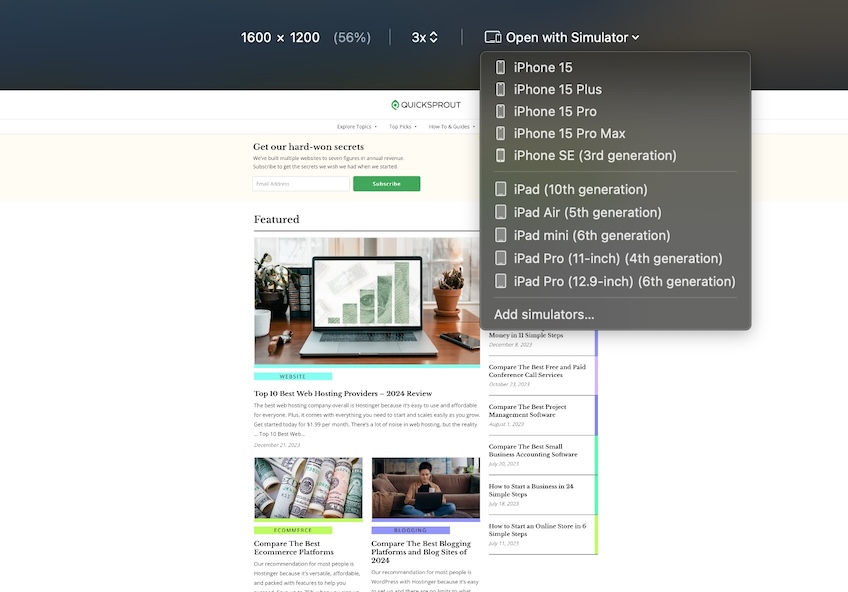
Here you can view your website in different iOS settings. Choose from predefined settings or customize as needed.
Enable Desktop View on Your Mobile Browser
More and more people use their smartphones to shop and conduct day-to-day activities. So it’s no surprise that website owners must keep the latest mobile trends in mind and optimize their site for mobile traffic.
In the quest to embrace mobile marketing strategies, though, you don’t want to lose sight of the visitor accessing your site the old-fashioned way—with their computer. You want your site optimized for both.
It’s easy to check how your website looks in desktop view even if you only have your mobile device handy. Whether you’re using an iPhone or Android device, here’s how to do it.
Access desktop view on iPhone
The process varies slightly depending on which browser you use on your iPhone. Here we’ll show you how to do it using two of the most popular—Safari and Google Chrome.
View Desktop Mode on Safari Mobile Browser
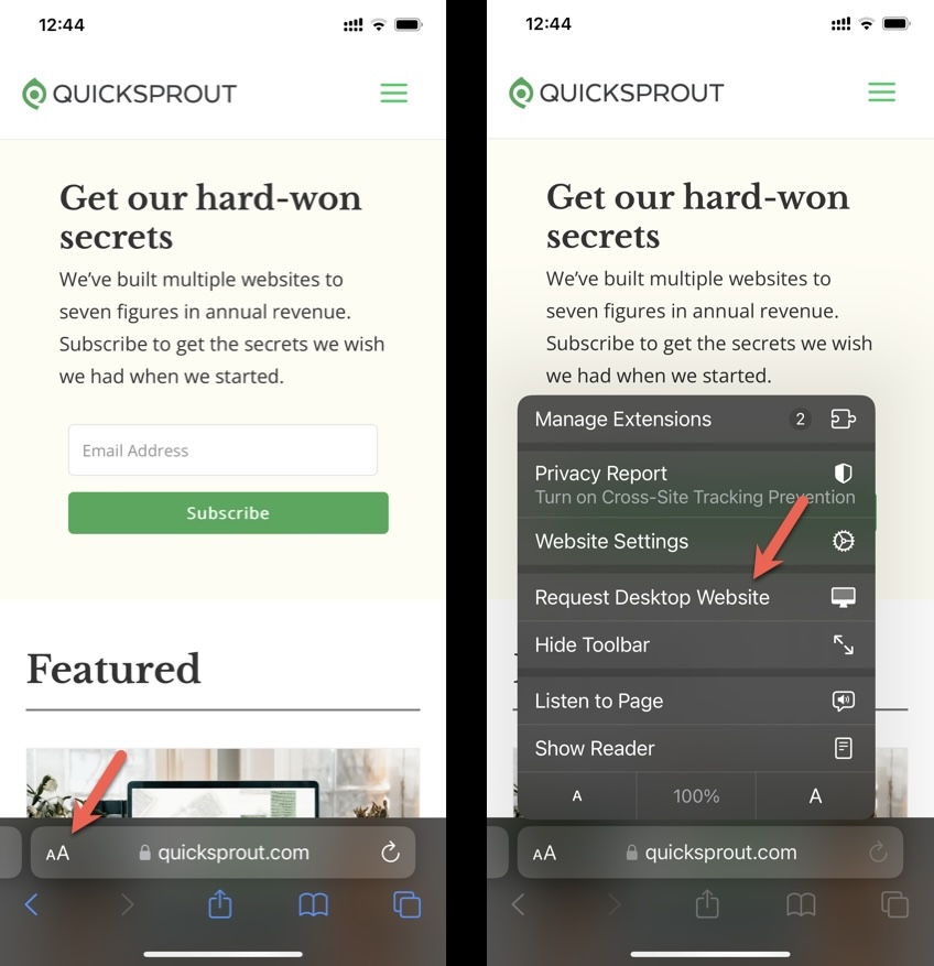
Open the Safari browser on your phone and navigate to your site. Select the Aa icon next to your site’s url. Then select Request Desktop Website from the popup menu. You will now see your site as it appears on a desktop browser.
Desktop Mode on Chrome
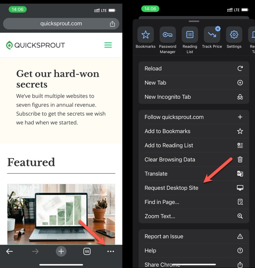
Open the Chrome browser on your iPhone and navigate to your site. Select the three dots icon in the lower right corner. Then select Request Desktop Site from the popup menu.
Access desktop view on Android
Switching to desktop mode in Google Chrome on your Android device is easy.
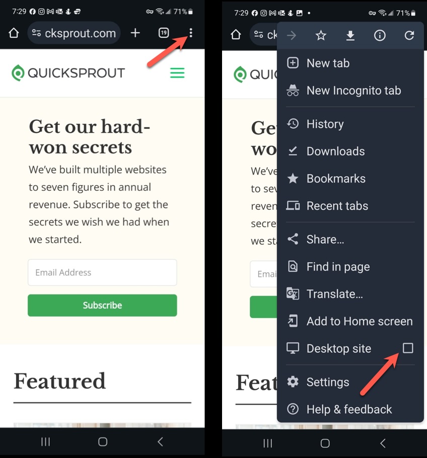
Open Chrome on your phone and navigate to your website. In the address bar, tap the three vertical dots (the Kebab menu), then check the box for Desktop site . That’s all there is to it.
Other Ways to View Your Website On Mobile
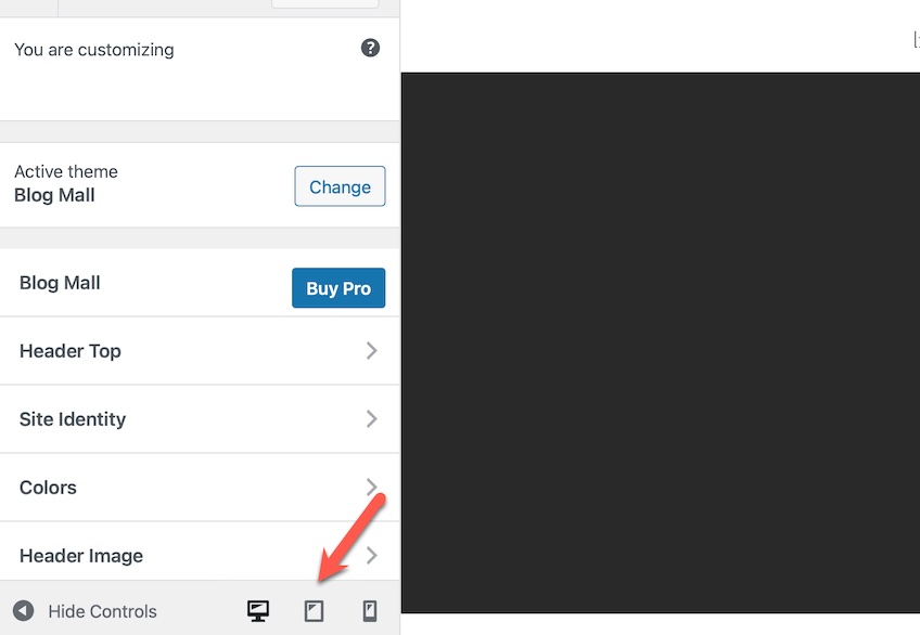
There is another handy way to check the responsiveness of your site. Whether you’re using WordPress , Wix , or any of the other top website builders out there , most have a feature to see your site in mobile, tablet, or desktop view.
In WordPress, for example, you can change the view through the sidebar menu on your Admin Dashboard. On the sidebar menu, choose Advanced > Customize , then look for the icons at the bottom of the left side of the screen. You can toggle between desktop, tablet, and mobile view.
This is a convenient way to make tweaks in real-time to optimize the mobile experience for your visitors.
Privacy Overview
Blazing fast. Incredibly private.
Safari is the best way to experience the internet on all your Apple devices. It brings robust customization options, powerful privacy protections, and optimizes battery life — so you can browse how you like, when you like. And when it comes to speed, it’s the world’s fastest browser. 1
Performance
More with the battery. less with the loading..
With a blazing-fast JavaScript engine, Safari is the world’s fastest browser. 1 It’s developed to run specifically on Apple devices, so it’s geared to make the most out of your battery life and deliver long-lasting power.
Increased performance
We’re always working to make the fastest desktop browser on the planet even faster.
Improved power efficiency
Safari lets you do more online on a single charge.
Up to 4 hours more streaming videos compared with Chrome 3
Up to 17 hours of video streaming 3
Best-in-class browsing
Safari outperforms both Mac and PC browsers in benchmark after benchmark on the same Mac. 4
- JetStream /
- MotionMark /
- Speedometer /
JavaScript performance on advanced web applications. 4
Safari vs. other Mac browsers
Safari on macOS
Chrome on macOS
Edge on macOS
Firefox on macOS
Safari vs. Windows 11 browsers
Chrome on Windows 11
Edge on Windows 11
Firefox on Windows 11
Rendering performance of animated content. 4
Web application responsiveness. 4
4K video streaming
See your favorite shows and films in their best light. Safari supports in-browser 4K HDR video playback for YouTube, Netflix, and Apple TV+. 5 And it runs efficiently for longer-lasting battery life.

Privacy is built in.
Online privacy isn’t just something you should hope for — it’s something you should expect. That’s why Safari comes with industry-leading privacy protection technology built in, including Intelligent Tracking Prevention that identifies trackers and helps prevent them from profiling or following you across the web. Upgrading to iCloud+ gives you even more privacy protections, including the ability to sign up for websites and services without having to share your personal email address.
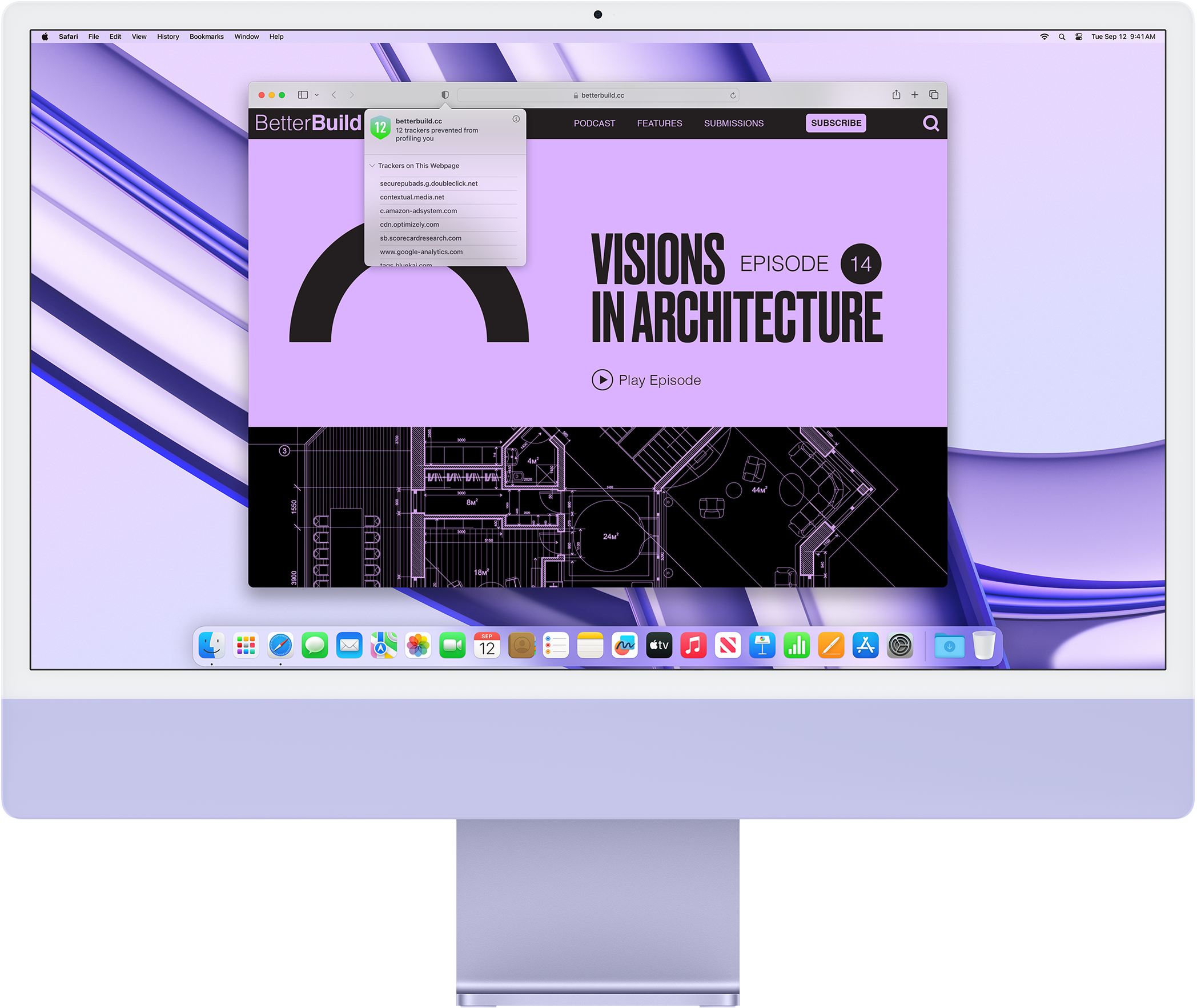
Intelligent Tracking Prevention
Safari stops trackers in their tracks.
What you browse is no one’s business but your own. Safari has built‑in protections to help stop websites and data-collection companies from watching and profiling you based on your browsing activity. Intelligent Tracking Prevention uses on‑device intelligence to help prevent cross‑site tracking and stops known trackers from using your IP address — making it incredibly difficult to learn who you are and what you’re interested in.
Privacy Report
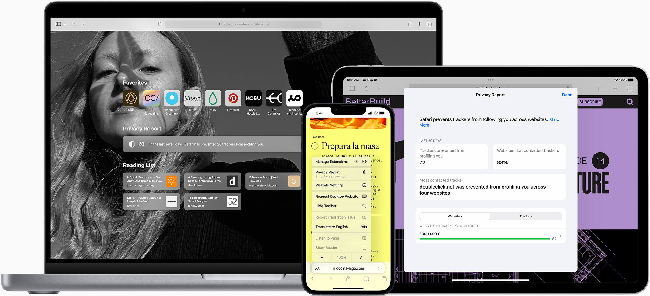
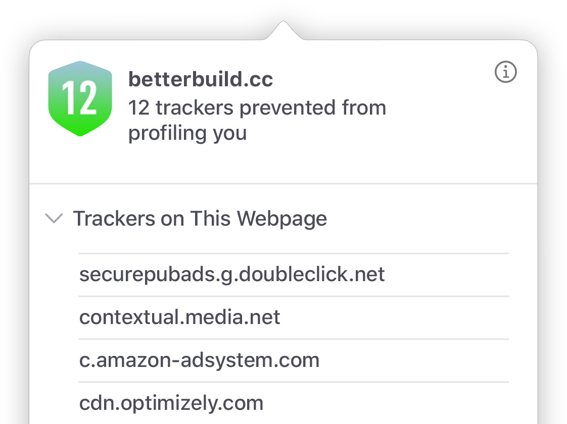
Safari makes it simple to see how your privacy is protected on all the websites you visit. Click Privacy Report in the Safari menu for a snapshot of cross-site trackers currently prevented from profiling you on the website you’re visiting. Or view a weekly Privacy Report to see how Safari protects you as you browse over time.
Customization
Putting the you in url..
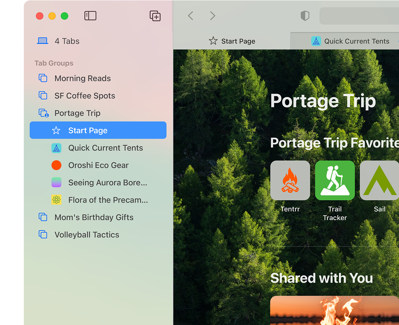
Safari is more customizable than ever. Organize your tabs into Tab Groups so it’s easy to go from one interest to the next. Set a custom background image and fine-tune your browser window with your favorite features — like Reading List, Favorites, iCloud Tabs, and Siri Suggestions. And third-party extensions for iPhone, iPad, and Mac let you do even more with Safari, so you can browse the way you want across all your devices.

Safari Profiles allow you to separate your history, extensions, Tab Groups, favorites, cookies, and more. Quickly switch between profiles for topics you create, like Personal and Work.

Web apps let you save your favorite websites to the Dock on Mac and to the Home Screen on iPhone and iPad. A simplified toolbar and separate settings give you an app-like experience.
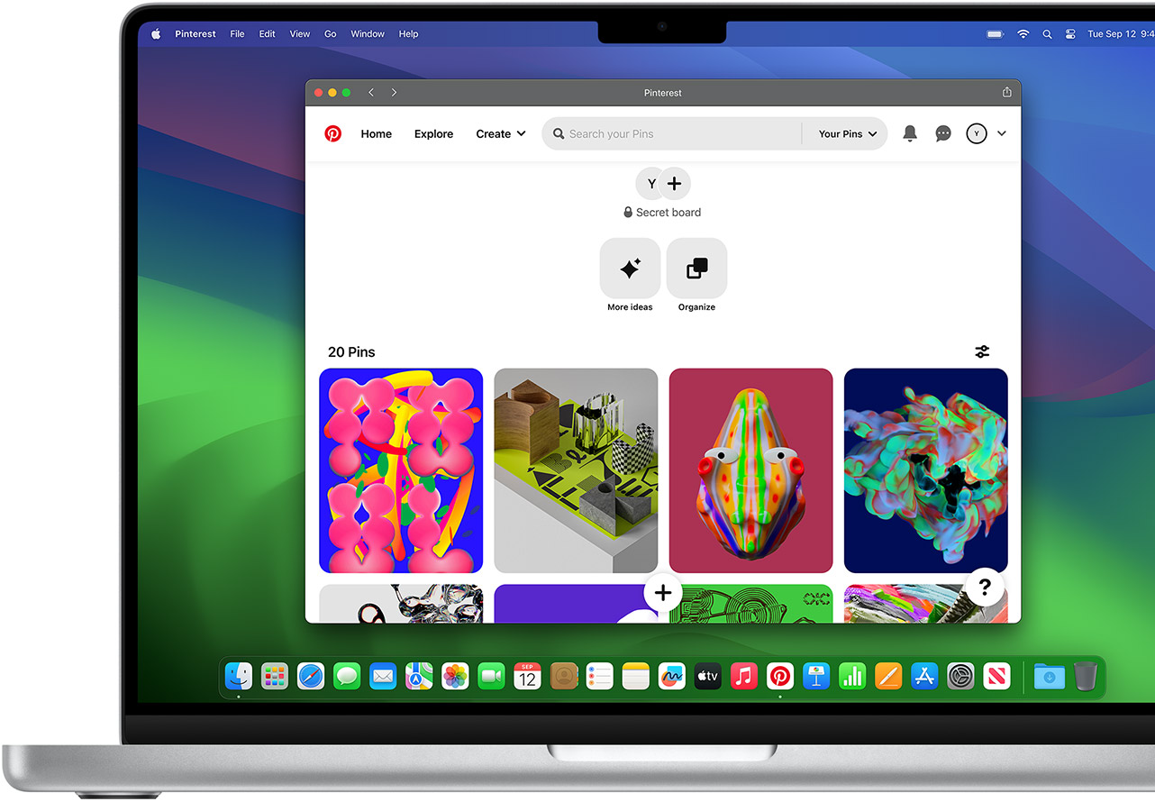
Safari Extensions add functionality to your browser to help you explore the web the way you want. Find and add your favorite extensions in the dedicated Safari category on the App Store.
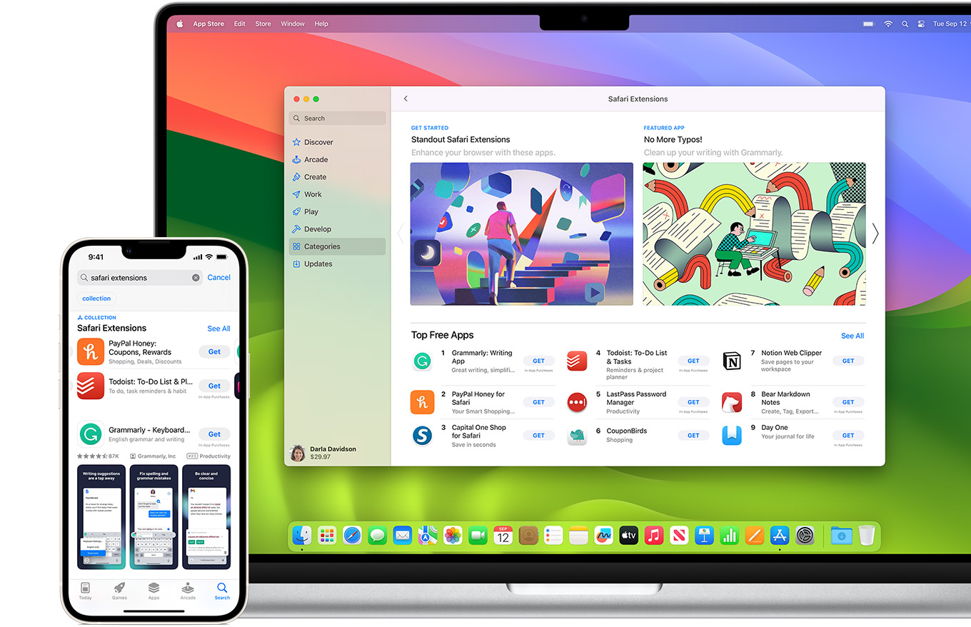
Save and organize your tabs in the way that works best for you. Name your Tab Groups, edit them, and switch among them across devices. You can also share Tab Groups — making planning your next family trip or group project easier and more collaborative.
Smart Tools
Designed to help your work flow..
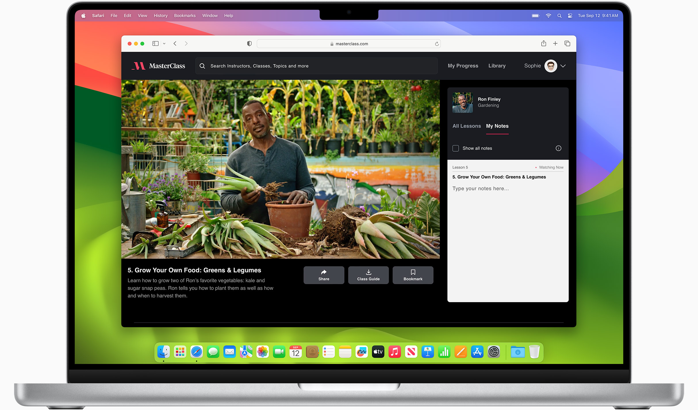
Built-in tools create a browsing experience that’s far more immersive, intuitive, and immediate. Get detailed information about a subject in a photo with just a click, select text within any image, instantly translate an entire web page, and quickly take notes wherever you are on a site — without having to switch apps.
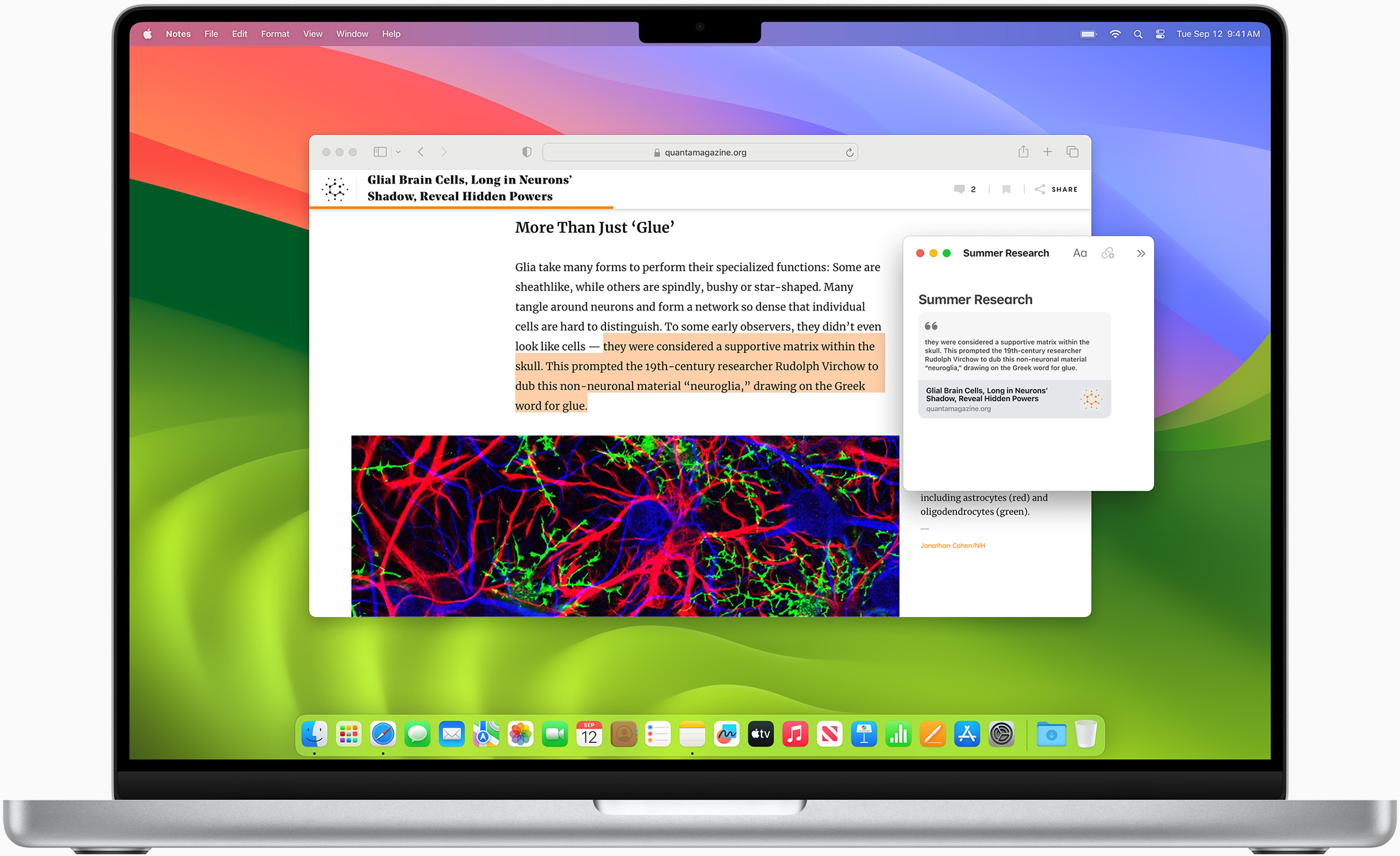
Notes is your go-to app to capture any thought. And with the Quick Note feature, you can instantly jot down ideas as you browse websites without having to leave Safari.
Translation
Translate entire web pages with a single click. You can also get translations for text in images and paused video without leaving Safari.
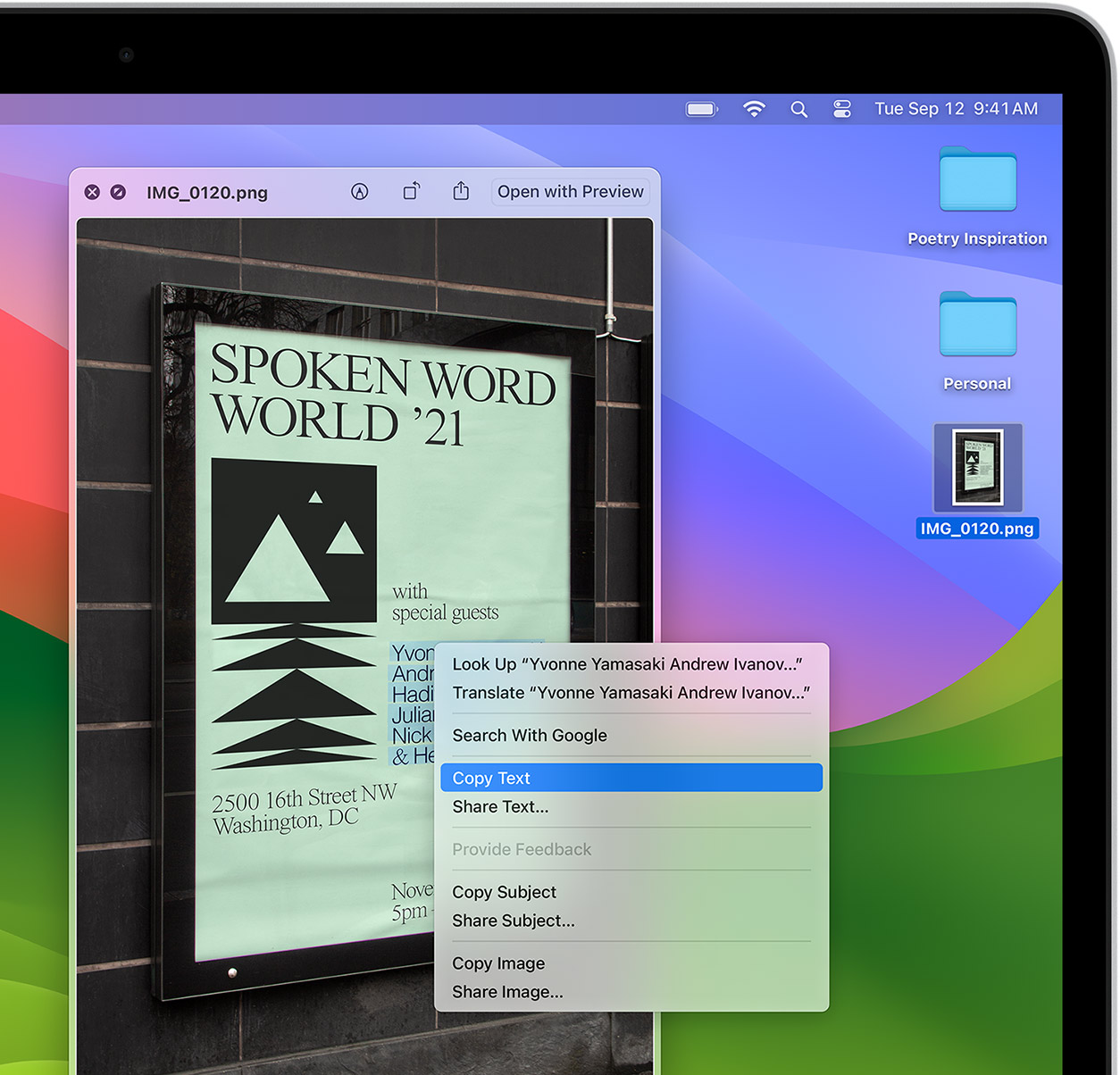
Interact with text in any image or paused video on the web using functions like copy and paste, translate, and lookup. 6
Visual Look Up
Quickly learn more about landmarks, works of art, breeds of dogs, and more with only a photo or an image you find online. And easily lift the subject of an image from Safari, remove its background, and paste it into Messages, Notes, or other apps.

Surf safe and sound.
Strong security protections in Safari help keep you safe. Passkeys introduce a safer way to sign in. iCloud Keychain securely stores and autofills passkeys and passwords across all your devices. Safari also notifies you when it encounters suspicious websites and prevents them from loading. Because it loads each web page in a separate process, any harmful code is always confined to a single browser tab so it won’t crash the entire application or access your data. And Safari automatically upgrades sites from HTTP to the more secure HTTPS when available.
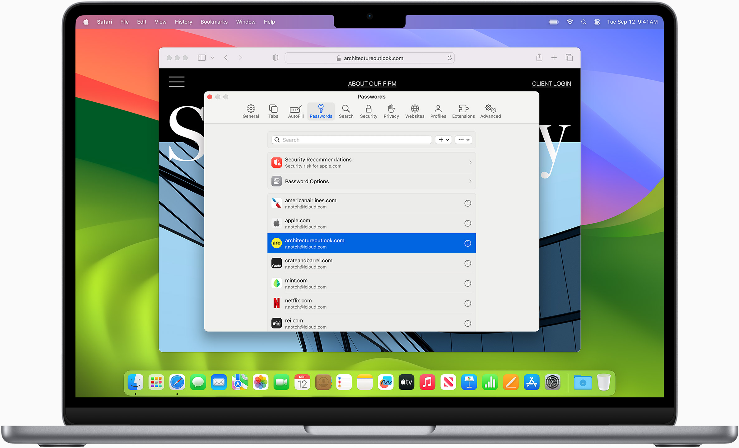
Passkeys introduce a more secure and easier way to sign in. No passwords required.
Passkeys are end-to-end encrypted and safe from phishing and data leaks, and they are stronger than all common two-factor authentication types. Thanks to iCloud Keychain, they work across all your Apple devices, and they even work on non-Apple devices.
Learn more about passkeys
Apple Pay and Wallet make checkout as easy as lifting a finger.
Apple Pay is the easiest and most secure way to shop on Safari — allowing you to complete transactions with Face ID or Touch ID on your iPhone or iPad, with Touch ID on your MacBook Pro or MacBook Air, or by double-clicking the side button on your Apple Watch.
Learn more about Apple Pay
With AutoFill, you can easily fill in your previously saved credit card information from the Wallet app during checkout. Your credit card details are never shared, and your transactions are protected with industry-leading security.
Same Safari. Different device.
Safari works seamlessly and syncs your passwords, bookmarks, history, tabs, and more across Mac, iPad, iPhone, and Apple Watch. And when your Mac, iOS, or iPadOS devices are near each other, they can automatically pass what you’re doing in Safari from one device to another using Handoff. You can even copy images, video, or text from Safari on your iPhone or iPad, then paste into another app on your nearby Mac — or vice versa.
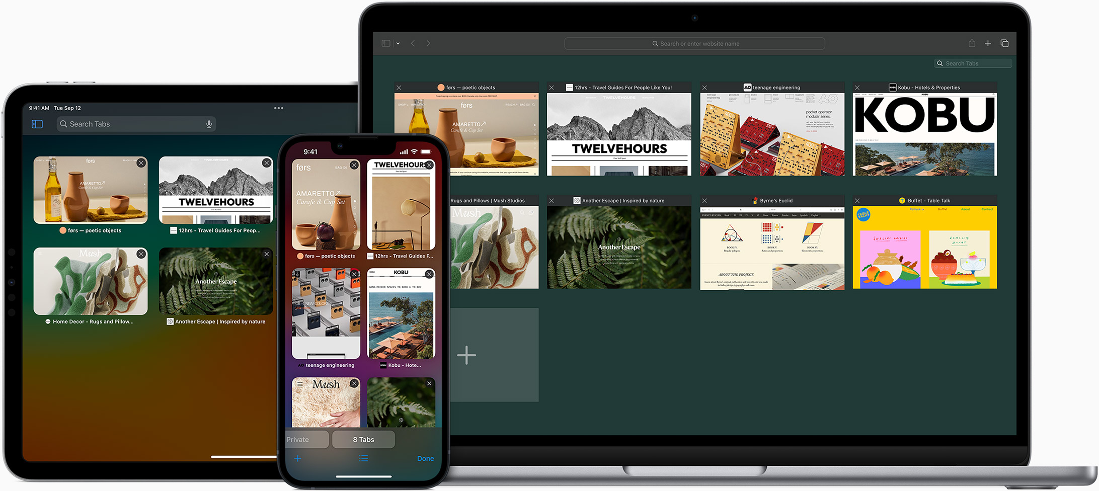
When you use Safari on multiple devices, your tabs carry over from one Apple device to another. So you can search, shop, work, or browse on your iPhone, then switch to your iPad or Mac and pick up right where you left off.
Save web pages you want to read later by adding them to your Reading List. Then view them on any of your iCloud-connected devices — even if you’re not connected to the internet.
iCloud Keychain securely stores your user names, passkeys, passwords, and credit card numbers and keeps them up to date on your trusted devices. So you can easily sign in to your favorite websites — as well as apps on iOS and iPadOS — and quickly make online purchases.
Designed for developers.
Deep WebKit integration between Mac hardware and macOS allows Safari to deliver the fastest performance and the longest battery life of any browser on the platform, while supporting modern web standards for rich experiences in the browser. WebKit in macOS Sonoma includes optimizations that enable even richer browsing experiences, and give developers more control over styling and layout — allowing for more engaging content.
Make Safari your default browser
Customize your start page, view your browsing privacy report, monitor your saved passwords, use apple pay in safari, view your tabs across all your devices, read the safari user guide, get safari support.
How-To Geek
View mobile websites in windows with safari 4 developer tools.
Want to try out mobile websites designed for the iPhone and other mobile devices on your PC? Safari 4 for Windows lets you do this easily with their
Want to try out mobile websites designed for the iPhone and other mobile devices on your PC? Safari 4 for Windows lets you do this easily with their developer tools.
By default, Safari will show standard desktop websites. But by making a simple change, you can switch it to work like Safari Mobile on the iPhone or iPod Touch.
Getting Started
First make sure you have Safari 4 for Windows installed. You can download Safari directly (link below) and install it as usual.
Or if you already have another Apple program installed, such as QuickTime or iTunes, then you can install it from Apple Software update. Simply enter apple software update in the Start menu search box.
And then select Safari 4 from the list of new software available. Click Install to automatically download and install Safari.
Accept the license Agreement, and then Safari will automatically install.
Once this is finished, Safari will be ready to use.
View Mobile Sites in Safari
First, we need to enable the developer tools. Click the gear icon on the toolbar, and select Preferences.
Click the Advanced tab, and then check the box that says “Show Develop menu in menu bar”.
Once you’ve closed your settings box, click the page icon, select Develop, then User Agent, and then choose one of the Mobile Safari settings. In our test we chose Mobile Safari 3.1.2 – iPhone.
To make your browser emulate a mobile device better, you can hide the bookmarks and tab bar to have a more streamlined interface.
Click the Gear icon, and select “Hide Bookmarks Bar”, and then repeat and click “Hide Tab Bar”.
You can also shrink your window to be closer to the size of a mobile device screen. Once you’ve done these things, Safari should look similar to this screenshot. Here we have loaded Google.com, and you can see it in its iPhone-style interface.
Simply enter any website into the address bar, and it will load in its mobile interface if it has one. Here is Google’s other mobile offerings, right inside Windows.
Gmail loads messages with the default iPhone interface.
One especially interesting mobile site is Apple’s online iPhone User Guide . When loaded in Safari with the iPhone setting, it loads with a very nice mobile UI that works just like an iPhone app. In fact, you can even click and drag to scroll, just like you would with your finger on an iPhone.
Even if you do not have a Smartphone, you can still preview what websites will look like on them with this trick. Not all sites will work of course, but it’s fun to play around with different sites that have mobile versions.
Safari 4 Download
Apple iPhone online user guide
The trick to viewport units on mobile
Viewport units have always been controversial and some of that is because of how mobile browsers have made things more complicated by having their own opinions about how to implement them.
Case in point: should the scrollbar be taken into account for the vw unit? What about a site’s navigation or page controls — should those count in the calculation? Then there are physical attributes of the devices themselves (hello, notch !) that can’t be overlooked.
First, a little context
The spec is pretty vague about how viewport units should be calculated. With mobile devices, we’re often concerned with the vertical height, so let’s look specifically at viewport height ( vh ):
vh unit Equal to 1% of the height of the initial containing block.
So yeah, no clear guidance there when it comes to handling device and browser-specific differentiations.
vh was initially calculated by the current viewport of your browser. If you opened your browser and started to load a website, 1vh was equal to 1% of your screen height, minus the browser interface.
But! If you start scrolling, it’s a different story. Once you get past a piece of the browser interface, like the address bar, the vh value would update and the result was an awkward jump in the content.
Safari for iOS was one of the first mobile browsers to update their implementation by choosing to define a fixed value for the vh based on the maximum height of the screen. By doing so, the user would not experience jumps on the page once the address bar went out of view. Chrome’s mobile browser followed suit around a year ago .
As of this writing, there is a ticket to address this in Firefox Android .
While using a fixed value is nice, it also means that you cannot have a full-height element if the address bar is in view. The bottom of your element will be cropped.

CSS Custom Properties: The trick to correct sizing
The idea struck me that CSS Custom Properties and a few lines of JavaScript might be the perfect way to get the consistent and correct sizing I needed.
In JavaScript, you can always get the value of the current viewport by using the global variable window.innerHeight . This value takes the browser’s interface into account and is updated when its visibility changes. The trick is to store the viewport value in a CSS variable and apply that to the element instead of the vh unit.
Let’s say our CSS custom variable is --vh for this example. That means we will want to apply it in our CSS like this:
OK, that sets us up. Now let’s get the inner height of the viewport in JavaScript:
We told JavaScript to grab the height of the viewport and then drilled it down into 1/100th of that total so we have a value to assign as our viewport height unit value. Then we politely asked JS to create the CSS variable ( --vh ) at the :root .
As a result, we can now use --vh as our height value like we would any other vh unit, multiply it by 100 and we have the full height we want.
There is another fix for this that has come along more recently. Matt Smith documents it here . The trick is min-height: -webkit-fill-available; on the body as a progressive enhancement over 100vh , which should work on iOS devices.
Whoa, there! One more little detail.
While our work might look done at this point, those of you with an astute eye for detail may have caught that the JavaScript fires but never updates the size of our element when the viewport’s height changes. Go ahead and try resizing the demo above.
We can update the value of --vh by listening to the window resize event. This is handy in case the user rotates the device screen, like from landscape to portrait, or the navigation moves out of view on scroll.
⚠️ Updating the value of --vh will trigger a repaint of the page and the user may experience a jump as a result. Because of this, I’m not advising that this trick should be used for every project or to replace all usage of the vh unit but only when you may need your users to have an exact viewport unit value.
Also, you may want to implement a debounce method for the resize event to avoid triggering to many events while the user is resizing their browser’s window. You can learn more about it with this article: Debouncing and Throttling Explained Through Examples
You can now resize the demo above and notice that the CSS variable is updated accordingly.
While I recently used this technique on a project and it really helped, you should always think twice when replacing the browser’s default behaviors. (For example, this comes up a lot with ::focus .) Also, browsers tend to update very fast these days, so beware that today’s solution may not work tomorrow.
In the meantime, I hope this article helps! 👋
Here’s a proposal for vhc and vwc units that may be a savior in all this.
You should really use some kind of throtteling when listening to the resize event especially if it is triggering a repaint — for example like documented here: https://devdocs.io/dom_events/resize
Thanks for your feedback, I added a small note the debounce technique but I didn’t want to add extra code into the demos to keep them clear ✌️
Haven’t tried that yet but I struggled with that problem for months! Thank you very much will try this to fix my website soon.
Could you elaborate your use case? You need an in-flow full-height element at the top of the page?
I’ve read somewhere (I think, on nngroup.com) that it’s best to make such an element slightly smaller, so that the user knows that they can scroll down. (Apparently, some users will assume that there is no content below.)
That’s exactly the use case where I needed it. The first screen of the website was supposed to be full-height on mobile but we got the bottom cropped (which was the client’s logo). You could also use this trick if you have a modal that should be 100vh and you don’t want your users to loose the bottom part because of the browser’s interface.
I was struggling with this exact issue a month ago and came up with similar solution :D
I wasn’t doing –vh in root but in that element that needed vh unit only and with jQuery as the project was in jQuery. But the concept is the same.
Similar fix width modal overlay, when body tag overflow hidden:
in js: function getScrollbarWidth() { return window.innerWidth – document.documentElement.clientWidth; } document.documentElement.style.setProperty(‘–scrollbar-width’, ${getScrollbarWidth()}px );
in css: body.modal-opened { padding-right: calc(var(–scrollbar-width)); }
Just a side node – probably it’s better to call variable –vh100, as long it is “100vh”, not a single unit.
If you only need full-height elements, yes you could skip the calc part and set the variable to 100% of window.innerHeight. But if you need an element to be 50vh or else, you can use the variable and multiple it like so: height: calc(var(--vh, 1vh) * 50);
A really nice solution.
However there is a problem – if any script execution fails, JS fails to load or loading takes a long time, you’re going to have an unusable site.
Add a .js class to the body and make the calc height apply only when JS has loaded – The 100vh is both the fallback and non-js/slow loading version
There is already a fallback in the CSS in case the JavaScript doesn’t run. In this line: height: calc(var(--vh, 1vh) * 100); there is var(--vh, 1vh) where 1vh is a fallback. This is not really mentioned in the article but CSS Custom Properties can have fallback if the property is not defined. You can read more about this here: https://developer.mozilla.org/en-US/docs/Web/CSS/var You could also add a default value on the root in your CSS.
I use the following code, never had an issue with 100vh not actually occupying the whole height.
This gets rid of the default behaviour. To me it looks like the issue you are having is caused by it.
After that IIjust manually add margins and padding as needed.

I got that working on chrome on my mobile device, but it is not working for Safari :(
Louis, please ignore my first comment, after looking into issue myself I have discovered more than I had hoped for. I always assumed that viewport height would be.. you know viewport height. Not the the mess it actually is.
So I have been researching a bit.. it appears that only solution that is somewhat reliable is the one you write about in your post maybe with some media queries… I am currently looking into it.
Meanwhile I made a little demo which seems to work fine, sort of… Ill try to use orientationchange event listener to handle the change of orientation and manually adjust height of pages which are below first 2 screen heights, because the URL bar will be always hidden at that point.
http://www.patriklegard.com/app
THANK YOU – this issue has irritated me for ages, and it seems obvious now but it actually never occurred to me to solve the problem this way using innerheight.
I wouldn’t recommend using the resize event though since the height of the element is then forced to change as you scroll on mobile(especially evident on safari ios). Meaning if there’s a background image on the element that is set to cover it makes the background position change, and will also affect any absolute positioned things inside that element too.
To avoid this issue I let the script only update my vh var when the resize is substantial enough(or in this case any landscape mode, mostly the desktop users)
I am running into this issue on an aside with a sticky footer. I always want the footer to be visible since it contains the cancel and submit buttons but depending on scrolling it might show correcrly and it might not. Do you have any suggestions on a sticky footer in an aside on a mobile device?
Just in case somebody else runs into this issue, apparently in Chrome, window.innerHeight doesn’t return the correct viewport height if you’re in Device Mode in Dev Tools. I was trying to use this method on a personal website of mine but was stumped when I went into device mode to check how it looks on iOS and the console log showed a different value for innerHeight then the device viewport height. Firefox and Safari showed correct values but Chrome did not.
I found this article which seems to clarify the reason: https://developers.google.com/web/updates/2017/09/visual-viewport-api
I needed to console log window.visualViewport.width if I wanted Chrome to use the visual viewport of the device. But if you’re actually on your mobile device innerHeight works fine, it’s just that when you’re emulating a mobile device on your laptop in Chrome dev tools innerHeight is not going to work as you may expect.
oops I meant window.visualViewport.height
Just nitpicking but might as well swap that let for const .
iPad User Guide
- iPad models compatible with iPadOS 17
- iPad mini (5th generation)
- iPad mini (6th generation)
- iPad (6th generation)
- iPad (7th generation)
- iPad (8th generation)
- iPad (9th generation)
- iPad (10th generation)
- iPad Air (3rd generation)
- iPad Air (4th generation)
- iPad Air (5th generation)
- iPad Pro 10.5-inch
- iPad Pro 11-inch (1st generation)
- iPad Pro 11-inch (2nd generation)
- iPad Pro 11-inch (3rd generation)
- iPad Pro 11-inch (4th generation)
- iPad Pro 12.9-inch (2nd generation)
- iPad Pro 12.9-inch (3rd generation)
- iPad Pro 12.9-inch (4th generation)
- iPad Pro 12.9-inch (5th generation)
- iPad Pro 12.9-inch (6th generation)
- Setup basics
- Make your iPad your own
- Keep in touch with friends and family
- Customize your workspace
- Do more with Apple Pencil
- Customize iPad for your child
- What’s new in iPadOS 17
- Turn on and set up iPad
- Wake and unlock
- Set up cellular service
- Connect to the internet
- Sign in with Apple ID
- Subscribe to iCloud+
- Find settings
- Set up mail, contacts, and calendar accounts
- Learn the meaning of the status icons
- Charge the battery
- Show the battery percentage
- Check battery usage
- Use Low Power Mode to save battery life
- Read and bookmark the user guide
- Learn basic gestures
- Learn advanced gestures
- Adjust the volume
- Find your apps in App Library
- Switch between apps
- Zoom an app to fill the screen
- Quit and reopen an app
- Drag and drop
- Open two items in Split View
- Switch an app window to Slide Over
- View an app’s windows and workspaces
- Multitask with Picture in Picture
- Move, resize, and organize windows
- Access features from the Lock Screen
- Perform quick actions
- Search on iPad
- Get information about your iPad
- View or change cellular data settings
- Travel with iPad
- Change or turn off sounds
- Create a custom Lock Screen
- Change the wallpaper
- Adjust the screen brightness and color balance
- Customize the text size and zoom setting
- Change the name of your iPad
- Change the date and time
- Change the language and region
- Organize your apps in folders
- Add, edit, and remove widgets
- Move apps and widgets on the Home Screen
- Remove apps
- Use and customize Control Center
- Change or lock the screen orientation
- View and respond to notifications
- Change notification settings
- Set up a focus
- Allow or silence notifications for a Focus
- Turn a Focus on or off
- Customize sharing options
- Type with the onscreen keyboard
- Dictate text
- Move the onscreen keyboard
- Select and edit text
- Use predictive text
- Use text replacements
- Add or change keyboards
- Add emoji and stickers
- Take a screenshot
- Take a screen recording
- Write and draw in documents
- Add text, shapes, signatures, and more
- Fill out forms and sign documents
- Use Live Text to interact with content in a photo or video
- Use Visual Look Up to identify objects in your photos and videos
- Lift a subject from the photo background
- Subscribe to Apple Arcade
- Play with friends in Game Center
- Connect a game controller
- Use App Clips
- Update apps
- View or cancel subscriptions
- Manage purchases, settings, and restrictions
- Install and manage fonts
- Buy books and audiobooks
- Annotate books
- Access books on other Apple devices
- Listen to audiobooks
- Set reading goals
- Organize books
- Create and edit events in Calendar
- Send invitations
- Reply to invitations
- Change how you view events
- Search for events
- Change calendar and event settings
- Schedule or display events in a different time zone
- Keep track of events
- Use multiple calendars
- Use the Holidays calendar
- Share iCloud calendars
- Take photos
- Take a selfie
- Take a Portrait mode selfie
- Take videos
- Change advanced camera settings
- Adjust HDR camera settings
- View, share, and print photos
- Use Live Text
- Scan a QR code
- See the world clock
- Set an alarm
- Use the stopwatch
- Use multiple timers
- Add and use contact information
- Edit contacts
- Add your contact info
- Send Contacts on iPad
- Use other contact accounts
- Hide duplicate contacts
- Export contacts
- Get started with FaceTime
- Make FaceTime calls
- Receive FaceTime calls
- Create a FaceTime link
- Take a Live Photo
- Turn on Live Captions
- Use other apps during a call
- Make a Group FaceTime call
- View participants in a grid
- Use SharePlay to watch, listen, and play together
- Share your screen in a FaceTime call
- Collaborate on a document in a FaceTime call
- Use video conferencing features
- Hand off a FaceTime call to another Apple device
- Change the FaceTime video settings
- Change the FaceTime audio settings
- Change your appearance
- Leave a call or switch to Messages
- Block unwanted callers
- Report a call as spam
- Connect external devices or servers
- Modify files, folders, and downloads
- Search for files and folders
- Organize files and folders
- Set up iCloud Drive
- Share files and folders in iCloud Drive
- Share your location
- Add or remove a friend
- Locate a friend
- Get notified when friends change their location
- Notify a friend when your location changes
- Add your iPad
- Get notified if you leave a device behind
- Locate a device
- Mark a device as lost
- Erase a device
- Remove a device
- Add an AirTag
- Share an AirTag or other item in Find My on iPad
- Add a third-party item
- Get notified if you leave an item behind
- Locate an item
- Mark an item as lost
- Remove an item
- Adjust map settings
- Get started with Freeform
- Create a Freeform board
- Draw or handwrite
- Apply consistent styles
- Position items on a board
- Search Freeform boards
- Share and collaborate
- Delete and recover boards
- Get started with Health
- Fill out your Health Details
- Intro to Health data
- View your health data
- Share your health data
- View health data shared by others
- Download health records
- View health records
- Log menstrual cycle information
- View menstrual cycle predictions and history
- Track your medications
- Learn more about your medications
- Log your state of mind
- Take a mental health assessment
- Customize your Sleep Focus
- Turn Sleep Focus on or off
- View your sleep history
- Check your headphone audio levels
- Use audiogram data
- Back up your Health data
- Intro to Home
- Upgrade to the new Home architecture
- Set up accessories
- Control accessories
- Control your home using Siri
- Use Grid Forecast to plan your energy usage
- Set up HomePod
- Control your home remotely
- Create and use scenes
- Use automations
- Set up security cameras
- Use Face Recognition
- Configure a router
- Invite others to control accessories
- Add more homes
- Get music, movies, and TV shows
- Get ringtones
- Manage purchases and settings
- Magnify nearby objects
- Change settings
- Detect people around you
- Detect doors around you
- Receive image descriptions of your surroundings
- Read aloud text and labels around you
- Set up shortcuts for Detection Mode
- Add and remove email accounts
- Set up a custom email domain
- Check your email
- Unsend email with Undo send
- Reply to and forward emails
- Save an email draft
- Add email attachments
- Download email attachments
- Annotate email attachments
- Set email notifications
- Search for email
- Organize your email in mailboxes
- Flag or block emails
- Filter emails
- Use Hide My Email
- Use Mail Privacy Protection
- Change email settings
- Delete and recover emails
- Add a Mail widget to your Home Screen
- Print emails
- Use keyboard shortcuts
- Get travel directions
- Select other route options
- Find stops along your route
- View a route overview or a list of turns
- Change settings for spoken directions
- Get driving directions
- Report traffic incidents
- Get cycling directions
- Get walking directions
- Get transit directions
- Delete recent directions
- Get traffic and weather info
- Predict travel time and ETA
- Download offline maps
- Search for places
- Find nearby attractions, restaurants, and services
- Get information about places
- Mark places
- Share places
- Rate places
- Save favorite places
- Explore new places with Guides
- Organize places in My Guides
- Delete significant locations
- Look around places
- Take Flyover tours
- Find your Maps settings
- Measure dimensions
- View and save measurements
- Measure a person’s height
- Set up Messages
- About iMessage
- Send and reply to messages
- Unsend and edit messages
- Keep track of messages
- Forward and share messages
- Group conversations
- Watch, listen, or play together using SharePlay
- Collaborate on projects
- Use iMessage apps
- Take and edit photos or videos
- Share photos, links, and more
- Send stickers
- Request, send, and receive payments
- Send and receive audio messages
- Animate messages
- Change notifications
- Block, filter, and report messages
- Delete messages and attachments
- Recover deleted messages
- View albums, playlists, and more
- Show song credits and lyrics
- Queue up your music
- Listen to broadcast radio
- Subscribe to Apple Music
- Listen to lossless music
- Listen to Dolby Atmos music
- Apple Music Sing
- Find new music
- Add music and listen offline
- Get personalized recommendations
- Listen to radio
- Search for music
- Create playlists
- See what your friends are listening to
- Use Siri to play music
- Change the way music sounds
- Get started with News
- Use News widgets
- See news stories chosen just for you
- Read stories
- Follow your favorite teams with My Sports
- Subscribe to Apple News+
- Browse and read Apple News+ stories and issues
- Download Apple News+ issues
- Solve crossword puzzles
- Search for news stories
- Save stories in News for later
- Subscribe to individual news channels
- Get started with Notes
- Add or remove accounts
- Create and format notes
- Draw or write
- Add photos, videos, and more
- Scan text and documents
- Work with PDFs
- Create Quick Notes
- Search notes
- Organize in folders
- Organize with tags
- Use Smart Folders
- Export or print notes
- Change Notes settings
- Delete, share, or copy a photo
- View and edit Photo Booth photos in the Photos app
- View photos and videos
- Play videos and slideshows
- Delete or hide photos and videos
- Edit photos and videos
- Trim video length and adjust slow motion
- Edit Live Photos
- Edit Cinematic videos
- Edit portraits
- Use photo albums
- Edit, share, and organize albums
- Filter and sort photos and videos in albums
- Make stickers from your photos
- Duplicate and copy photos and videos
- Merge duplicate photos
- Search for photos
- Identify people and pets
- Browse photos by location
- Share photos and videos
- Share long videos
- View photos and videos shared with you
- Watch memories
- Personalize your memories
- Manage memories and featured photos
- Use iCloud Photos
- Create shared albums
- Add and remove people in a shared album
- Add and delete photos and videos in a shared album
- Set up or join an iCloud Shared Photo Library
- Add content to an iCloud Shared Photo Library
- Use iCloud Shared Photo Library
- Import and export photos and videos
- Print photos
- Find podcasts
- Listen to podcasts
- Follow your favorite podcasts
- Use the Podcasts widget
- Organize your podcast library
- Download, save, and share podcasts
- Subscribe to podcasts
- Listen to subscriber-only content
- Change download settings
- Make a grocery list
- Add items to a list
- Edit and manage a list
- Search and organize lists
- Work with templates
- Use Smart Lists
- Print reminders
- Use the Reminders widget
- Change Reminders settings
- Browse the web
- Search for websites
- Customize your Safari settings
- Change the layout
- Use Safari profiles
- Open and close tabs
- Organize your tabs with Tab Groups
- View your tabs from another device
- Share Tab Groups
- Use Siri to listen to a webpage
- Bookmark a website
- Bookmark a website as a favorite
- Save pages to a Reading List
- Find links shared with you
- Annotate and save a webpage as a PDF
- Automatically fill in forms
- Get extensions
- Hide ads and distractions
- Clear your cache
- Browse the web privately
- Use passkeys in Safari
- Check stocks
- Manage multiple watchlists
- Read business news
- Add earnings reports to your calendar
- Use a Stocks widget
- Translate text, voice, and conversations
- Translate text in apps
- Translate with the camera view
- Subscribe to Apple TV+, MLS Season Pass, or an Apple TV channel
- Add your TV provider
- Get shows, movies, and more
- Watch sports
- Watch Major League Soccer with MLS Season Pass
- Watch multiple live sports streams
- Control playback
- Manage your library
- Change the settings
- Make a recording
- Play it back
- Edit or delete a recording
- Keep recordings up to date
- Organize recordings
- Search for or rename a recording
- Share a recording
- Duplicate a recording
- Check the weather
- Check the weather in other locations
- View weather maps
- Manage weather notifications
- Use Weather widgets
- Learn the weather icons
- Find out what Siri can do
- Tell Siri about yourself
- Have Siri announce calls and notifications
- Add Siri Shortcuts
- About Siri Suggestions
- Change Siri settings
- Set up Family Sharing
- Add Family Sharing members
- Remove Family Sharing members
- Share subscriptions
- Share purchases
- Share locations with family and locate lost devices
- Set up Apple Cash Family and Apple Card Family
- Set up parental controls
- Set up a child’s device
- Get started with Screen Time
- Protect your vision health with Screen Distance
- Set up Screen Time for yourself
- Set communication and safety limits and block inappropriate content
- Set up Screen Time for a family member
- Set up Apple Pay
- Use Apple Pay in apps and on the web
- Track your orders
- Use Apple Cash
- Use Apple Card
- Use Savings
- Manage payment cards and activity
- Power adapter and charge cable
- Use AirPods
- Use EarPods
- Use headphone audio-level features
- Apple Pencil compatibility
- Pair and charge Apple Pencil (1st generation)
- Pair and charge Apple Pencil (2nd generation)
- Pair and charge Apple Pencil (USB-C)
- Enter text with Scribble
- Draw with Apple Pencil
- Take and mark up a screenshot with Apple Pencil
- Quickly write notes
- Preview tools and controls with Apple Pencil hover
- Wirelessly stream videos and photos to Apple TV or a smart TV
- Connect to a display with a cable
- HomePod and other wireless speakers
- iPad keyboards
- Switch between keyboards
- Enter characters with diacritical marks
- Use shortcuts
- Choose an alternative keyboard layout
- Change typing assistance options
- Connect Magic Trackpad
- Trackpad gestures
- Change trackpad settings
- Connect a mouse
- Mouse actions and gestures
- Change mouse settings
- External storage devices
- Bluetooth accessories
- Apple Watch with Fitness+
- Share your internet connection
- Make and receive phone calls
- Use iPad as a second display for Mac
- Use iPad as a webcam
- Use a keyboard and mouse or trackpad across your Mac and iPad
- Hand off tasks between devices
- Cut, copy, and paste between iPad and other devices
- Stream video or mirror the screen of your iPad
- Use AirDrop to send items
- Connect iPad and your computer with a cable
- Transfer files between devices
- Transfer files with email, messages, or AirDrop
- Transfer files or sync content with the Finder or iTunes
- Automatically keep files up to date with iCloud
- Use an external storage device, a file server, or a cloud storage service
- Get started with accessibility features
- Turn on accessibility features for setup
- Change Siri accessibility settings
- Open features with Accessibility Shortcut
- Enlarge text by hovering
- Change color and brightness
- Make text easier to read
- Reduce onscreen motion
- Customize per-app visual settings
- Hear what’s on the screen or typed
- Hear audio descriptions
- Turn on and practice VoiceOver
- Change your VoiceOver settings
- Use VoiceOver gestures
- Operate iPad when VoiceOver is on
- Control VoiceOver using the rotor
- Use the onscreen keyboard
- Write with your finger
- Use VoiceOver with an Apple external keyboard
- Use a braille display
- Type braille on the screen
- Customize gestures and keyboard shortcuts
- Use VoiceOver with a pointer device
- Use VoiceOver for images and videos
- Use VoiceOver in apps
- Use AssistiveTouch
- Use an eye-tracking device
- Adjust how iPad responds to your touch
- Auto-answer calls
- Change Face ID and attention settings
- Use Voice Control
- Adjust the top or Home button
- Use Apple TV Remote buttons
- Adjust pointer settings
- Adjust keyboard settings
- Adjust AirPods settings
- Adjust Apple Pencil settings
- Control a nearby Apple device
- Intro to Switch Control
- Set up and turn on Switch Control
- Select items, perform actions, and more
- Control several devices with one switch
- Use hearing devices
- Use Live Listen
- Use sound recognition
- Set up and use RTT
- Flash the LED for alerts
- Adjust audio settings
- Play background sounds
- Display subtitles and captions
- Show transcriptions for Intercom messages
- Get Live Captions (beta)
- Type to speak
- Record a Personal Voice
- Use Guided Access
- Use built-in privacy and security protections
- Set a passcode
- Set up Face ID
- Set up Touch ID
- Control access to information on the Lock Screen
- Keep your Apple ID secure
- Use passkeys to sign in to apps and websites
- Sign in with Apple
- Share passwords
- Automatically fill in strong passwords
- Change weak or compromised passwords
- View your passwords and related information
- Share passkeys and passwords securely with AirDrop
- Make your passkeys and passwords available on all your devices
- Automatically fill in verification codes
- Sign in with fewer CAPTCHA challenges
- Two-factor authentication
- Use security keys
- Control app tracking permissions
- Control the location information you share
- Control access to information in apps
- Control how Apple delivers advertising to you
- Control access to hardware features
- Create and manage Hide My Email addresses
- Protect your web browsing with iCloud Private Relay
- Use a private network address
- Use Advanced Data Protection
- Use Lockdown Mode
- Receive warnings about sensitive content
- Use Contact Key Verification
- Turn iPad on or off
- Force restart iPad
- Update iPadOS
- Back up iPad
- Return iPad settings to their defaults
- Restore all content from a backup
- Restore purchased and deleted items
- Sell, give away, or trade in your iPad
- Install or remove configuration profiles
- Important safety information
- Important handling information
- Find more resources for software and service
- FCC compliance statement
- ISED Canada compliance statement
- Apple and the environment
- Class 1 Laser information
- Disposal and recycling information
- Unauthorized modification of iPadOS
- ENERGY STAR compliance statement
Browse the web using Safari on iPad
View websites with Safari
You can easily navigate a webpage with a few taps.
Get back to the top: Double-tap the top edge of the screen to quickly return to the top of a long page.
See more of the page: Turn iPad to landscape orientation.
Refresh the page: Pull down from the top of the page.
View two pages side-by-side in Split View
Use Split View to open two Safari pages side-by side.
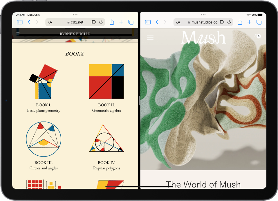
Open a link in Split View: Touch and hold the link, then tap Open in New Window.
Leave Split View: Drag the divider over the window you want to close.
Preview website links
Touch and hold a link in Safari to see a preview of the link without opening the page. To open the link, tap the preview, or tap Open.
To close the preview and stay on the current page, tap anywhere outside the preview.

Translate a webpage
When you view a webpage that’s in another language, you can use Safari to translate it (not available in all languages or regions).
Manage downloads
To download a file, touch and hold the file or link you want to download, then tap Download Linked File.
Tip: You can download files in the background while you continue to use Safari.
Add Safari back to your Home Screen
If you don’t see Safari on your Home Screen, you can find it in App Library and add it back.
On the Home Screen, swipe left until you see the App Library.
Enter “Safari” in the search field.
iOS 17: How to Use Desktop View on iPhone – A Step-by-Step Guide
Switching to desktop view on your iPhone is easy with iOS 17. Simply open Safari, navigate to your desired website, tap the “AA” icon in the address bar, and choose “Request Desktop Site.” This will reload the page in its desktop version, giving you access to features and content sometimes limited on mobile sites.
When you complete the action, the website you’re browsing will reload and display the desktop version of the site, which often provides a more comprehensive view and additional features compared to the mobile version.
You can also watch this video about how to use desktop view on iPhone for more on this topic.
Introduction
Ever found yourself squinting at your iPhone’s screen trying to tap that tiny link or button on a website? Yeah, it’s not fun. But here’s the good news: With the release of iOS 17, you now have the power to turn that cramped mobile view into a full-fledged desktop experience. That’s right, the same layout you’d see on your computer, right on your iPhone. Why is this important, you ask?
Well, some websites hide features or content from their mobile versions, or maybe the desktop version is just easier to navigate. Plus, with more of us using our phones as our primary internet devices, having access to desktop sites is a must. This isn’t just for tech geeks, either; it’s for anyone who wants the full internet experience on the go. So, let’s dive in and learn how to unleash the desktop power within your iPhone.
Step by Step Tutorial on How to Use Desktop View on iPhone
The following steps will guide you through how to request the desktop version of a website on your iPhone using Safari.
Step 1: Open Safari on your iPhone
Open the Safari app on your iPhone. This is Apple’s default web browser, where you’ll be able to access the desktop view feature.
When you open Safari, ensure that you’re on the latest version of iOS to access this feature. If it’s not working, check for any available updates.
Step 2: Navigate to a website
Type in the website’s address in the address bar or access it from your bookmarks.
Remember to visit a site that has distinct desktop and mobile versions. Some sites automatically adjust to screen size and may not have a separate desktop version.
Step 3: Tap the “AA” icon in the address bar
Once the website loads, look for the “AA” icon on the left side of the address bar at the top of your screen.
The “AA” icon is a quick access button to several Safari settings, including the option to switch to desktop view.
Step 4: Choose “Request Desktop Site”
After tapping the “AA” icon, a menu will appear. From this menu, select “Request Desktop Site.”
The website should immediately reload and display the desktop version. If it doesn’t change, try refreshing the page or making sure that the site you’re visiting offers a desktop version.
Additional Information
While the desktop view on your iPhone is a great feature, there are a few extra things you should know. First, once you’ve requested the desktop site, Safari will remember your preference for that website and automatically load the desktop version in future visits—pretty handy, right? But if you ever want to go back to the mobile site, just follow the same steps and choose “Request Mobile Site” instead.
Also, keep in mind that not all websites will look perfect in desktop view on your iPhone. Sometimes elements might overlap or be off-screen, but you can usually pinch to zoom and navigate around those issues. And remember, if you’re using desktop view on cellular data, keep an eye on your usage to avoid unexpected charges if your plan has limits. Happy browsing!
- Open Safari on your iPhone.
- Navigate to a website.
- Tap the “AA” icon in the address bar.
- Choose “Request Desktop Site.”
Frequently Asked Questions
Will desktop view work for all websites.
Most websites with distinct desktop versions will load in desktop view when you request it, but some sites are designed to automatically adjust to your screen size and may not have a separate desktop version.
Can I set Safari to always open sites in desktop view?
Safari will remember your preference for individual websites, but there is no global setting to open all sites in desktop view by default.
What if a website doesn’t look right in desktop view?
You can always switch back to the mobile version or try zooming and scrolling to navigate around any display issues.
Does using desktop view consume more data than mobile view?
Yes, desktop sites often have more content and larger files, which can result in higher data usage compared to mobile-optimized sites.
Will my browsing history be different when using desktop view?
No, your browsing history will remain the same regardless of whether you use desktop or mobile view.
There you have it—the convenience of a desktop right in your pocket. With iOS 17’s desktop view feature on your iPhone, you’re no longer confined to pared-down mobile sites. You now have the power to explore the web in all its full-sized glory, with all the features and content you’d typically enjoy on a larger screen.
Whether you’re researching, shopping, or just browsing, desktop view can make your online experience that much better. So next time you find yourself on a mobile site that’s just not cutting it, remember these simple steps and make the switch to desktop view. Your eyes (and fingers) will thank you. Keep exploring, stay curious, and enjoy the vast world of the internet, just as it was intended.

Matthew Burleigh has been writing tech tutorials since 2008. His writing has appeared on dozens of different websites and been read over 50 million times.
After receiving his Bachelor’s and Master’s degrees in Computer Science he spent several years working in IT management for small businesses. However, he now works full time writing content online and creating websites.
His main writing topics include iPhones, Microsoft Office, Google Apps, Android, and Photoshop, but he has also written about many other tech topics as well.
Read his full bio here.
Share this:
Join our free newsletter.
Featured guides and deals
You may opt out at any time. Read our Privacy Policy
Related posts:
- How to Request Desktop Site on iPhone 13
- 15 Ways to Fix Safari Not Working on iPhone in 2023
- Safari History iPhone: How to See It [2023 Guide]
- How to Publish a Google Site
- How to Force Desktop Site in Microsoft Edge for Mobile
- A 14 Step Guide to Making Money from Blogging
- How to Remove Frequently Visited on iPhone
- How to Get Safari Back on iPhone 13
- Hands On With StudioPress Sites
- How to Create a Desktop Shortcut for a Website in Windows 7
- Why Can’t I Create a Private Browsing Tab in Safari on My iPhone?
- How to Request Desktop Site in Safari on an iPhone 7
- 15 iPhone Settings You Might Want to Change
- Can I Get Rid of Frequently Visited in Safari on iPhone?
- How to View Saved Passwords in Google Chrome (3 Methods)
- How to Make All Columns the Same Width in Excel 2013
- How to Block Websites on iPhone 12: A Step-by-Step Guide
- 3 iPhone Safari Tips You Might Not Know
- Can I Put a Chrome Shortcut on Desktop in Windows?
- How to Clear Cookies on iPhone
How to Always Open Private Browsing by Default on Android and iPhone
Jump right into Incognito mode when you launch your web browser.
Quick Links
How to launch your iphone browser in private browsing mode, how to launch your android browser in incognito mode.
Tired of having to manually switch to an incognito tab every time you want to surf the web privately? There are easier ways to go about this on your phone. We'll teach you how to open your browser in private mode on Android and iPhone.
If you use Safari as the default browser on your iPhone , you're probably familiar with the steps to open a Private Browsing tab—tap the Tabs icon, swipe right on the tab bar, and then tap the screen. This is far from convenient if you regularly use Safari's Private Browsing feature.
So, the next time you want to browse privately, long-press the Safari app icon and select New Private Tab from the context menu. Note that you may not see this if you haven't opened a private tab in Safari before.
If you use other popular browsers like Chrome, Firefox, or Edge, you can long-press the respective app's icon to see similar options like Incognito Search or New InPrivate Tab .
You can open a web browser in private mode on Android by following the same steps. Just long-press the app icon and choose the New Private Tab or New Incognito Tab option from the context menu.
Additionally, Android lets you create a Home screen shortcut for this context menu item. You can use it to launch a private browsing tab on Android with a single tap.
Long-press your browser's app icon on your Home screen, then long-press the New Private Tab or New Incognito Tab option, depending on your browser. Doing so will create an app icon you can drag and drop anywhere on the Home screen.
The next time you want to open a private tab, you simply need to tap this app shortcut. From my testing, I found that Firefox, Chrome, Edge, and Opera have these context menu options.
If you use Chrome, you can use its Home screen widget to quickly open an Incognito tab. To add this widget, long-press on any empty area on your Android phone and select Widgets . Type "Chrome" in the search field and expand the dropdown to see all available widgets. Scroll down, select the Chrome Shortcuts widget, and tap Add .
When you want to use it, simply tap the Incognito icon in the widget to launch Chrome in private mode. And while you're at it, you can follow our tips to enhance Chrome's Incognito mode on Android .
With these simple workarounds, you can always launch your browser in private mode. However, you should know that browsing incognito isn't fully private, and you can still be tracked . Fear not, though; there are several other ways to browse the web anonymously .
Exclusive: EU's new tech laws are working; small browsers gain market share
- Medium Text

- Company Alphabet Inc Follow
- Company Apple Inc Follow
- Company Microsoft Corp Follow
CHOSEN ONES
Sign up here.
Reporting by Supantha Mukherjee in Stockholm and Yun Chee in Brussels; Editing by Kenneth Li and Daniel Wallis
Our Standards: The Thomson Reuters Trust Principles. New Tab , opens new tab

Thomson Reuters
Supantha leads the European Technology and Telecoms coverage, with a special focus on emerging technologies such as AI and 5G. He has been a journalist for about 18 years. He joined Reuters in 2006 and has covered a variety of beats ranging from financial sector to technology. He is based in Stockholm, Sweden.

An agenda-setting and market-moving journalist, Foo Yun Chee is a 20-year veteran at Reuters. Her stories on high profile mergers have pushed up the European telecoms index, lifted companies' shares and helped investors decide on their move. Her knowledge and experience of European antitrust laws and developments helped her broke stories on Microsoft, Google, Amazon, numerous market-moving mergers and antitrust investigations. She has previously reported on Greek politics and companies, when Greece's entry into the eurozone meant it punched above its weight on the international stage, as well as Dutch corporate giants and the quirks of Dutch society and culture that never fail to charm readers.

Technology Chevron

IBM nearing deal for cloud software provider HashiCorp, source says
International Business Machines is nearing a deal to buy cloud software provider HashiCorp , according to a person familiar with the matter.


COMMENTS
To access the Responsive Design Mode, enable the Safari Develop menu. Follow the steps below to enable the Develop menu: Launch Safari browser. Click on Safari -> Settings -> Advanced. Select the checkbox -> Show Develop menu in menu bar. Once the Develop menu is enabled, it'll show up in the menu bar as shown in the image below: Note ...
Tutorial. 1. Open up Safari on your Mac. 2. Now click on 'Safari' in the menu bar. 3. Now click on Preferences, then Advanced. 4. At the very bottom you'll see an option called 'See Develop menu ...
Step 1: Open Safari on your device. To begin the process of changing Safari to mobile view, the first step is to open the Safari web browser on your Apple device. Whether you're using an iPhone, iPad, or any other Apple product, Safari is the default browser, offering a seamless and intuitive browsing experience.
Responsive Design Mode in Safari DevTools for Mobile view. To start with, bear in mind that the Developer menu is, by default, disabled for Safari browser. In order to access the Responsive Design Mode, enable the Safari Develop menu. Follow the steps below to enable the Develop menu: Launch Safari browser; Click on Safari -> Preferences ...
1. Load Single Site in Mobile Mode - Temporarily. You can easily instruct Safari to switch a tab to mobile view whenever you face issues with the site's desktop view. Start by tapping the ᴀA ...
Step 1- Open Developer Tools in Safari. To open the Developer Tools, follow these simple steps-. With Safari open, click on the "Develop" menu in the menu bar. In the dropdown menu, select 'Show Web Inspector' or use the keyboard shortcut- Cmd + Option + I (Mac) or Ctrl + Shift + I (Windows, if using an older version of Safari).
How to Enable Safari Developer Tools. If you don't have developer tools enabled in Safari, you will need to do this before the console can be opened by using the following steps: From the main menu go to Safari > Preferences (or use the CMD + , keyboard shortcut.) Go to the Advanced tab. Check "Show Developer menu in menu bar".
Chrome and Edge: You need to have "Developer Tools" open first: In Windows/Linux, press Ctrl + Shift + I or just F12. In macOS, press option + command + I. Once developer tools is open and focused, you can toggle device emulation: In Windows/Linux, press Ctrl + Shift + M. In macOS, press command + shift + M.
In order to access the Responsive Design Mode, enable the Safari Develop menu. To enable the Safari development mode, follow the steps listed below: Launch the Safari browser. Click Safari -> Preferences -> Advanced. Select the checkbox -> Show Develop menu in the menu bar. Once the Develop menu is enabled, 'Enter Responsive Design Mode ...
To go back to the mobile version, tap and hold on the "Refresh" button again and select "Request Mobile Site." iOS 13 and Above With the iOS 13 update, Apple has improved the Safari browser in a couple of important ways.
Now, here are 30 tricks to help you have a better experience when using Safari. 1. Navigate Tab Bar. (Credit: Lance Whitney / Apple) The jump to iOS 15 moved Safari's address bar to the bottom of ...
If you don't see Safari on your Home Screen, you can find it in App Library and add it back. On the Home Screen, swipe left until you see the App Library. Enter "Safari" in the search field. Press and hold , then tap Add to Home Screen. In Safari on iPhone, view websites, preview website links, translate webpages, and add the Safari app ...
Open the Chrome browser. In Chrome, go to the website you wish to see in the mobile version. Right-click the webpage and select "Inspect" from the menu. To go to Developer Tools, click on the ...
Every popular browser lets you see your site through the "eyes" of a mobile phone. While the interfaces vary among browsers, all make it easy to do. Let's take a look at how this works in two of the most popular browsers, Google Chrome and Safari. View your mobile site on Google Chrome desktop browser. Step 1 - Open the Inspect Element tool
Safari. Blazing fast. Incredibly private. Safari is the best way to experience the internet on all your Apple devices. It brings robust customization options, powerful privacy protections, and optimizes battery life — so you can browse how you like, when you like. And when it comes to speed, it's the world's fastest browser. 1.
First, go into your Settings > Safari and turn on the Request Desktop Website switch next to " All Websites ." If you have manually configured specific sites to open up in mobile view - don't worry! You'll see them listed separately under Other Websites within the same setting page. Just turn off that respective switch so that from now all of ...
Mobile Safari can call other programs to "View Source" via the share functionality in iOS / iPadOS. To transform your web page into source, install an app that has this functionality (e.g. View Source - HTML, JavaScript and CSS), click the share button in the middle of screen footer (the icon depicts an arrow out from a square). This will open ...
so i have this problem, on Chrome (mobile view) when i click burger menu btn (SVG icon), it shows me menu and other page links (as it should). but on safari it just does not show. ... i want to menu show when i click on menu icon on mobile view safari browser. javascript; html; css; svg; safari; Share. Follow asked 1 min ago. Matteo Matteo. 1 ...
View Mobile Sites in Safari. First, we need to enable the developer tools. Click the gear icon on the toolbar, and select Preferences. Click the Advanced tab, and then check the box that says "Show Develop menu in menu bar". Once you've closed your settings box, click the page icon, select Develop, then User Agent, and then choose one of ...
Safari for iOS was one of the first mobile browsers to update their implementation by choosing to define a fixed value for the vh based on the maximum height of the screen. By doing so, the user would not experience jumps on the page once the address bar went out of view. Chrome's mobile browser followed suit around a year ago.
Add Safari back to your Home Screen. If you don't see Safari on your Home Screen, you can find it in App Library and add it back. On the Home Screen, swipe left until you see the App Library. Enter "Safari" in the search field. Press and hold , then tap Add to Home Screen. In Safari on iPad, view websites, preview website links, translate ...
Step 1: Open Safari on your iPhone. Open the Safari app on your iPhone. This is Apple's default web browser, where you'll be able to access the desktop view feature. When you open Safari, ensure that you're on the latest version of iOS to access this feature. If it's not working, check for any available updates.
Perform live interactive cross browser testing of your public or locally hosted websites and web apps on 3000+ real mobile and desktop browsers running on real devices and real OS. Test your native, hybrid or web mobile apps online on a scalable mobile testing cloud. Test and debug your mobile apps faster on both Emulators/Simulators or online ...
Long-press your browser's app icon on your Home screen, then long-press the New Private Tab or New Incognito Tab option, depending on your browser. Doing so will create an app icon you can drag and drop anywhere on the Home screen. The next time you want to open a private tab, you simply need to tap this app shortcut.
Independent browser companies in the European Union are seeing a spike in users in the first month after EU legislation forced Alphabet's Google , Microsoft and Apple to make it easier for users ...
Mobile browser market share. Because mobile devices are responsible for most of the global internet traffic today, it follows that browsers that rule this platform enjoy the most usage worldwide [5].. Google Chrome retains the lead regarding web browser usage on mobile platforms (64.52%) as of November 2023.Safari is second, with a 25.19% market share, and Samsung Internet (4.58%) closes the ...