Does Safari 15 finally fix viewport height?
Written by Luke Channings on June 11, 2021
The design for Safari 15 has been very controvercial, and has changed significantly since the beta that this article was based on Sadly, one of the casualties of the evolving design was the main thrust of this article: env(safe-area-inset-bottom) is no longer dynamically the height of the address bar in the final release.
TL;DR : No , but if you subtract env(safe-area-inset-bottom) from 100vh you'll get what you want .
Safari 15's UI is a radical departure from the previous version — and from web browsers in general — but does it fix the viewport height problem?

What is the viewport height problem again?
Mobile Safari has had problems related to 100vh not behaving like web developers expect 1 2 pretty much since the beginning. The main crux of the issue is that Mobile Safari's UI Chrome shrinks when you scroll, and expands again when you activate it. That means 100vh ("100% the height of the viewport") can't be a static number.
Let's start by understanding the definition of the vh unit 3 :
vh is defined as Equal to 1% of the height of the initial containing block . — Anthony Frehner
And here's the best explanation of the 100vh issues in Mobile Safari that I've seen so far,
The core issue is that mobile browsers (I’m looking at you, Chrome and Safari) have a “helpful” feature where the address bar is sometimes visible and sometimes hidden, changing the visible size of the viewport. Rather than adjusting the height of 100vh to be the visible portion of the screen as the viewport height changes, these browsers instead have 100vh set to the height of the browser with the address bar hidden. The result is that the bottom portion of the screen will be cut off when the address bar is visible, thus defeating the purpose of 100vh to begin with. — David Chanin , Avoid 100vh On Mobile Web
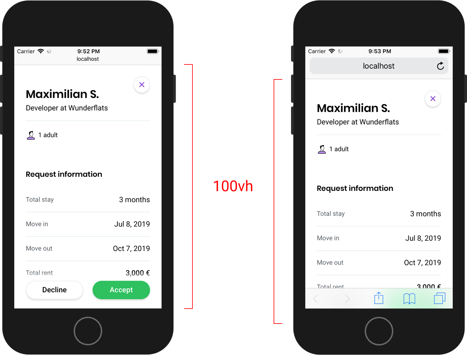
Let's put this new Safari to the test
I have a simple HTML page based on the example given in David's article. It has a header at the top and a button at the bottom, all wrapped in a 100vh container.

Safari's new floating address bar is displayed above our test button, which is more-or-less exactly the same behaviour as iOS 14.
So - Safari 15 does not change the behavour of 100vh 😢.
So what's the solution then?
It makes sense to me that the WebKit team wouldn't change the behaviour of the viewport unit, it's already well defined.
Do you remember when Apple introduced env() and safe-area-inset so that web developers could avoid their content being shown behind the notch 4 ?
Well in Safari 14, safe-area-inset-bottom is 0px whether the UI chrome is active or inactive, which is something that has annoyed me for a while.
safe-area-inset-bottom is 0px when the UI chrome is inactive in Safari 15 on iOS, and then the height of the collapsed chrome minus the height of the expanded chrome when the bar is expanded.
That means that to get a button to float at the bottom of the page, always above the UI Chrome, all you have to do is use calc(100vh - env(safe-area-inset-bottom)) .
Wrapping up
So not only does safe-area-inset-bottom work in Safari 15, it's animated !
I've been hoping that something to remedy the viewport height bug was coming since Jen Simmons (who joined the Safari / WebKit team in June 2020) was asking for feedback regarding viewport height issues.
Hey everyone who’s been frustrated that VH units in CSS don’t do what you need… can you describe your usecase? What layout are you creating? With which layout mechanism? What do you need? Screenshots & sample code appreciated. — Jen Simmons ( @jensimmons ) May 15, 2021
Have a feeling I’m going to be talking about Environment Variables a lot this week. They are really cool & supported! https://developer.mozilla.org/en-US/docs/Web/CSS/env() https://caniuse.com/css-env-function padding-bottom: calc(1rem + env(safe-area-inset-bottom)); -or- height: calc(100vh - env(safe-area-inset-bottom)); — Jen Simmons ( @jensimmons ) June 7, 2021
- https://bugs.webkit.org/show_bug.cgi?id=141832 ↩
- https://css-tricks.com/the-trick-to-viewport-units-on-mobile/ ↩
- https://github.com/w3c/csswg-drafts/issues/4329 ↩
- https://webkit.org/blog/7929/designing-websites-for-iphone-x/ ↩
[email protected]
How to fix Tailwind CSS’s h-screen on iOS Safari
December 24, 2021
Safari on iOS behaves strangely around 100vh heights in CSS: it defines 100vh to include the part of the page behind the URL bar, meaning that it overflows off the page a little bit when the URL bar is showing.
This can be annoying since you think your page will be exactly as tall as the screen, but instead it overflows a bit.
Since Tailwind CSS’s .h-screen class uses the measurement 100vh under the hood, it’s affected by this problem.
Luckily, there’s a solution using pure CSS. You can add this bit of extra CSS to your app to make .h-screen behave as you’d expect:
The @supports media query makes sure that this CSS only affects Safari, and then instead of 100vh , we use the browser-specific unit -webkit-fill-available . This is a height defined by the available space, which on iOS Safari only includes the visible area, without the area behind the URL bar.
More blog posts
Tufts Meal Plan Wrapped
Mar 2, 2024
Building an e-ink picture frame that displays an iCloud photo album
Jan 9, 2024
2023 in review
Jan 5, 2024
Subscribe to my newsletter for a monthly round-up of new blog posts and projects I’m working on!
Twitter ↗ RSS feed ↗
CSS fix for 100vh in mobile WebKit
Not long ago there was some buzz around how WebKit handles 100vh in CSS, essentially ignoring the bottom edge of the browser viewport. Some have suggested not using 100vh , others have come up with different alternatives to work around the problem. In fact, this issue goes further back a few years when Nicolas Hoizey filed a bug with WebKit on the subject (the short of it: WebKit says this is “intentional” 🧐 ).
The other day I was doing some work with a basic flexbox layout – header, main, sticky footer – the kind we’ve all seen and used many times before:
I began running some browser tests on my iPhone, and that’s when I noticed that my sticky footer wasn’t looking so sticky:

The footer was hiding below Safari’s menu bar. This is the 100vh bug (feature?) that Nicolas originally uncovered and reported. I did a little sleuthing – hoping that maybe by now a non-hacky fix had been found – and that’s when I stumbled upon my own solution (btw, it’s totally hacky):
🔥 TIL a #CSS trick to handle that annoying mobile viewport bug with `100vh` in WebKit (iOS Safari)! #WebDev #ProTip pic.twitter.com/lefD0Klqzd — Matt Smith (@AllThingsSmitty) April 25, 2020
Using -webkit-fill-available
The idea behind -webkit-fill-available – at least at one point – was to allow for an element to intrinsically fit into a particular layout, i.e., fill the available space for that property. At the moment intrinsic values like this aren’t fully supported by the CSSWG.
However, the above problem is specifically in WebKit, which does support -webkit-fill-available . So with that in mind, I added it to my ruleset with 100vh as the fallback for all other browsers.
And now the sticky footer is right where I want it to be in mobile Safari!

Does this really work?
The jury seems to be out on this. I’ve had no problems with any of the tests I’ve run and I’m using this method in production right now. But I did receive a number of responses to my tweet pointing to other possible problems with using this (e.g., the effect on rotating devices, Chrome not completely ignoring the property, etc.).
Will -webkit-fill-available work in every scenario? Probably not, cuz let’s be honest: this is the web, and it can be damn hard to build. But, if you’re having a problem with 100vh in WebKit and you’re looking for a CSS alternative, you might want to try this.
See the Pen CSS Fix for 100vh Mobile ViewPort Bug by Matt Smith ( @AllThingsSmitty ) on CodePen .
- Web Development
Fixing the iOS Toolbar Overlap Issue with CSS Viewport Units
One of the most exciting aspects of web development in recent years has been the continued growth and improvement of CSS. Flexbox and grid revolutionized how we build webpage layouts. Custom properties (aka, CSS variables) opened up new possibilities for theming. Newer selectors like :has() , :is() , and :where() have lead to more powerful and concise CSS. Container queries are now a reality and looking ahead, native CSS nesting is on its way ( decisions concerning its syntax notwithstanding).
But all of these new and upcoming features means that CSS is becoming increasingly complicated. Inevitably, then, some new features might fall through the cracks and get overlooked. (Which is why I’m of the opinion that “full-time CSS engineer” ought to be a thing, but that’s a topic for another post.) Speaking personally, I’m still pretty ignorant concerning the benefits of newer color formats like hwb() and lch() . Which brings me to viewport units.
Put simply, viewport units allow you to size a page’s elements relative to the size of the browser’s viewport , which contains everything that is currently visible on a webpage. (The viewport is basically the browser window minus any UI elements like the navigation and search bar.)
Consider this very simple example:
The vh stands for “viewport height,” so an element set to 100vh will be 100% of the viewport’s height. If that element’s height is set to 50vh , then it’ll be 50% of the viewport’s height, and so on. The 100vh is often used when you want an element to fill up the entire browser window. For instance, I use this technique on special features (like my recent David Zindell post ) to make their headers fill up the entire viewport with a splashy image. This gives them some extra visual oomph that sets them apart from my “normal” posts.
Not All Viewports Are the Same
This approach works well except for one pretty prominent scenario. If you’re viewing such a layout in Safari on an iOS device, that 100vh element fills up the viewport, but its bottom portion is then covered by a toolbar that includes the next/previous navigation and other controls. (See Figure A.)
Note: Although I’m focusing on iOS Safari, this issue also occurs in iOS Chrome. It doesn’t occur in other iOS browsers like Brave, DuckDuckGo, Firefox, and Opera. (More on that in a moment.) I haven’t tested this in any Android browsers.
In other words, Safari doesn’t seem to take its own UI into consideration when drawing its viewport. Thus, a 100vh element doesn’t behave the way it seems like it should, i.e., filling up the space between the URL bar and the bottom toolbar. (Remember that a browser viewport is the browser window minus any UI elements.)
There are, of course, reasons for why Apple opted for this approach. And reading the developer’s explanation — the viewport’s height changes dynamically because any toolbars disappear or minimize when you scroll — they seem perfectly valid. But that doesn’t mean I liked how it looked. It was hard to believe that this was still an issue the Year of Our Lord 2023.
Various Google searches returned different solutions, including some JavaScript-based workarounds . Using JavaScript to fix visual layout issues, however, always feels hack-y to me. Call me old-fashioned, but I like to keep my CSS and JavaScript nice and separate, and reserved for those things that they do best (e.g., CSS for layout, JavaScript for interactivity).
That aforelinked article also pointed me to Matt Smith’s article about -webkit-fill-available , which seemed promising at first. Unfortunately, it wasn’t applicable to my situation. I didn’t want the post header to simply fill up the entire available space because I also needed to take into account the height of my site’s header, which contains the logo, nav, and search.
Here’s what my original CSS looked like:
The site header is 6 rems high, so I use the calc function to subtract that from the 100vh to dynamically calculate the post header’s new height. But, as pointed out before, iOS doesn’t respond to 100vh the way you might think it would. What I really needed was a new type of CSS unit — and fortunately, I found it.
New Viewport Units
Back in November, Google’s Web.dev blog covered three new viewport units: the “large,” “small,” and “dynamic” viewport units . These units were created specifically to work with viewports whose size might change due to dynamic toolbars — which was the exact problem I was facing .
- The “large” viewport units assume that any dynamic toolbars (e.g., Safari’s bottom bar) are retracted and hidden , and calculate the viewport’s size accordingly. (This is akin to Safari’s aforementioned default behavior.)
- The “small” viewport units assume that any dynamic toolbars are expanded and visible , and calculates the viewport’s size accordingly.
- The “dynamic” viewport units sit in-between the “large” and “small” units, and react automatically to the dynamic toolbar’s behavior.
At first glance, a “dynamic” viewport unit seemed like the solution. After all, who doesn’t like a web design that automatically responds, all on its own, to a given situation? With that thought in mind, I updated my CSS:
In addition to the original selector, I added a feature query via @supports that basically says if the browser recognizes and supports the height: 100dvh declaration, then run the following CSS. (This is an example of progressive enhancement , i.e., starting with the basics and then adding on more advanced code that modern browsers will recognize.) That CSS is virtually identical to my original CSS, except I’m now using 100dvh instead of 100vh . (The dvh stands for “dynamic viewport height.”)
The first time I loaded the page, the problem seemed to be solved: the post header now filled up the space between Safari’s toolbars without anything cut off or hidden. But then I scrolled a little bit.
When you scroll down in iOS, the browser’s toolbars disappear or reduce in size, thus increasing the height of the browser’s viewport. Conversely, scrolling back to the top causes the toolbars to reappear or return to their original size, thus decreasing the viewport’s height. This behavior caused some distracting (IMO) changes to the post header: the background image expanded while the text shifted down in response to the additional height.
Interestingly, this “dynamic” approach is the behavior employed by the iOS versions of Brave, DuckDuckGo, Firefox, and Opera. In other words, toolbar overlap appears to be a non-issue for them, at least as far as Opus is concerned.
So after giving it some more thought, I replaced 100dvh with 100svh — i.e., the “small” viewport height — which assumes that any toolbars are always expanded.
Here’s my final code:
You can see the results — that is, the entire post header — in Figure B. Upon scrolling, the post header doesn’t take advantage of the increased viewport height, so it’s not a truly “full-height” element. However, it doesn’t have any weird shifting, either, but looks the same all the time. And I always prefer such stability in my web designs.
For what it’s worth, Firefox, Brave, et al . ignore the 100svh setting altogether, and instead, always stick with the “dynamic” handling of the viewport and post header heights. That’s a little frustrating, but since they represent a relatively minuscule amount of Opus ’ overall traffic, I’m not going to sweat it.
Final Thoughts
Along with the aforementioned color formats, viewport units are one of those aspects of CSS that has always felt rather abstract to me. (Then again, I still have trouble wrapping my mind around how srcset works, and that’s used all the time for responsive images.) The problems they seek to address have often seemed rather niche to me, compared to the issues that I’m trying to solve 95% of the time.
Of course, now I have to eat a little crow because I found myself in just such a “niche” situation. Which is to say, I’m glad that really smart people have spent time thinking through these situations, rarefied as they might seem, to find and propose potential solutions.
I’m also glad that browser makers are quick to implement them; browser support for these new viewport units is pretty good, with Opera being the only major holdout. (Which means that I’ll probably remove the @supports feature query in the not-too-distant future and use the 100svh as the default CSS.)
Finally, while Safari’s behavior was initially frustrating, I do believe they made the better choice concerning how to handle dynamic toolbars and viewport heights now that I’ve seen how Firefox et al . handle them. I’d rather have part of the design covered up by default (but fixable, if needed, with the right CSS) then see the page rearrange itself as you scroll. The latter behavior is unexpected and thus distracting, two things that can create a poorer user experience — which is something I try to avoid in every aspect of my designs.
A rather geeky/technical weblog, est. 2001, by Bramus
100vh in Safari on iOS
Update 2021.07.08: There are new viewport units on the way that will finally solve this issue. 100dvh is the one you’re looking for.
When working with Viewport Units there’s this longstanding and extremely annoying bug in Safari on iOS where it does not play nice with the vh unit. Setting a container to 100vh for example will actually result in an element that’s a wee bit too tall: MobileSafari ignores parts of its UI when calculating 100vh .
🤔 New to Viewport Units? Ahmad Shadeed has got you covered .
Apple/WebKit’s stance is that it works as intended , although it’s not what I (and many other developers) expect. As a result we have to rely on workarounds.
In the past I’ve used Viewport Units Buggyfill or Louis Hoebregts’ CSS Custom Properties Hack to fix this behavior. I was glad to see that Matt Smith recently found a way to have MobileSafari render an element at 100vh using CSS:
🔥 TIL a #CSS trick to handle that annoying mobile viewport bug with `100vh` in WebKit (iOS Safari)! #WebDev #ProTip — Matt Smith (@AllThingsSmitty) April 25, 2020
As I replied on Twitter : Nice, but I’d rather have MobileSafari fix the vh unit , as using -webkit-fill-available for this will only work to achieving 100vh .
If you want to achieve a perfect 50vh for example, using -webkit-fill-available won’t work as you can’t use -webkit-fill-available in calc() . Above that it won’t work when the targeted element is nested somewhere deep in your DOM tree with one its parents already having a height set.
Come ‘on Safari, stop being the new IE6 …
UPDATE 2020.05.16 Apparently this -webkit-fill-available workaround can negatively impact the Chrome browser:
Ugh, while this works on iOS Safari and in-app browsers like the one in Google Hangouts, it breaks in Chrome, since Chrome honors `-webkit-fill-available` (and consequently doesn't ignore it). Demo: https://t.co/Rx0VSoxe0e . pic.twitter.com/z3MKEcgUAz — Thomas Steiner (@tomayac) April 29, 2020
Given this it’s recommended to selectively ship -webkit-fill-available to only Safari using a @supports rule that tests for -webkit-touch-callout support:
Alternatively you can still use Louis Hoebregts’ CSS Custom Properties Hack , which uses JavaScript:
Published by Bramus!
Bramus is a frontend web developer from Belgium, working as a Chrome Developer Relations Engineer at Google. From the moment he discovered view-source at the age of 14 (way back in 1997) , he fell in love with the web and has been tinkering with it ever since (more …) View more posts
Unless noted otherwise, the contents of this post are licensed under the Creative Commons Attribution 4.0 License and code samples are licensed under the MIT License
Join the Conversation

- Pingback: Failing function detection - Abu Sayed
- Pingback: CSS in 2022 | WIT블로그
Leave a comment
Cancel reply.
Your email address will not be published. Required fields are marked *
Notify me of followup comments via e-mail. You can also subscribe without commenting.
This site uses Akismet to reduce spam. Learn how your comment data is processed .
Overlapping bottom navigation bar despite 100vh in iOS Safari
»100vh« may not behave as expected for some mobile browsers and the bottom of your content will be partially hidden behind the browser’s bottom bar (i.e. below the »fold«).
First of all, let’s have a look at the issue by checking out the following example. It’s a simple page with 2 absolutely positioned boxes in the top left corner ( .top ) and the right bottom corner ( .bottom ). These boxes are wrapped within an element ( .container ) with a width of 100vw and a height of 100vh . You may have something similar in your project, such as a fullscreen modal/lightbox with a header/footer.
This should span accross the full viewport, right? Well, in the left screenshot below, you can see that in iOS Safari the bottom navigation bar actually overlaps your content, i.e. your content is below the »fold«—although you may have expected that it’s not part of the viewport.
In the right screenshot, you can see how one would expect the layout to be. The container spans between the top address bar and the bottom navigation bar.
This is a well-known issue and unfortunately intentional, as it prevents other problems, as Benjamin Poulain explained in his reply to a WebKit bug ticket regarding this issue.
This is completely intentional. It took quite a bit of work on our part to achieve this effect.
The base problem is this: the visible area changes dynamically as you scroll. If we update the CSS viewport height accordingly, we need to update the layout during the scroll. Not only that looks like shit, but doing that at 60 FPS is practically impossible in most pages (60 FPS is the baseline framerate on iOS).
It is hard to show you the "looks like shit" part, but imagine as you scroll, the contents moves and what you want on screen is continuously shifting.
Dynamically updating the height was not working, we had a few choices: drop viewport units on iOS, match the document size like before iOS 8, use the small view size, use the large view size.
From the data we had, using the larger view size was the best compromise. Most website using viewport units were looking great most of the time.
So, it’s not a bug—and no fix is planned for this.
Luckily, this doesn't have to be the most depresssing answer ever. How do we go on from this? There’s a couple of solutions.
Depending on your use case, it may be enough to simply use 100% instead of 100vh , especially for fixed/sticky elements (as 100% will be relative to the »real« viewport).
However, if your element is nested somewhere in the DOM, this may not work out (as 100% will be relative to the parent elements which are only as tall as the content they contain). And that may have been the motivation why you wanted to use 100vh in the first place.
stretch / -webkit-fill-available
Intrinsic and extrinsic sizing is a new CSS functionality that extends the sizing properties with keywords that represent content-based »intrinsic« sizes and context-based »extrinsic« sizes. This allows CSS to more easily describe boxes that fit their content or fit into a particular layout context.
One of these keywords is stretch which formerly was known as fill , fill-available , and its prefixed spin-offs -moz-available and -webkit-fill-available . We can make use of this functionality and because CSS skips over style declarations it doesn’t understand, we can implement fallbacks for all of these possible implementations.
(Hint: Autoprefixer will compile stretch to -webkit-fill-available and -moz-available automatically.)
JavaScript is always the »last stronghold« for stuff that’s not possible with pure CSS. Using CSS variables, you can pass the value of window.innerHeight into your CSS and update this variable every time the viewport is resized.
In your CSS, you can consume this variable as follows.
If you can’t use CSS variables in your project (e.g. due to browser support concerns), you can also update the height of your affected elements directly from within your script.
Unfortunately, there isn’t a one-size-fits-all solution for this issue. You should try the aforementioned solutions top down and be very conscientious with your cross-browser/cross-device testing.
- Discuss on Twitter
- Edit on GitHub
DEV Community
Posted on Jan 22, 2021
Dealing with 100vh on iOS Safari in TailwindCSS
Recently I've been needing to develop for iOS Safari, in which I found out that 100vh is not quite 100vh on there .
Now, there are fixes for this. Namely by using height: -webkit-fill-available , as demonstrated here . This however has the unfortunate side effect of also targetting Chromium-based browsers.
To fix that you can check for the support of -webkit-touch-callout: none . With that, only iOS and iPadOS Safari are targetted.
In order to make this much easier to use in Tailwind I created a plugin for it.
You can find the plugin here: https://www.npmjs.com/package/@rvxlab/tailwind-plugin-ios-full-height
Top comments (0)
Templates let you quickly answer FAQs or store snippets for re-use.
Are you sure you want to hide this comment? It will become hidden in your post, but will still be visible via the comment's permalink .
Hide child comments as well
For further actions, you may consider blocking this person and/or reporting abuse

I built these 5 types of loading animation in HTML and CSS, which do you prefer?
Adeyele Paul - Apr 22

ManyShiba - The World's Greatest Twitter Bot
Spencer Lepine - Apr 8

Creating a custom logger in Node JS using Winston
Ian Kamau - Apr 11

How to create a slick CSS animation from Jackie Brown
Rob OLeary - Apr 19

We're a place where coders share, stay up-to-date and grow their careers.
Navigation Menu
Search code, repositories, users, issues, pull requests..., provide feedback.
We read every piece of feedback, and take your input very seriously.
Saved searches
Use saved searches to filter your results more quickly.
To see all available qualifiers, see our documentation .
- Notifications
Have a question about this project? Sign up for a free GitHub account to open an issue and contact its maintainers and the community.
By clicking “Sign up for GitHub”, you agree to our terms of service and privacy statement . We’ll occasionally send you account related emails.
Already on GitHub? Sign in to your account
🐞 Bug Report: 100vh issue in iOS Safari #20701
bouveng commented Dec 12, 2022 • edited
nicholaszein commented Dec 14, 2022
- 👍 1 reaction
Sorry, something went wrong.
bouveng commented Dec 17, 2022
ConsultMePL commented Dec 27, 2022
No branches or pull requests
- | New Account
- | Log In Remember [x]
- | Forgot Password Login: [x]
- Format For Printing
- - XML
- - Clone This Bug
- - Top of page
Where are the cicadas? Use this interactive map to find Brood XIX, Brood XIII in 2024
In a few weeks, over a dozen states will be abuzz as trillions of periodical cicadas will emerge from their yearslong underground stay.
Broods XIX and XIII will emerge in a combined 17 states, mostly in the Midwest and Southeast, in a rare, double brood event . These two broods last emerged together 221 years ago, and after this year are not predicted to do so again until 2245.
Once conditions are right, the two broods will emerge in massive numbers to feed, make noise, mate and die. Here's what to know about where to find the 13-year Brood XIX and the 17-year Brood XIII.
2024 double cicada broods: Check out where Broods XIII, XIX will emerge
The two cicada broods will emerge in a combined 17 states across the Southeast and Midwest, with an overlap in parts of Illinois and Iowa. They will emerge once soil eight inches underground reaches 64 degrees, expected to begin in mid-May and lasting through late June.
The two broods last emerged together in 1803 , when Thomas Jefferson was president.
What is a periodical cicada?
Both the 13-year Brood XIX and the 17-year Brood XIII are periodical cicadas, which emerge every 13 or 17 years across North America. They differ from annual cicadas, which emerge every year.
You may remember the last periodical brood to emerge in huge numbers: the 17-year Brood X that was found in 2021 throughout the Midwest and Eastern Seaboard.
Annual cicadas, which are dark green to black with green wing veins, are typically larger than periodical cicadas , which are recognizable for their red eyes, red legs and red wing veins, according to North Carolina State University Extension.
Periodical cicadas emerge earlier, usually in mid-to-late May as opposed to annual cicadas in July and August. According to North Carolina State University Extension, annual cicadas begin mating, " singing conspicuously " and lying eggs about two weeks after they emerge. Their first nymphs will fall to the ground and begin feeding on roots under the soil, and fully-developed nymphs will emerge two years later and molt into adults.
Above ground, periodical cicadas have a similar life cycle, appear in much larger numbers and are much louder. At the end of their season, the next generation of nymphs move underground and remain for either 13 or 17 years.
- a. Send us an email
- b. Anonymous form
- Buyer's Guide
- Upcoming Products
- Tips / Contact Us
- Podcast Instagram Facebook Twitter Mastodon YouTube Notifications RSS Newsletter
Apple Releases Safari Technology Preview 193 With Bug Fixes and Performance Improvements
Apple today released a new update for Safari Technology Preview , the experimental browser Apple first introduced in March 2016. Apple designed the Safari Technology Preview to test features that may be introduced into future release versions of Safari.

The current Safari Technology Preview release is compatible with machines running macOS Ventura and macOS Sonoma , the latest version of macOS that Apple released in September 2023.
The Safari Technology Preview update is available through the Software Update mechanism in System Preferences or System Settings to anyone who has downloaded the browser . Full release notes for the update are available on the Safari Technology Preview website .
Apple's aim with Safari Technology Preview is to gather feedback from developers and users on its browser development process. Safari Technology Preview can run side-by-side with the existing Safari browser and while designed for developers, it does not require a developer account to download.
Get weekly top MacRumors stories in your inbox.
Top Rated Comments
I'm always curious about these Safari Tech Preview posts. Are they just a quick way to add another headline? I suspect so, as I don't see many people trusting these builds as their daily driver. I've tried that in the past, but it never stuck.
Popular Stories

Apple Announces 'Let Loose' Event on May 7 Amid Rumors of New iPads

Apple Releases Open Source AI Models That Run On-Device

Apple Cuts Vision Pro Shipments as Demand Falls 'Sharply Beyond Expectations'

Apple Finally Plans to Release a Calculator App for iPad Later This Year

iOS 18 Rumored to Add These 10 New Features to Your iPhone
Next article.

Our comprehensive guide highlighting every major new addition in iOS 17, plus how-tos that walk you through using the new features.

App Store changes for the EU, new emoji, Podcasts transcripts, and more.

Get the most out your iPhone 15 with our complete guide to all the new features.
A deep dive into new features in macOS Sonoma, big and small.

Revamped models with OLED displays, M3 chip, and redesigned Magic Keyboard accessory.

Updated 10.9-inch model and new 12.9-inch model, M2 chip expected.

Apple's annual Worldwide Developers Conference will kick off with a keynote on June 10.

Expected to see new AI-focused features and more. Preview coming at WWDC in June with public release in September.
Other Stories

4 hours ago by Joe Rossignol

8 hours ago by MacRumors Staff

1 day ago by Joe Rossignol

2 days ago by Tim Hardwick

3 days ago by Tim Hardwick
IMAGES
VIDEO
COMMENTS
Mobile Safari has had problems related to 100vh not behaving like web developers expect 1 2 pretty much since the beginning. The main crux of the issue is that Mobile Safari's UI Chrome shrinks when you scroll, and expands again when you activate it. That means 100vh ("100% the height of the viewport") can't be a static number.
The problem you have been receiving after adding the height: 100vh to mobile resolutions. It happens due to the calculation method which Safari and Chrome are using. Mobile devices calc browser viewport as ( top bar + document + bottom bar) = 100vh. I had a hard time with 100vh when the page have to have a section filled the whole screen.
1. change the height every time the bar hides and shows. or. 2. make the viewport height constant, and have the button bar cover part of the viewport. They opted for a constant height to avoid ...
This is a well know issue (at least in safari mobile), which is intentional, as it prevents other problems. Benjamin Poulain replied to a webkit bug: This is completely intentional. It took quite a bit of work on our part to achieve this effect. :) The base problem is this: the visible area changes dynamically as you scroll.
On some mobile browsers, most commonly Chrome and Safari on iOS, 100vh actually refers to outerHeight. This means the lower toolbar on the browser will not be taken into account, cutting off the last couple of rems of your design. While you can account for the difference using CSS, the view height will subsequently change as soon as the user ...
Safari on iOS behaves strangely around 100vh heights in CSS: it defines 100vh to include the part of the page behind the URL bar, meaning that it overflows off the page a little bit when the URL bar is showing. This can be annoying since you think your page will be exactly as tall as the screen, but instead it overflows a bit. ...
Not long ago there was some buzz around how WebKit handles 100vh in CSS, essentially ignoring the bottom edge of the browser viewport. Some have suggested not using 100vh, others have come up with different alternatives to work around the problem. In fact, this issue goes further back a few years when Nicolas Hoizey filed a bug with WebKit on the subject (the short of it: WebKit says this is ...
In other words, Safari doesn't seem to take its own UI into consideration when drawing its viewport. Thus, a 100vh element doesn't behave the way it seems like it should, i.e., filling up the space between the URL bar and the bottom toolbar. (Remember that a browser viewport is the browser window minus any UI elements.)
On mobile 100vh !== 100%. This creates weird issues with mobile viewport heights like this: Now this is an issue and indeed a very frustrating one, but we'll discuss a couple of solutions one by one. 1. Use 100% instead of 100vh - "DOM tree nightmare". Now the quickest, and most CSS way is to use 100% in your page for the whole DOM tree ...
PostCSS plugin to fix iOS's bug with 100vh. It works in Chrome (just -webkit-fill-available causes problems in Chrome in some cases), iOS/iPad/MacOS Safari and all other browsers. Pure CSS solution, no JS required.
100vh. in Safari on iOS. May 6, 2020 https://brm.us/100vh 2 Comments 100vh. Update 2021.07.08: There are new viewport units on the way that will finally solve this issue. 100dvh is the one you're looking for. When working with Viewport Units there's this longstanding and extremely annoying bug in Safari on iOS where it does not play nice ...
Solution 1: CSS Media Queries. This method, albeit not entirely elegant, is simple and easy to implement. Simply target all iOS devices with specific device-width and heights. Here is a code ...
How to fix safari 100vh height? Question. Hi, I tried to look at multiple solution + the code. min-height: -webkit-fill-available; However, it's not working and it has a weird white space at the bottom like if my 100vh was transformed into 95vh. Is there a jQuery solution to fixe this height problem that doesn't break other browsers?
Hi everybody, I'm trying to fix the bug in iOS Safari that their team claims is a feature, which is that the mobile browser hijacks the viewport unit VH to render it's UI as well. ... How do I deal with iOS Safari's 100vh bug? (It's happening in iOS Chrome as well now!) #14590. Closed rchrdnsh opened this issue Jun 6, 2019 · 8 comments Closed
Now you can simply use the CSS: height: var(--real100vh); wherever you want 100vh to actually be the real 100vh on mobile, and this will simply work! It looks better if you also add a transition: height 0.4s ease-in-out; on the same element, so it doesn't snap when you scroll down on mobile. The advantage of using a CSS var to do this is that ...
Well, in the left screenshot below, you can see that in iOS Safari the bottom navigation bar actually overlaps your content, i.e. your content is below the »fold«—although you may have expected that it's not part of the viewport. In the right screenshot, you can see how one would expect the layout to be. The container spans between the ...
Recently I've been needing to develop for iOS Safari, in which I found out that 100vh is not quite 100vh on there. Now, there are fixes for this. Namely by using height: -webkit-fill-available, as demonstrated here. This however has the unfortunate side effect of also targetting Chromium-based browsers. To fix that you can check for the support ...
Add a section with 100vh, putting some content at the bottom, it will be hidden by the ui-chrome of safari. Isolating the problem. This bug happens with only Elementor plugin active (and Elementor Pro). This bug happens with a Blank WordPress theme active (Hello theme). I can reproduce this bug consistently using the steps above. System Info
Hi Benjamin, sorry to resurrect this old bug, but I'm working on improving interop between Chromium and Safari here and the choice to use the larger view size seems strange given that the ICB uses the smaller view size. In particular, this means height:100% and height:100vh will be different which might be surprising.
5. I'm encountering a very niche issue CSS issue on Safari. I have the following CSS rule: min-height: calc(100vh - 115.5px - 25px*2); This works on Chrome, but Safari doesn't seem to like the combination of calc and vh. (It works if I replace vh with %, for example--but I do need to calculate based on vh or some appropriate alternative.)
The bugs congregate in trees, and the male cicadas form a cacophonous chorus of thousands to attract mates. ... Download community science apps such as the Cicada Safari app and take photographs ...
2024 double cicada broods: Check out where Broods XIII, XIX will emerge. The two cicada broods will emerge in a combined 17 states across the Southeast and Midwest, with an overlap in parts of ...
Apple has dropped the number of Vision Pro units that it plans to ship in 2024, going from an expected 700 to 800k units to just 400k to 450k units, according to Apple analyst Ming-Chi Kuo.
I have a html step such that i have sections styled to be 100vw and 100vh. On safari they appear to have a height of 0; ... So many times devs/users post links to the website they currently work on and once the bug/error/question is answered/done the link is dead. Thank you. - lowtechsun. May 29, 2017 at 14:35.